如何在R中从矩阵生成图像?
矩阵的值将对应于图像上的像素强度(尽管我目前只对0,1值白色或黑色感兴趣),而列和行号对应于图像上的垂直和水平位置。
生成图像的意思是在屏幕上显示并将其保存为jpg格式。
m = matrix(runif(100),10,10)
par(mar=c(0, 0, 0, 0))
image(m, useRaster=TRUE, axes=FALSE)
您还可以查看raster软件包...
设置没有边距的绘图:
par(mar = rep(0, 4))
将矩阵以灰度图像的形式显示,就像spacedman的答案一样,但是要完全填充设备:
m = matrix(runif(100),10,10)
image(m, axes = FALSE, col = grey(seq(0, 1, length = 256)))
将其包装在调用png()之内以创建文件:
png("simpleIm.png")
par(mar = rep(0, 4))
image(m, axes = FALSE, col = grey(seq(0, 1, length = 256)))
dev.off()
image.default(x,y,z,...) 格式,其中x和y给出z中像素的中心位置。x 和y 可以具有长度dim(z)+1,以提供该约定的角落坐标。x <- seq(0, 1, length = nrow(m))
y <- seq(0, 1, length = ncol(m))
image(x, y, m, col = grey(seq(0, 1, length = 256)))
像素的角落(需要额外的1个x和y,而0现在是最底部的左角):
x <- seq(0, 1, length = nrow(m) + 1)
y <- seq(0, 1, length = ncol(m) + 1)
image(x, y, m, col = grey(seq(0, 1, length = 256)))
请注意,从R 2.13开始,image.default函数增加了一个参数useRaster,该参数使用高效的新图形函数rasterImage而不是旧有的image函数。后者在底层上实际上是多次调用rect函数来绘制每个像素点的多边形。
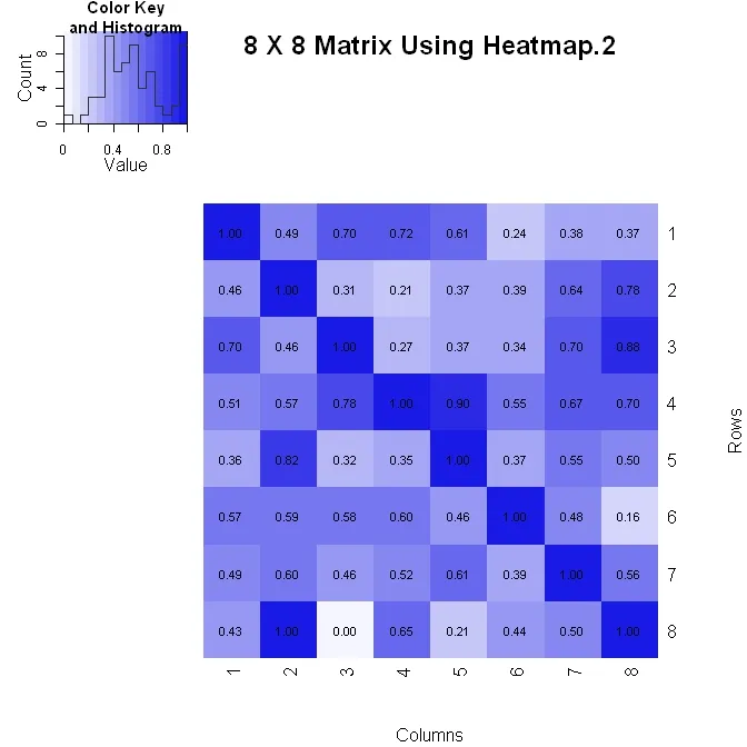
我用两种方法之一来创建矩阵(其中垂直轴向下增加)。以下是使用heatmap.2()的第一种方法。它可以更好地控制图中数字值的格式(请参见下面的formatC语句),但在更改布局时可能会有些困难。
 library(gplots)

 #Build the matrix data to look like a correlation matrix
 x <- matrix(rnorm(64), nrow=8)
 x <- (x - min(x))/(max(x) - min(x)) #Scale the data to be between 0 and 1
 for (i in 1:8) x[i, i] <- 1.0 #Make the diagonal all 1's

 #Format the data for the plot
 xval <- formatC(x, format="f", digits=2)
 pal <- colorRampPalette(c(rgb(0.96,0.96,1), rgb(0.1,0.1,0.9)), space = "rgb")

 #Plot the matrix
 x_hm <- heatmap.2(x, Rowv=FALSE, Colv=FALSE, dendrogram="none", main="8 X 8 Matrix Using Heatmap.2", xlab="Columns", ylab="Rows", col=pal, tracecol="#303030", trace="none", cellnote=xval, notecol="black", notecex=0.8, keysize = 1.5, margins=c(5, 5))
library(pheatmap)

# Create a 10x10 matrix of random numbers
m = matrix(runif(100), 10, 10)

# Save output to jpeg
jpeg("heatmap.jpg")

pheatmap(m, cluster_row = FALSE, cluster_col = FALSE, color=gray.colors(2,start=1,end=0))

dev.off()
更多选项请查看?pheatmap。
尝试使用levelplot:
library(lattice)
levelplot(matrix)
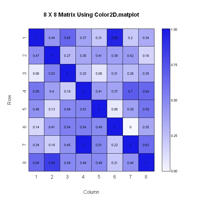
 library(plotrix)

 #Build the matrix data to look like a correlation matrix
 n <- 8
 x <- matrix(runif(n*n), nrow=n)
 xmin <- 0
 xmax <- 1
 for (i in 1:n) x[i, i] <- 1.0 #Make the diagonal all 1's

 #Generate the palette for the matrix and the legend.  Generate labels for the legend
 palmat <- color.scale(x, c(1, 0.4), c(1, 0.4), c(0.96, 1))
 palleg <- color.gradient(c(1, 0.4), c(1, 0.4), c(0.96, 1), nslices=100)
 lableg <- c(formatC(xmin, format="f", digits=2), formatC(1*(xmax-xmin)/4, format="f", digits=2), formatC(2*(xmax-xmin)/4, format="f", digits=2), formatC(3*(xmax-xmin)/4, format="f", digits=2), formatC(xmax, format="f", digits=2))

 #Set up the plot area and plot the matrix
 par(mar=c(5, 5, 5, 8))
 color2D.matplot(x, cellcolors=palmat, main=paste(n, " X ", n, " Matrix Using Color2D.matplot", sep=""), show.values=2, vcol=rgb(0,0,0), axes=FALSE, vcex=0.7)
 axis(1, at=seq(1, n, 1)-0.5, labels=seq(1, n, 1), tck=-0.01, padj=-1)

 #In the axis() statement below, note that the labels are decreasing.  This is because
 #the above color2D.matplot() statement has "axes=FALSE" and a normal axis()
 #statement was used.
 axis(2, at=seq(1, n, 1)-0.5, labels=seq(n, 1, -1), tck=-0.01, padj=0.7)

 #Plot the legend
 pardat <- par()
 color.legend(pardat$usr[2]+0.5, 0, pardat$usr[2]+1, pardat$usr[2], paste(" ", lableg, sep=""), palleg, align="rb", gradient="y", cex=0.7)
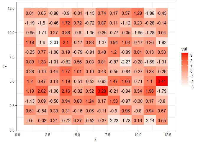
ggplot2:library(tidyverse)
n <- 12
m <- matrix(rnorm(n*n),n,n)
rownames(m) <- colnames(m) <- 1:n
df <- as.data.frame(m) %>% gather(key='y', value='val')
df$y <- as.integer(df$y)
df$x <- rep(1:n, n)
ggplot(df, aes(x, y, fill= val)) +
geom_tile() +
geom_text(aes(x, y, label=round(val,2))) +
scale_fill_gradient(low = "white", high = "red") +
theme_bw()