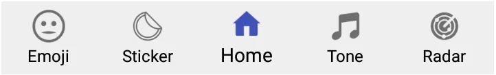
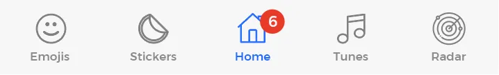
如何在Android中创建自定义BottomNavigationView项目?

10

我在我的应用程序中使用 Bottomnavigationview 作为选项卡栏,以下是我使用的代码,请检查一下。

布局:

<android.support.design.widget.BottomNavigationView
        android:id="@+id/bottom_navigation"
        android:layout_width="match_parent"
        android:layout_height="wrap_content"
        android:layout_alignParentBottom="true"     
        app:itemTextColor="@android:color/black"
        app:menu="@menu/bottom_navigation_main" />

从中我得到了以下结果,请查看图片。

Current Result

但问题是,我需要Bottomnavigationview的自定义项,就像下面的图片中有redTextView计数,在Bottomnavigationview的主页上,请查看下面的图片。

Expected Result

我已经搜索过并找到了一个第三方库,它能够创建我想要的视图。请查看它的库点击这里不可能不使用任何第三方库,只使用Bottomnavigationview吗?

我在SO上搜索了但没得到预期的结果,请查看我访问过的下面链接。

1. 第一链接
2. 第二链接
3. 第三链接
4. 第四链接
5. 第五链接

请帮我解决这个问题。谢谢 :)


不需要使用底部表单,可以自己创建自定义的图像和文本视图。 - Mohit Suthar
@MohitSuthar..我认为你所说的“这不是一个好的做法”,我并不同意。因为我有选项卡的功能,所以我使用了选项卡。在每个屏幕上创建视图并填充该视图更加繁琐。无论如何,感谢您的建议。请再给我提供另一种方法。 - Ravindra Kushwaha
@KuLdipPaTel 请检查您分享的链接一次。它与这个问题无关。 - Ravindra Kushwaha
1
@MortezaRastgoo 我已经完成了上述任务.. 明天一定会更新您,因为我大约2年前就问过它了。 - Ravindra Kushwaha
1
@MortezaRastgoo,请检查下面更新的解决方案,如有疑虑请告知。 - Ravindra Kushwaha
显示剩余2条评论
3个回答

13

我已按以下方法完成了上述任务,请查看解决方案:

布局

 <android.support.design.widget.BottomNavigationView
            android:id="@+id/bottom_navigation"
            android:layout_width="match_parent"
            android:layout_height="60dp"
            android:layout_alignParentBottom="true"
            android:background="@color/header_color"
            app:itemIconTint="@color/white_color"
            app:itemTextColor="@color/white_color"
            app:menu="@menu/bottom_navigation" />  /// YOUR MENU ITEMS FOR THE BOTTOM NAVIGATION
你的徽章计数布局应该如下所示。
<?xml version="1.0" encoding="utf-8"?>
<FrameLayout xmlns:android="http://schemas.android.com/apk/res/android"
    android:layout_width="match_parent"
    android:layout_height="match_parent">

    <TextView
        android:id="@+id/notificationsBadge"
        android:layout_width="25dp"
        android:layout_height="25dp"
        android:layout_gravity="top|center_horizontal"
        android:layout_marginLeft="10dp"
        android:layout_marginStart="10dp"
        android:background="@drawable/circle_red"
        android:gravity="center"
        android:padding="4dp"
        android:text=""
        android:textColor="@android:color/white"
        android:textSize="12sp" />
</FrameLayout>

然后你的徽章可绘制对象应该像下面这样

<?xml version="1.0" encoding="utf-8"?>
<shape xmlns:android="http://schemas.android.com/apk/res/android"
    android:shape="oval">
    <solid android:color="@android:color/holo_red_light" />
    <size
        android:width="20dp"
        android:height="20dp" />
</shape>

最后,我们需要将徽章布局填充到MainActivity.java中,在这里我们使用BottomNavigationView,请检查以下代码。

    BottomNavigationMenuView mbottomNavigationMenuView =
            (BottomNavigationMenuView) mBinding.bottomNavigation.getChildAt(0);

    View view = mbottomNavigationMenuView.getChildAt(4);

    BottomNavigationItemView itemView = (BottomNavigationItemView) view;

    View cart_badge = LayoutInflater.from(this)
            .inflate(R.layout.profile_view,
                    mbottomNavigationMenuView, false);

    //// AND THAN SET THE COUNTER BADGE, AS FOLLOW
    ((TextView) cart_badge.findViewById(R.id.notificationsBadge)).setText("5");

    itemView.addView(cart_badge);

我们可以使用相同的方法在ActionBar菜单中设置自定义文本吗? - cahyo
你的意思是,在工具栏的右侧或左侧添加循环视图的计数器类型? - Ravindra Kushwaha
是的,我们可以为这些工具栏设置自定义文本吗? - cahyo

4
如果您正在使用androidX,请参考下面的代码:

  BottomNavigationView mbottomNavigationView =findViewById(R.id.navigation);

        BottomNavigationMenuView mbottomNavigationMenuView =
                (BottomNavigationMenuView) mbottomNavigationView.getChildAt(0);

        View view = mbottomNavigationMenuView.getChildAt(1);

        BottomNavigationItemView itemView = (BottomNavigationItemView) view;

        View cart_badge = LayoutInflater.from(this)
                .inflate(R.layout.notification_badge,
                        mbottomNavigationMenuView, false);

        itemView.addView(cart_badge);

1
我在选项卡布局中使用了自定义视图。
    <com.google.android.material.tabs.TabLayout
        android:id="@+id/mainTabBar"
        android:layout_width="match_parent"
        android:layout_height="48dp"
        android:layout_alignParentBottom="true"
        android:background="@color/colorPrimaryDark"
        app:tabGravity="fill"
        app:tabIndicatorHeight="0dp"
        app:tabMode="fixed"
        app:tabSelectedTextColor="@color/colorPrimary" />

    var mainPagerAdapter = MainPagerAdapter(supportFragmentManager!!)
        viewPager.setAdapter(mainPagerAdapter)
        viewPager.setOffscreenPageLimit(mainPagerAdapter.getCount())
        for (i in 0 until mainPagerAdapter.getCount()) {
            val tab = mainTabBar.newTab()
            val tabView = mainPagerAdapter.getTabView(i, this)
            tab.setCustomView(tabView)
            mainTabBar.addTab(tab)
        }
        val tab = mainTabBar.getTabAt(0)
        if (tab != null) {
            tab.select()
            val view = tab.customView
            mainPagerAdapter.changeColorOfTabView(view!!, true, this,tab.position)
        }
        viewPager.setCurrentItem(0)

        mainTabBar.addOnTabSelectedListener(object : TabLayout.OnTabSelectedListener {
            override fun onTabSelected(tab: TabLayout.Tab) {
                viewPager.currentItem = tab.getPosition()
                val view = tab.getCustomView()
                mainPagerAdapter.changeColorOfTabView(view!!, true, this@MainActivity, tab.position)
            }

            override fun onTabUnselected(tab: TabLayout.Tab) {
                val view = tab.getCustomView()
                mainPagerAdapter.changeColorOfTabView(view!!, false, this@MainActivity, tab.position)
            }

            override fun onTabReselected(tab: TabLayout.Tab) {}
        })


    fun getTabView(i: Int, context: Context): View {
//        val typeface = Typeface.createFromAsset(context.getAssets(), "fonts/Vazir-FD.ttf")
        val tabView = LayoutInflater.from(context).inflate(R.layout.tab_main, null) as LinearLayout

        val text = tabView.findViewById<TextView>(R.id.tabTextView)
        val icon = tabView.findViewById<ImageView>(R.id.drawableTop)
        text.setText(getPageTitle(i))
        text.setTextColor(context.getResources().getColor(R.color.white))
//        text.setTypeface(typeface)
        icon.setImageResource(getIconResId(i))

        if (i == 3) {
            tabView.isSelected = true
        }
        return tabView
    }

tab_main.xml

<?xml version="1.0" encoding="utf-8"?>
<LinearLayout xmlns:android="http://schemas.android.com/apk/res/android"
    android:layout_width="match_parent"
    android:layout_height="wrap_content"
    android:gravity="center"
    android:paddingTop="10dp"
    android:orientation="vertical">

    <ImageView
        android:id="@+id/drawableTop"
        android:layout_width="30dp"
        android:layout_height="wrap_content"
        android:layout_alignParentTop="true"
        android:layout_centerHorizontal="true"
        android:adjustViewBounds="true" />

    <TextView
        android:id="@+id/tabTextView"
        android:layout_width="wrap_content"
        android:layout_height="wrap_content"
        android:layout_below="@+id/drawableTop"
        android:layout_centerHorizontal="true"
        android:textColor="@color/toggle_text_color_gray_red"
        android:textSize="11sp" />
</LinearLayout>

是的,它是可定制的,您可以根据自己的需求对自定义用户界面进行任何操作。 - Morteza Rastgoo
当你想要自定义所有选项卡时,这是非常方便的。 - Morteza Rastgoo
这个解决方案是否支持平板电脑?实际上,我正在面临这个问题。这个问题 - Arbaz.in
2
这支持平板电脑,但不填充所有空间。 - Morteza Rastgoo

网页内容由stack overflow 提供, 点击上面的
可以查看英文原文,
原文链接