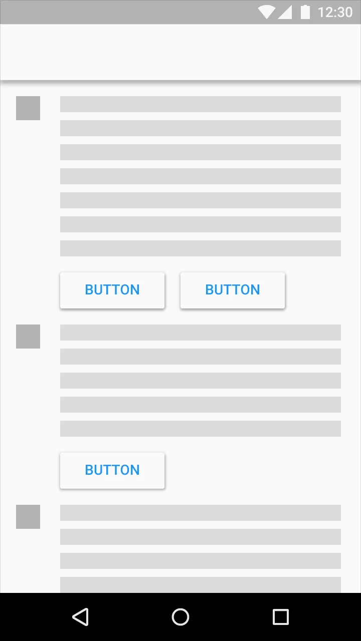
Raised buttons(凸起按钮)可以为大多数平面布局增加维度。它们强调繁忙或宽敞空间中的功能。
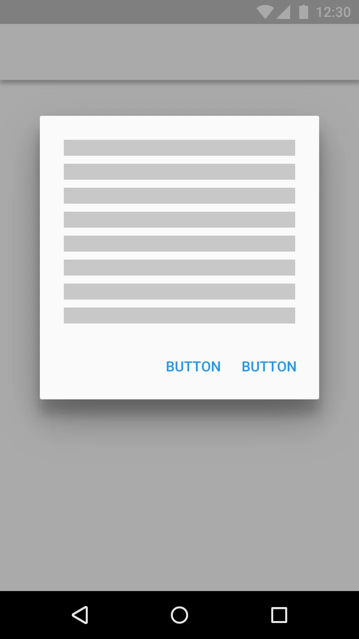
使用扁平按钮来创建工具栏和对话框,以避免过度的层叠。
来源:http://www.google.com/design/spec/components/buttons.html
这需要 Android 5.0 及以上版本
凸起按钮
从 Widget.Material.Button 继承按钮样式,标准的高程和凸起效果将会自动应用。
<style name="Your.Button" parent="android:style/Widget.Material.Button">
<item name="android:background">@drawable/raised_button_background</item>
</style>
然后您需要创建一个raised_button_background.xml
文件,其中包含按钮背景颜色,并将其放在涟漪标记内:
<ripple xmlns:android="http://schemas.android.com/apk/res/android"
android:color="?attr/colorControlHighlight">
<item android:drawable="@color/button_color"/>
</ripple>
扁平化按钮
编辑:与其按照我之前的建议使用扁平化按钮,你应该跟随下面 Stephen Kaiser 给出的建议:
<Button
android:layout_width="wrap_content"
android:layout_height="wrap_content"
android:text="DONE"
style="?android:attr/borderlessButtonStyle"
/>
编辑:如果你正在使用Support Library,你可以通过使用style="?attr/borderlessButtonStyle"
在Pre-Lollipop设备上实现相同的结果。(注意没有android:
)那么上面的例子就变成了
<Button
android:layout_width="wrap_content"
android:layout_height="wrap_content"
android:text="DONE"
style="?attr/borderlessButtonStyle"
/>
borderlessButtonStyle
被设置为@style/Widget.AppCompat.Button.Borderless
。如果你想要它拉取强调颜色,请在你的主题中将borderlessButtonStyle
设置为@style/Widget.AppCompat.Button.Borderless.Colored
。 - pumpkinpie65style="?android:attr/borderlessButtonStyle"
。<Button
android:layout_width="wrap_content"
android:layout_height="wrap_content"
android:text="DONE"
style="?android:attr/borderlessButtonStyle"
/>
style="@style/Widget.AppCompat.Button.Borderless"
表示无边框的AppCompat按钮样式。 - Michael Kazarian我将其用作一个AppCompat按钮的背景,并且它呈现出一个凸起的按钮(带有涟漪效果),希望能够帮到你。
myRaisedButton.xml - 存放在 drawable
文件夹中:
<layer-list xmlns:android="http://schemas.android.com/apk/res/android">
<item>
<shape xmlns:android="http://schemas.android.com/apk/res/android"
android:shape="rectangle">
<solid android:color="@color/yourColor"/>
<corners android:radius="6dp"/>
</shape>
</item>
<item android:drawable="?android:selectableItemBackground"/>
</layer-list>
styles.xml:
<resources>
<style name="AppTheme" parent="AppTheme.Base"/>
<style name="AppTheme.Base" parent="Theme.AppCompat">
</resources>
styles.xml (v21):
...
<style name="AppTheme" parent="AppTheme.Base">
layout.xml:
...
android:background="@drawable/myRaisedButton"
我正在开发一个材料兼容性库。其中包含按钮类,支持动态阴影和触摸波纹效果。也许您会发现它很有用。这是链接。
如果想使用appcompat库进行操作,请查看我对另一个问题的回答:https://dev59.com/s18d5IYBdhLWcg3wTQon#27696134
这将展示如何在Android 5.0及之前的版本(最高支持API级别11)中使用凸起和扁平按钮!
<item name="android:layout_marginBottom">@dimen/activity_vertical_margin</item>
<item name="android:elevation">1dp</item>