我希望设计一个简单的响应式HTML电子邮件模板,不使用CSS媒体查询或弹性盒子。当在大屏幕上时,我希望电子邮件的中间区域有两列:
但是只有在小屏幕上,它才具有一个列,并且其内容居中:
如果不使用媒体查询,你会如何做到这一点?
但是只有在小屏幕上,它才具有一个列,并且其内容居中:
如果不使用媒体查询,你会如何做到这一点?
<!--[if (gte mso 9) | (IE) ]><table width="640"><tr><td align="center"><![endif]-->
<table width="100%" align="center">
<tr>
<td align="center">
       <!--[if (gte mso 9) | (IE) ]><table width="100%"><tr><td width="300" align="center"><![endif]-->
    <div style="width:300px; display:inline-block; margin:0 auto; text-align:center;">
    <table align="center" width="100%">
              <tr>
                      <td class="left" align="center">
                        <img border="0" src="yourimage.png" width="280" />
                      </td>
              </tr>
            </table>
            </div>
           <!--[if (gte mso 9) | (IE) ]></td><td width="320" align="right"><![endif]-->
            <div style="max-width:320px; display:inline-block; margin:0 auto;">
            <table align="center" width="100%">
              <tr>
                      <td align="center">Your copy goes here</td>
                      </tr>
                      </table></div>
      <!--[if (gte mso 9) | (IE) ]></td></tr></table><![endif]-->
            </td>
          </tr>
        </table>
      <!--[if (gte mso 9) | (IE) ]></td></tr></table><![endif]-->
<!--[if (gte mso 9) | (IE) ]><table width="640"><tr><td align="center"><![endif]-->
<table width="100%" align="center" style="max-width:640px;">
<tr>
<th align="center" width="300" style="display:inline-block;"><img src="yourimage.png"></th>
<th align="center" width="310" style="display:inline-block;">your copy here</th>
 </tr>
</table>
<!--[if (gte mso 9) | (IE) ]></td></tr></table><![endif]-->
.column-1 {float:left; width:200px;}
.column-2 {float:left; width:400px;}
.content { padding:10px; }
The HTML
<table width="100%" cellpadding="0" cellspacing="0" border="0">
<tr>
<td width="100%">
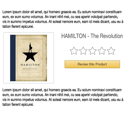
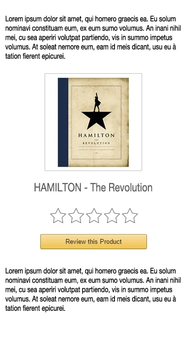
<p>Lorem ipsum dolor sit amet, consectetur adipisicing elit. Hic autem ratione porro perferendis minus itaque ab harum molestiae natus ipsam.</p>
</td>
</tr>
<tr>
<td width="100%">
<div class="column-1">
<div class="content">
<img src="http://placehold.it/200x200/" alt="" style="max-width:100%;">
</div>
</div>
<div class="column-2">
<div class="content">
<h2>HAMILTON - The Revolution</h2>
<a href="">Review this Product</a>
</div>
</div>
</td>
</tr>
<tr>
<td width="100%">
<p>Lorem ipsum dolor sit amet, consectetur adipisicing elit. Ullam, esse itaque. Aliquid doloremque tempore, dicta iure consectetur odit vel eveniet minus mollitia reprehenderit incidunt ratione minima aut dignissimos, pariatur in.</p>
</td>
</tr>
</table>
display: inline-block来使它们自动排列。不确定所有电子邮件客户端是否都支持它,但应该能够正常工作。
HTML:
<div>Whatever content before</div>

<div class="row">
  <div class="col"><img src="image.jpg" /></div>
  <div class="col">text content</div>
  <div class="col"><img src="image2.jpg" /></div>
</div>

<div>Whatever content after</div>
.row {
  text-align: center;
}

.col {
  display: inline-block;
  max-width: 300px;
  text-align: left;
}
@Gortonington提供的答案非常好!我会更详细地讲解并提供一些代码:
<!--[if mso]>
<table border="0" cellspacing="0" cellpadding="0" align="center" width="660">
<tr>
<td align="center" valign="top" width="660">
<![endif]-->
<table border="0" cellpadding="0" cellspacing="0" align="center" width="100%" style="max-width:660px;">
    <tr>
        <td align="center" valign="top" style="font-size:0;">
            <!--[if mso]>
            <table border="0" cellspacing="0" cellpadding="0" align="center" width="660">
            <tr>
            <td align="left" valign="top" width="330">
            <![endif]-->
            <div style="display:inline-block; Margin: 0 -2px; width:100%; min-width:200px; max-width:330px; vertical-align:top;">
                <table cellspacing="0" cellpadding="0" border="0" width="100%">
                    <tr>
                        <td>
                            CONTENT DOES HERE
                        </td>
                    </tr>
                </table>
            </div>
            <!--[if mso]>
            </td>
            </tr>
            </table>
            <![endif]-->
        </td>
    </tr>
</table>
<!--[if mso]>
</td>
</tr>
</table>
<![endif]-->
你使用表格并依赖于正常的文档流程(这里简要描述)。这里有太多需要解释的内容,虽然我自己讨厌只有链接的回答,但是这里有一个。
在我看来,这个回答解决了你的问题,也是我曾经阅读过的最好的电子邮件模板教程之一。
"创建一个未来可靠的响应式电子邮件,无需媒体查询"
编辑:此外,这是一个非常好的链接,可以验证不同电子邮件客户端中CSS属性的兼容性:
尝试使用Bootstrap3,它可能会对你有所帮助,它基本上是一个简化的CSS库。它非常适用于简单的网站和博客,但不适合复杂的应用。