我需要一个带有渐变的svg形状,颜色从 。当我使用这些停止颜色创建渐变时:
虽然看起来相当丑陋。 有更好的方法吗?
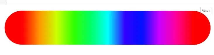
hsl(0, 100%, 50%)到hsl(360, 100%, 50%)渐变,色相平滑地从0-360变化,就像下面这个图一样:。当我使用这些停止颜色创建渐变时:<linearGradient id="Gradient1">
<stop offset="0%" stop-color="hsl(0, 100%, 50%)"/>
<stop offset="100%" stop-color="hsl(360, 100%, 50%)"/>
</linearGradient>
...它会产生一个完全红色的渐变效果
我通过添加更多的渐变停止点,成功地解决了这个问题。
<linearGradient id="Gradient2">
  <stop offset="0%" stop-color="hsl(0, 100%, 50%)"/>
  <stop offset="1%" stop-color="hsl(3, 100%, 50%)"/>
  <stop offset="2%" stop-color="hsl(7, 100%, 50%)"/>
  <!-- Lots more -->
  <stop offset="98%" stop-color="hsl(352, 100%, 50%)"/>
  <stop offset="99%" stop-color="hsl(356, 100%, 50%)"/>
</linearGradient>
虽然看起来相当丑陋。 有更好的方法吗?