ggplot2:在geom_line上添加点

13

我在ggplot2中有一个线图,我想为每个数据行添加点(=形状),以便清楚地识别它。我不需要在每个数据点上都有一个形状/点,而是一些值就足够了。请参见以下示例:

library(ggplot2)
library(data.table)
d=data.table(x=seq(0, 100, by=0.1), y=seq(0,1000)))
ggplot(d, aes(x=x, y=y))+geom_line()
ggplot(d, aes(x=x, y=y))+geom_line()+geom_point()

只有线条 加入点后

由于样本数量巨大,它们的形状不再可见,而是互相重叠。我只需要其中一些样本,也许等距间隔看起来最好,但我也愿意考虑其他解决方案。

3个回答

13

你也可以添加一些索引来仅提取所需数据。

library(ggplot2)
library(data.table)
d=data.table(x=seq(0, 100, by=0.1), y=seq(0,1000))
ggplot(d, aes(x=x, y=y))+geom_line()
#Change the length parameter for fewer or more points
thinned <- floor(seq(from=1,to=dim(d)[1],length=70))
ggplot(d, aes(x=x, y=y))+geom_line()+geom_point(data=d[thinned,],aes(x=x,y=y))

在此输入图像描述


6
您可以使用quantile在特定分位数处绘制点。例如,以下序列生成十分位数。
quantile(rnorm(100), probs = seq(0, 1, .1))
#         0%         10%         20%         30%         40%         50%         60%         70%         80%         90%        100% 
#-2.43934306 -1.17208001 -0.91497203 -0.69489868 -0.46306926 -0.24133438 -0.03434118  0.39989589  0.72331902  1.06402664  2.02892420 

library(ggplot2)
library(data.table)
d <- data.table(x = seq(0, 100, by=0.1), y = seq(0,1000))

ggplot(d, aes(x=x, y=y))+
geom_line()+
geom_point(aes(x = quantile(x, probs = seq(0, 1, .1)),
               y = quantile(y, probs = seq(0, 1, .1))))

Plot with points at deciles


5

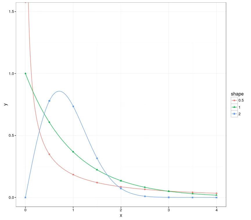
我想补充一个 data.table 的解决方案,可以处理分组数据:

library(ggplot2)
library(data.table)

# Creates data from the Weibull distribution
weib_dt <- function(x = seq(0, 4.0, 0.01), w_shape = 1, w_scale = 1) {
  y = dweibull(x, shape = w_shape, scale = w_scale)
  data.table("shape" = as.factor(w_shape), "scale" = as.factor(w_scale), "x" = x, "y" = y)
}

dt_a <- weib_dt(w_shape = 0.5)
dt_b <- weib_dt(w_shape = 1.0)
dt_c <- weib_dt(w_shape = 2.0)
# Bind multiple Weibull samples together, created from different parametrizations
dt_merged <- rbindlist(list(dt_a, dt_b, dt_c))

# Create the plot, using all the points for the lines, and only 9 points per group for the points.
ggplot(dt_merged, aes(x, y, group=shape, color=shape)) + 
  coord_cartesian(ylim = c(0, 1.5)) +
  geom_line() +
  geom_point(data=dt_merged[, .SD[floor(seq(1, .N, length=9))], by=shape], 
             aes(x, y, group = shape,  color = shape, shape = shape))

这里的技巧是使用seq,与上述建议的解决方案一样,但这次是在组内使用(使用.SD)。请注意,目前.SD的性能可能不佳,如果速度较慢,可以使用更冗长的dt[dt[, ..., by=shape]$V1]
这将创建以下输出: Weibull plots

网页内容由stack overflow 提供, 点击上面的
可以查看英文原文,
原文链接