如何在最大宽度下增加Bootstrap容器的宽度?

18

我已经将DataTable放在一个Bootstrap容器类型为“container”的div中。当我在浏览器的最大宽度上运行网站时,表格的容器添加了一个滚动条,并且切掉了表格的最后一列。

我尝试使用建议这里container-fluid div类型,但这会进一步缩小表格容器的宽度。

检查元素后发现,周围的container body-content从布局页面继承的属性会在表格容器的左右两侧添加边距:

enter image description here

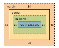
我正在考虑的一个可能的解决方案是,在最大宽度上减小继承的container body-content的边距,但我不确定如何通过CSS实现这一点。

从下面的截图可以看出,删除列被切断了,尽管表格两侧都有足够的空白处可以扩展:

enter image description here

问题:

如何在最大宽度上增加Bootstrap容器的宽度?

表格容器标记的要点:

<div class="container">


    <div class="form-group">
        <div class="table-responsive">
            <div class="table-responsive" id="datatable-wrapper">

                <table id="escalation" class="table table-striped table-bordered" cellspacing="0">
                    <thead>
                        <tr>
                            <th style="font-size: 12px; border-right: 1px solid #7591ac; ">ID</th>
                            <th style="font-size: 12px; border-right: 1px solid #7591ac; ">Application</th>
                            <th style="font-size: 12px; border-right: 1px solid #7591ac; ">UID</th>
                            <th style="font-size: 12px; border-right: 1px solid #7591ac; ">Type</th>
                            <th style="font-size: 12px; border-right: 1px solid #7591ac; ">Status</th>
                            <th style="font-size: 12px; border-right: 1px solid #7591ac; ">Statement</th>
                            <th style="font-size: 12px; border-right: 1px solid #7591ac; ">Created</th>
                            <th style="font-size: 12px; border-right: 1px solid #7591ac; ">Updated</th>
                            <th style="font-size: 12px; border-right: 1px solid #7591ac; ">Last Update</th>
                            <th style="font-size: 12px; border-right: 1px solid #7591ac; ">Next Update</th>
                            <th style="font-size: 12px; border-right: 1px solid #7591ac; ">Root Cause</th>
                            <th style="font-size: 12px; border-right: 1px solid #7591ac; ">Details</th>
                            <th style="font-size: 12px; border-right: 1px solid #7591ac; ">Delete</th>
                        </tr>
                    </thead>
                    <tbody>
                        @foreach (HP.ESCALATION.Web.Models.Escalation item in Model)
                        {

                            <tr>
                                <td>@item.ID</td>
                                <td>@item.Application</td>
                                <td class="td-limit">@item.EM</td>
                                <td class="td-limit">@item.Event</td>
                                <td class="td-limit">@item.status</td>
                                <td class="td-limit">@item.Statement</td>
                                <td class="td-limit">@item.Created</td>
                                <td class="td-limit">@item.Updated</td>
                                <td data-order="@item.UnixTimeStamp" class="td-limit">@item.UpdatedTime</td>
                                <td class="td-limit">@item.NextUpdate</td>
                                <td class="td-limit">@item.RootCause</td>
                                @* Add CRUD buttons to each table row --> *@
                                <td><button type="submit" style="background-color: #0CA281;" class="btn btn-success details">Details</button></td>
                                <td><button type="submit" class="btn btn-danger delete">Delete</button></td>
                            </tr>

                        }


                    </tbody>
                </table>


            </div>
        </div>
    </div>
</div>

布局容器的要点:

<div class="container body-content" style="margin-top: 90px; margin-bottom: 70px;">

                @* Main Content Render *@
                <div id="content">
                    <div class="content-wrapper main-content clear-fix">

                    </div>
                    @RenderSection("featured", required: false)
                    <section class="content-wrapper main-content clear-fix">
                        @RenderBody()
                    </section>
                </div>


            </div>  

你能在这里放一个fiddle或者任何链接吗? - Vishal Panara
10个回答

35

以上回答都不是好的解决方案。你可以轻松地通过创建一个新的 _project_variables.scss 文件并在主要的 scss 文件中在 bootstrap 之前导入它来更改 bootstrap 的变量。

// Grid containers
//
// Define the maximum width of `.container` for different screen sizes.

$container-max-widths: (
        sm: 540px,
        md: 720px,
        lg: 960px,
        xl: 1280px
) !default;

5
我很高兴,@SteveBauman。如果你不知道的话,你也可以将更多尺寸添加到数组中。最近由于高分辨率的27英寸Mac,我开始这样做。比如我添加了xxl: 1960px等。你还需要在$grid-breakpoints数组中添加相应的值。 - Keith Mifsud
你如何定义网格断点数组?看起来值的比例是任意的? - Capuchin
你能否澄清一下:我是否可以像添加CSS或JS文件一样将scss文件添加到我的HTML中,还是需要预编译什么东西?我真的不喜欢预编译。 - Nick.McDermaid
好的,这确实需要预编译元素。如果从CDN加载引导程序,则不是一个选项。 - Nick.McDermaid

14

在这种情况下起作用并且仍然允许容器在较小的分辨率下调整大小的解决方案是使用@media针对CSS:

@media only screen and (min-width : 1200px) {

    .container { width: 1500px; } 

}

3
虽然这是一个可以接受的答案,但正确的答案是使用Sass更改这些值(请查看@Keith Mifsud的答案)。 - kanlukasz

10
在Bootstrap 4中使用:

@media only screen and (min-width : 1200px) {
    .container { max-width: 1500px; }
}

如果需要,一定要使用CSS特异性。否则默认样式将被应用。 - Yuvraj Patil

6

我需要它也能在大屏幕上使用,所以我添加了以下内容。

/* large devices */
@media (min-width: 1200px) {
  .container {
     max-width: 1200px;
   }
}
/* extra large devices */
@media screen and (min-width: 1800px) {
  .container {
    max-width: 1800px;
  }
}

1
为了增加容器的宽度,使用CSS选取目标容器:
.container{
   max-width: 1400px; //Or whatever value you need
}

你可以使用媒体查询来指定这个样式将应用于哪些断点

1

您可以通过添加容器的CSS来覆盖Bootstrap CSS,例如:

.container { width: 1400px; } 

make sure this css file is added after the bootstrap css

我只想让表格容器在浏览器最大化时最大宽度为1400像素。目前,这段代码^不允许容器在浏览器大小小于最大值时调整大小。 - Brian Var
你可以设置max-width:1400px和width:100%。这样,当你的浏览器被最小化时,你的宽度会相应地调整。如果你的浏览器宽度超过了1400像素,容器将不再扩展。 - Manikandan

1
我想分享一个想法,如何使bootstrap的容器类(container class)的行为类似于“max-width:none;”。(如果您不需要视口溢出)
如果您将bootstrap的“$ container-max-widths”变量设置大于或等于“$ grid-breakpoints”变量,则它们的工作方式类似于“max-width:none;”。
$grid-breakpoints: (
    xs: 0,
    sm: 576px,
    md: 768px,
    lg: 992px,
    xl: 1230px,
    xxl: 1400px
);

$container-max-widths: (
    sm: 576px,
    md: 768px,
    lg: 1258px,
    xl: 1259px,
    xxl: 1260px
);

结果为:

@media (min-width: 768px)
.container, .container-md, .container-sm {
    max-width: 768px;
}

0
我正在考虑的一种可能的解决方案是,在最大宽度时减少继承容器body-content的边距,但我不确定如何通过CSS实现。请尝试将以下内容添加到您的CSS中:
.container.body-content{
  margin-left:0;
  margin-right:0;
  padding-left:0;
  padding-right:0;
}  

没有一个可用的演示来测试这个,很难说这是否足够好,或者是否需要改进。

祝你好运!


0

针对使用Sass的Bootstrap 4开发者

@include media-breakpoint-up(xl) {
    .container {
        max-width: 1440px;
    }
}

请享受!


0

网页内容由stack overflow 提供, 点击上面的
可以查看英文原文,
原文链接