父级div高度固定,第二个子元素高度可变,第一个子元素填充其余部分。

3

我很难解释我想要什么,所以我画了一张图。

Paint masterpiece

所以基本上第一个div(外部div)具有固定高度。第三个div - 蓝色 - 包含一些我不知道高度的文本,因此div应该围绕文本包裹,这意味着它具有可变高度。而第二个div - 绿色 - (应填充其余高度)包含一个图像,该图像应缩小以适合div或者如果它更小,则仅对齐到底部。我遇到的问题是图像根本不想缩小。它将始终尝试成为全尺寸,并将推出文本div#1。
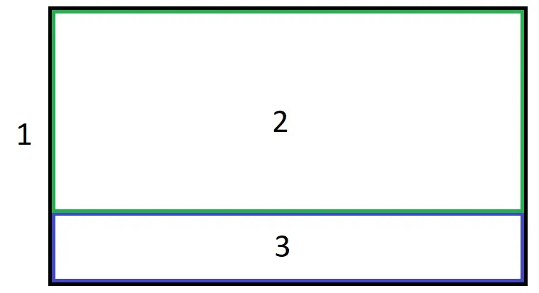
我尝试使用表格方法解决它,但某种方式表格忽略了外部div的固定高度。我可以接受flexbox解决方案,尽管我想避免它以支持旧浏览器。
我真的很想用css解决这个问题,因为javascript只会使事情复杂化并使其更加滞后。

.outer{
  width: 100%; 
  height: 200px; 
  background-color: lightgray;
  padding: 20px;
}
<div class="outer">
 <div class="top">
  <img src="http://themeflush.com/minimalix/demo4/wp-content/uploads/2014/08/wallpapers-for-christian-background-tumblr-photography-vintage-images-tumblr-wallpapers.jpg">
 </div>
 <div class="bottom">
  <span>Title of the description<span>
  <p>This is a long description.</p>
 </div>
</div>

3个回答

1

这里有一个纯CSS的解决方案。

.outer {
  display: flex;
  flex-direction: column;
  height: 200px;
  background-color: lightgray;
  padding: 20px;
}

.top {
  flex: 1;
  display: flex;
}

.top > img {
  width: 100%;
  object-fit: contain;
  object-position: left;
}
<div class="outer">
  <div class="top">
    <img src="http://themeflush.com/minimalix/demo4/wp-content/uploads/2014/08/wallpapers-for-christian-background-tumblr-photography-vintage-images-tumblr-wallpapers.jpg">
  </div>
  <div class="bottom">
    <span>Title of the description</span>
    <p>This is a long description.</p>
  </div>
</div>

jsFiddle演示

浏览器支持:Flexbox被所有主流浏览器支持,除了IE < 10。一些最近的浏览器版本,如Safari 8和IE10,需要供应商前缀。为了快速添加前缀,可以使用Autoprefixer。更多细节请参考这个答案

参考资料:


1
这里有一个解决方案,使用display: table来最大化浏览器的支持,无需使用polyfill。然而,它使用背景图像而不是图片。

.outer {
  box-sizing: border-box;
  display: table;
  width: 100%;
  height: 200px;
  background-color: lightgray;
  padding: 20px;
}

.top {
  background-size: contain;
  background-repeat: no-repeat;
  display: table-cell;
  height: 100%;
}

.bottom {
  display: table-row;
}
<div class="outer">
  <div class="top" style="background-image: url(http://themeflush.com/minimalix/demo4/wp-content/uploads/2014/08/wallpapers-for-christian-background-tumblr-photography-vintage-images-tumblr-wallpapers.jpg)">
  </div>
  <div class="bottom">
    <span>Title of the description</span>
  <p>This is a long description.</p>
 </div>
</div>


图像似乎没有按照OP的说明对齐到底部。 - Julio Feferman

0

如果我没有弄错的话,纯 CSS 解决方案可能不太可能,但可以考虑使用 CSS 网格布局,但这也存在一些兼容性问题。我不明白你为什么说 JS 很卡顿,所有现代浏览器在解释和处理语言方面都非常高效,大多数网站和 Web 应用程序都使用 JavaScript。因此,这里提供了一个使用 JS 计算的解决方案。

var img = document.getElementById("myImage");
var bottom = document.getElementById("bottom");
var myTop = document.getElementById("myTop");

var outerHeight = 200;
var remainingHeight = 200 - bottom.offsetHeight;

myTop.style.height = remainingHeight + "px";

if (img.offsetHeight >= remainingHeight) 
  img.style.height = remainingHeight + "px";
.outer{
  width: 100%; 
  height: 200px; 
  background-color: lightgray;
  padding: 20px;
}

.top {
  position:relative;
}

.top img {
  position:absolute;
  display:block;
  bottom:0px;
}
<div class="outer">
 <div id="myTop" class="top">
  <img id="myImage" src="http://themeflush.com/minimalix/demo4/wp-content/uploads/2014/08/wallpapers-for-christian-background-tumblr-photography-vintage-images-tumblr-wallpapers.jpg"/>
 </div>
 <div id="bottom" class="bottom">
  <span>Title of the description<span>
  <p>This is a long description.</p>
 </div>
</div>


网页内容由stack overflow 提供, 点击上面的
可以查看英文原文,
原文链接