我有一个嵌套在外部div内的两个内部div,外部div的宽度为100%。这两个嵌套的div应该在同一行,并且第一个div应该根据其内容获得大小:
<div id="#outer" style="width:100%; border:1px">
  <div id="#inner1" style="border:1px; display:inline">
    inner div 1. Some text...
  </div>
  <div id="#inner2" style="width:100%????; border:1px; display:inline">
    inner div 2...
  </div>
</div>
如何在不指定#inner1 div宽度且其宽度取决于内部内容的情况下,使#inner2 div占据水平空间的其余部分?
注:我的情况下所有样式均在单独的类中,这里将CSS放入style属性中只是为了简化。
我希望结果能在IE7+和FF 3.6中工作。
更详细地说,对我来说,问题是这样的:
 <style type="text/css">
.captionText
{
 float:left;
}

.captionLine
{
 height: 1px;
 background-color:black;
 margin: 0px;
 margin-left: 5px;
 margin-top: 5px;
 border: 0px;
 padding: 0px;
 padding-top: 1px;
}
 </style>
<table style="width:300px;">
<caption width="100%">
     <div class="captionText">Some text</div>
     <div class="captionLine"> </div>
</caption>
     <tr>
           <td>something</td>
     </tr>
</table>
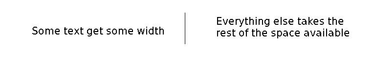
以下是我想要的图片: