我在flexbox方面比较新手。我尝试设置顶部、底部和右侧内容。查看演示
但是我需要在移动设备上进行设置,就像图片一样。
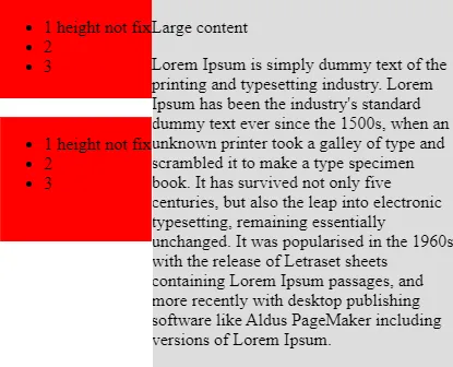
左侧和右侧的高度不一致。
我们能否像上面提到的图片那样进行设置或者使用其他类型在移动和平板电脑屏幕大小下进行设置?
.main {
  display: -webkit-box;
  display: -ms-flexbox;
  display: flex;
  -ms-flex-wrap: wrap;
  flex-wrap: wrap;
}

.left {
  background: #f00;
  -webkit-box-flex: 0;
  -ms-flex: 0 0 25%;
  flex: 0 0 25%;
  max-width: 25%;
}

.center {
  background: #ddd;
  -webkit-box-flex: 0;
  -ms-flex: 0 0 50%;
  flex: 0 0 50%;
  max-width: 50%;
}

.right {
  background: #f00;
  -webkit-box-flex: 0;
  -ms-flex: 0 0 25%;
  flex: 0 0 25%;
  max-width: 25%;
}<div class="main">
<div class="left">
<ul>
<li>1 height not fix</li>
<li>2</li>
<li>3</li>
</ul>
</div>
<div class="center">
<p>
Large content
</p>
<p>
Lorem Ipsum is simply dummy text of the printing and typesetting industry. Lorem Ipsum has been the industry's standard dummy text ever since the 1500s, when an unknown printer took a galley of type and scrambled it to make a type specimen book. It has
survived not only five centuries, but also the leap into electronic typesetting, remaining essentially unchanged. It was popularised in the 1960s with the release of Letraset sheets containing Lorem Ipsum passages, and more recently with desktop
publishing software like Aldus PageMaker including versions of Lorem Ipsum.
</p>
</div>
<div class="right">
<ul>
<li>1 height not fix</li>
<li>2</li>
<li>3</li>
</ul>
</div>
</div>