我一直在寻找一个3状态切换开关,但是没有太大的运气。基本上我需要一个有以下状态的开关:
| 开 | 不适用 | 关 |
滑块默认位于中间,一旦用户向左或向右滑动,就不能返回不适用状态。
任何人有关于如何处理这个问题的想法吗?
滑块默认位于中间,一旦用户向左或向右滑动,就不能返回不适用状态。
任何人有关于如何处理这个问题的想法吗?
尝试像这样:
.switch-toggle {
  width: 10em;
}

.switch-toggle label:not(.disabled) {
  cursor: pointer;
}<link href="https://cdn.jsdelivr.net/css-toggle-switch/latest/toggle-switch.css" rel="stylesheet" />
<div class="switch-toggle switch-3 switch-candy">
<input id="on" name="state-d" type="radio" checked="" />
<label for="on" onclick="">ON</label>
<input id="na" name="state-d" type="radio" disabled checked="checked" />
<label for="na" class="disabled" onclick=""> </label>
<input id="off" name="state-d" type="radio" />
<label for="off" onclick="">OFF</label>
<a></a>
</div>这将以N/A作为默认选项(通过checked="checked"),但稍后使其无法选择(使用disabled)。
JSFiddle演示(简化版)
$('#off, #on').click(function)(){ $('#na').remove(); }); - DarkAjax.switch-toggle {
float: left;
background: #242729;
}
.switch-toggle input {
position: absolute;
opacity: 0;
}
.switch-toggle input + label {
padding: 7px;
float:left;
color: #fff;
cursor: pointer;
}
.switch-toggle input:checked + label {
background: green;
} <div class="switch-toggle switch-3 switch-candy">
<input id="on" name="state-d" type="radio" checked="" />
<label for="on" onclick="">ON</label>
<input id="na" name="state-d" type="radio" checked="checked" />
<label for="na" class="disabled" onclick="">N/A</label>
<input id="off" name="state-d" type="radio" />
<label for="off" onclick="">OFF</label>
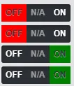
</div>如果你想要一个类似下面这样的具有颜色切换功能的开关:

那么可以使用上面DarkAjax的答案,但需要添加以下CSS样式:
.switch-toggle  input:checked.toggle-no ~ a {
    background-color:  red;
 }

 .switch-toggle  input:checked.toggle-yes ~ a {
    background-color:  green;
 }

 .switch-toggle  input:checked.toggle-unset ~ a {
    background-color:  grey;
 }
同时将相应的类(class="toggle-no"等)添加到相应的单选框输入中。如果您愿意,还可以添加图标等内容。
希望这能帮助到某些人!
function filterme(value) {
  value = parseInt(value, 10); // Convert to an integer
  if (value === 1) {
    $('#RangeFilter').removeClass('rangeAll', 'rangePassive').addClass('rangeActive');
    $('span').text('Active');
  } else if (value === 2) {
    $('#RangeFilter').removeClass('rangeActive', 'rangePassive').addClass('rangeAll');
    $('span').text('All');
  } else if (value === 3) {
    $('#RangeFilter').removeClass('rangeAll', 'rangeActive').addClass('rangePassive');
    $('span').text('Passive');
  }
}<script src="https://ajax.googleapis.com/ajax/libs/jquery/2.1.1/jquery.min.js"></script>
<p class="range-field" style=" width:60px">
<input type="range" id="RangeFilter" name="points" onchange="filterme(this.value);" min="1" class="rangeAll" max="3" value="2">
</p>
<span>All</span>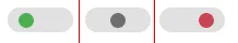
(function($) {
  $.fn.removeClasses = function(classes) {
    return this.removeClass(classes.join(' '));
  };
  $.fn.switchify = function(config) {
    config = config || {};
    var prefix   =           config.prefix   || 'range-';
    var onCls    = prefix + (config.onCls    || 'on'   );
    var offCls   = prefix + (config.offCls   || 'off'  );
    var unsetCls = prefix + (config.unsetCls || 'unset');
    var $self = this;
    return this.on('change', function(e) {
      var value = parseInt(this.value, 10);
      switch (value) {
        case 1  :  return $self.removeClasses([unsetCls, offCls]).addClass(onCls);
        case 2  :  return $self.removeClasses([onCls, offCls]).addClass(unsetCls);
        case 3  :  return $self.removeClasses([onCls, unsetCls]).addClass(offCls);
        default :  return $self;
      }
    });
  };
})(jQuery);

$('#range-filter').switchify({
   onCls    : 'active',
   offCls   : 'passive',
   unsetCls : 'all'
}).on('change', function(e) {
  var $self = $(this);
  if      ($self.hasClass('range-active'))  $('span').text('Active');
  else if ($self.hasClass('range-passive')) $('span').text('Passive');
  else if ($self.hasClass('range-all'))     $('span').text('All');
  else                                      $('span').text('Error!');
});
.range-field { width: 60px; }<script src="https://ajax.googleapis.com/ajax/libs/jquery/2.1.1/jquery.min.js"></script>
<p class="range-field">
<input type="range" id="range-filter" name="points" min="1" class="rangeAll" max="3" value="2">
</p>
<span>All</span>除了gat的回答之外,还可以通过Bootstrap将其建模为分组单选按钮:
<div class="btn-group" data-toggle="buttons">
    <label class="btn btn-primary">
        <input type="radio" name="options" id="On" />ON</label>
    <label class="btn btn-primary">
        <input type="radio" name="options" id="NA" />N/A</label>
    <label class="btn btn-primary">
        <input type="radio" name="options" id="Off" />OFF</label>
</div>
JSFiddle: http://jsfiddle.net/p7DGe/1/
$(document).ready(function(){
  $("#toggle-button1").addClass("active");
  $(".tri-state-toggle-button").click(function(){
    $(".tri-state-toggle-button").removeClass("active");
    var id = $(this).attr('id');
    $("#" + id).addClass("active");
  });
});
body {
margin-left: 100px;
margin-top: 100px;
}
.tri-state-toggle {
background: rgba(0,0,0,0.8);
box-shadow: inset 0 2px 8px 0 rgba(165,170,174,0.25);
border-radius: 24px;
display: inline-block;
overflow: hidden;
display: inline-flex;
flex-direction: row;
transition: all 500ms ease;
}
.tri-state-toggle-button {
border-radius: 22px;
height: 44px;
display: flex;
align-items: center;
justify-content: center;
width: 64px;
background-color: transparent;
border: 0px solid transparent;
margin: 2px;
color: white;
cursor: pointer;
/* -webkit-transition: all 0.5s ease-in-out;
-moz-transition: all 0.5s ease-in-out;
-ms-transition: all 0.5s ease-in-out;
-o-transition: all 0.5s ease-in-out; */
transition: all 0.5s ease;
}
.tri-state-toggle-button.active {
background-image: linear-gradient(
90deg,
rgba(229, 3, 87, 1) 0%,
rgba(229, 3, 56, 1) 35%,
rgba(219, 101, 17, 1) 100%
);
border: 0px solid rgba(207,207,207,0.6);
box-shadow: 0 8px 16px 0 rgba(0,0,0,0.1);
color: white;
font-weight: 500;
transition: all .5s ease-in;
}
.tri-state-toggle-button:focus {
outline: none;
}<script src="https://cdnjs.cloudflare.com/ajax/libs/jquery/3.3.1/jquery.min.js"></script>
<h3>Select any one option:</h3>
<div class="tri-state-toggle">
<button class="tri-state-toggle-button" id="toggle-button1">
Song
</button>
<button class="tri-state-toggle-button" id="toggle-button2">
Video
</button>
<button class="tri-state-toggle-button" id="toggle-button3">
Party
</button>
</div>function togglebutton(range) {
var val = range.value;
if (val == 1) {
//change color of slider background
range.className = "rangeFalse";
//alter text
$('.toggle-false-msg').attr('id', 'textActive');
$('.toggle-neutral-msg').attr('id', '');
$('.toggle-true-msg').attr('id', '');
} else if (val == 2) {
//change color of slider background
range.className = "rangeNeutral";
//alter text
$('.toggle-false-msg').attr('id', '');
$('.toggle-neutral-msg').attr('id', 'textActive');
$('.toggle-true-msg').attr('id', '');
} else if (val == 3) {
//change color of slider background
range.className = "rangeTrue";
//alter text
$('.toggle-false-msg').attr('id', '');
$('.toggle-neutral-msg').attr('id', '');
$('.toggle-true-msg').attr('id', 'textActive');
}
}.test_div {
height: 50px;
width: 50px;
background: #204d75 !important;
top: 100px;
position: relative;
display: block;
}
.toggle-container {
position: relative;
width: 8em;
margin: 1em;
padding: 0.25em;
border: thin solid lightgrey;
text-align: center;
}
.range-field {
display: inline-block;
width: 100px;
margin: 0px;
border-radius: 2px;
}
input[type=range] {
-webkit-appearance: none;
margin: 0;
width: 100%;
padding: 0px;
outline: none;
border: none;
}
.toggle-false-msg {
display: none;
opacity: .2;
transition: .5s opacity;
display: inline-block;
position: relative;
top: -8px;
}
.toggle-true-msg {
display: none;
opacity: .2;
transition: .5s opacity;
display: inline-block;
position: relative;
top: -8px;
}
.toggle-neutral-msg {
display: none;
opacity: .2;
transition: .5s opacity;
display: none;
position: relative;
top: -8px;
}
#rangeActive {
background-color: blue;
}
#textActive {
opacity: 1;
color: black;
}
input[type=range]:focus {
outline: none;
}
input[type=range]::-webkit-slider-runnable-track {
width: 100%;
height: 30px;
cursor: pointer;
animate: 0.2s;
box-shadow: 0px 0px 0px #000000;
background: #3071A9;
border-radius: 0px;
border: 0px solid #000000;
}
input[type=range]::-webkit-slider-thumb {
box-shadow: 0px 0px 0px #000000;
border: 0px solid #000000;
height: 30px;
width: 19px;
border-radius: 0px;
background: #FFFFFF;
cursor: pointer;
-webkit-appearance: none;
margin-top: 0px;
}
input[type=range]:focus::-webkit-slider-runnable-track {
background: #3071A9;
}
input[type=range]::-moz-range-track {
width: 100%;
height: 30px;
cursor: pointer;
animate: 0.2s;
box-shadow: 0px 0px 0px #000000;
background: #3071A9;
border-radius: 0px;
border: 0px solid #000000;
}
input[type=range]::-moz-range-thumb {
box-shadow: 0px 0px 0px #000000;
border: 0px solid #000000;
height: 30px;
width: 19px;
border-radius: 0px;
background: #FFFFFF;
cursor: pointer;
}
input[type=range]::-ms-track {
width: 100%;
height: 30px;
cursor: pointer;
animate: 0.2s;
background: transparent;
border-color: transparent;
color: transparent;
}
input[type=range]::-ms-fill-lower {
background: #3071A9;
border: 0px solid #000000;
border-radius: 0px;
box-shadow: 0px 0px 0px #000000;
}
input[type=range]::-ms-fill-upper {
background: #3071A9;
border: 0px solid #000000;
border-radius: 0px;
box-shadow: 0px 0px 0px #000000;
}
input[type=range]::-ms-thumb {
box-shadow: 0px 0px 0px #000000;
border: 0px solid #000000;
height: 30px;
width: 19px;
border-radius: 0px;
background: #FFFFFF;
cursor: pointer;
}
input[type=range]:focus::-ms-fill-lower {
background: #3071A9;
}
input[type=range]:focus::-ms-fill-upper {
background: #3071A9;
}
.rangeFalse::-webkit-slider-runnable-track {
background: #5d0a0a !important;
}
.rangeFalse::-webkit-slider-thumb {
background: white !important;
}
.rangeNeutral::-webkit-slider-runnable-track {
background: #204d75 !important;
}
.rangeNeutral::-webkit-slider-thumb {
background: white !important;
}
.rangeTrue::-webkit-slider-runnable-track {
background: #0e4e1f !important;
}
.rangeTrue::-webkit-slider-thumb {
background: white !important;
}<script src="https://ajax.googleapis.com/ajax/libs/jquery/2.1.1/jquery.min.js"></script>
<div class="toggle-container">
<div class="toggle-false-msg">Off</div>
<div class="range-field" style=" width:60px">
<input type="range" name="points" min="1" class="" max="3" value="2"
onchange="togglebutton(this);">
</div>
<div class="toggle-neutral-msg">Neutral</div>
<div class="toggle-true-msg">On</div>
</div>这个开关不使用单选按钮,而是利用范围并将值传递到JavaScript来确定开关的操作。设计中最大的障碍是更改范围的伪元素(特别是其轨道的背景颜色)。可以通过设置带有伪元素的不同类并使用Java旋转类来实现。
有关修改伪元素的信息可以在下面的链接中找到。我使用了文章中描述的方法1。
我稍微修改了@mustafa bagwala的答案,这里是同样的例子,有三个状态按钮,可以在两个之间设置,但可以在三个之间获取,并且颜色不同。
输出可以是这样的:
这里是CSS代码和HTML代码:
    .switch-toggle input {
        opacity: 0;
        height: 25px;
        position: absolute;
        border-radius: 15px;
    }

        .switch-toggle input + label {
            float: left;
            color: #fff;
            height: 25px;
            font-size: 12px;
            cursor: pointer;
        }

        .switch-toggle input[value="na"] + label {
            pointer-events: none;
            opacity: 0.5;
        }

        .switch-toggle input[value="na"]:checked + label {
            background: grey;
        }

        .switch-toggle input[value="on"]:checked + label {
            background: green;
        }

        .switch-toggle input[value="off"]:checked + label {
            background: red
}<link href="https://cdn.jsdelivr.net/css-toggle-switch/latest/toggle-switch.css" rel="stylesheet" />
<div class="switch-toggle switch-3 switch-candy">
<input id="on" name="state-d" type="radio" value="on" />
<label for="on">ON</label>
<input id="na" name="state-d" type="radio" value="na" checked="checked" />
<label for="na">N/A</label>
<input id="off" name="state-d" type="radio" value="off" />
<label for="off">OFF</label>
<a></a>
</div>你可以始终使用同心三元运算符。
className = {title === 'One' ? classes.one : (title === 'Two : classes.two : classes.three)
等等..对于n个类也是如此。
$(document).on('click', '.switch-3', function(event) {
        /* get switch slider */
        let slider = $(this).find('.switch-3-slider');
        /* get switch height */
        let height = $(this).height();
        /* get coord of click */
        let clickPos = event.pageY - $(this).offset().top;
        /* get 1/3 of switch height */
        let heightThird1 = height / 3;
        let heightThird2 = heightThird1 + height / 3;
        if (clickPos > heightThird2) {
            $(this).removeClass('switch-state-top');
            $(this).removeClass('switch-state-center');
            $(this).addClass('switch-state-bottom');
            $(this).find('.switch-3-label').eq(2).find('.switch-3-radio').prop('checked', true);
        } else if (clickPos > heightThird1 && clickPos <= heightThird2) {
            $(this).removeClass('switch-state-top');
            $(this).removeClass('switch-state-bottom');
            $(this).addClass('switch-state-center');
            $(this).find('.switch-3-label').eq(1).find('.switch-3-radio').prop('checked', true);
        } else {
            $(this).removeClass('switch-state-bottom');
            $(this).removeClass('switch-state-center');
            $(this).addClass('switch-state-top');
            $(this).find('.switch-3-label').eq(0).find('.switch-3-radio').prop('checked', true);
        }

    });
.switch-3 {
width: 3rem;
height: 7.5rem;
overflow: hidden;
}
.switch-3 .switch-3-slider {
width: 3rem;
height: 7.5rem;
left: 0;
right: 0;
transition: ease .4s all;
}
.switch-3 .switch-3-cover {
width: 3rem;
height: 2.5rem;
}
.switch-3 .switch-3-key {
width: 3rem;
height: 2.5rem;
background-color: rgba(0, 0, 0, .25);
}
.switch-3-label {
flex: 0 1 2.5rem;
}
.switch-3.switch-state-top .switch-3-slider {
bottom: 5rem;
}
.switch-3.switch-state-center .switch-3-slider {
bottom: 2.5rem;
}
.switch-3.switch-state-bottom .switch-3-slider {
bottom: 0rem;
}<script src="https://cdn.jsdelivr.net/npm/bootstrap@5.2.3/dist/js/bootstrap.bundle.min.js"></script>
<link href="https://cdn.jsdelivr.net/npm/bootstrap@5.2.3/dist/css/bootstrap.min.css" rel="stylesheet"/>
<script src="https://cdnjs.cloudflare.com/ajax/libs/jquery/3.3.1/jquery.min.js"></script>
<div class="position-relative d-inline-block switch-3 switch-state-bottom" role="button">
<div class="h-100 w-100 d-flex flex-column flex-nowrap text-light bg-primary">
<label class="d-flex justify-content-center align-items-center switch-3-label">
<small>ON</small>
<input class="switch-3-radio" type="radio" value="on" />
</label>
<label class="d-flex justify-content-center align-items-center switch-3-label">
<small>N/A</small>
<input class="switch-3-radio" type="radio" value="na" />
</label>
<label class="d-flex justify-content-center align-items-center switch-3-label">
<small>OFF</small>
<input class="switch-3-radio" type="radio" value="off" checked />
</label>
</div>
<div class="position-absolute d-block switch-3-slider">
<span class="d-block bg-primary switch-3-cover"></span>
<span class="d-block bg-primary switch-3-cover"></span>
<span class="d-block switch-3-key"></span>
<span class="d-block bg-primary switch-3-cover"></span>
<span class="d-block bg-primary switch-3-cover"></span>
</div>
</div>
<select>元素可能适合您。您可以使用CSS和/或JavaScript将其显示为所需的样式。 - mts7