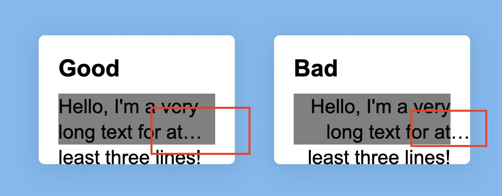
TL;DR: 没有100%可预测的CSS解决方案
只需查看MDN上的兼容性表格,除了Firefox外,浏览器支持相当不稳定(委婉地说)。
但是,您可以使用一些JavaScript解决此渲染问题。
...或者您也可以使用一些旧式的溢出和行高属性来模仿text-overflow和line-clamp属性。
示例1:仅使用CSS的hack
此hack基于定义一些与line-height相关的类。
CSS变量有助于简化计算:
:root {
  --overflowLineHeight: 1.25em;
  --overflowColor1: rgba(255, 255, 255, 1);
  --overflowColor2: rgba(255, 255, 255, 0);
}


.maxLines2 {
  max-height: calc(var(--overflowLineHeight) * 2);
}
实际的溢出指示符(省略号)元素只是一个具有背景渐变的绝对定位伪元素(放置在相对定位的父元素中)。
* {
  box-sizing: border-box;
}

body {
  height: 100vh;
  width: 100%;
  display: flex;
  align-items: center;
  justify-content: center;
  background: #78b9f3;
  margin: 0;
  font-family: "Arial";
}

.wrapper {
  display: flex;
  justify-content: center;
  padding:1em;
}

.card {
  background: #fff;
  box-shadow: 0 4px 24px 3px rgb(0 0 0 / 10%);
  padding: 1em;
  margin: 1em;
  width: 33%;
  height: auto;
  border-radius: 6px;
  resize: both;
  overflow: hidden;
}

p {
  font-size: 1em;
  line-height: 1.3em;
  margin: 0;
}

h2 {
  font-size: 1.5em;
  margin: 0 0 0.5em 0;
}

:root {
  --overflowLineHeight: 1.25em;
  --overflowColor1: rgba(255, 255, 255, 1);
  --overflowColor2: rgba(255, 255, 255, 0);
}

.overflow {
  font-size: 20px;
  line-height: var(--overflowLineHeight);
  text-align: right;
  overflow: hidden;
  position: relative;
}

.overflow:after {
  content: " …";
  position: absolute;
  bottom: 0;
  right: 0;
  display: block;
  z-index: 1;
  background-image: linear-gradient( 90deg, var(--overflowColor2), var(--overflowColor1) 50%);
  width: 2.5em;
}

.maxLines2 {
  max-height: calc(var(--overflowLineHeight) * 2);
}

.maxLines3 {
  max-height: calc(var(--overflowLineHeight) * 3);
}

.maxLines4 {
  max-height: calc(var(--overflowLineHeight) * 4);
}
<section class="wrapper">
  <div class="card">
    <h2>Fix: 2 lines</h2>
    <p class=" maxLines2 overflow">Hello, I'm a very long text1 for at least three lines! Hello, I'm a very long text2 for at least three lines!</p>
  </div>

  <div class="card">
    <h2>Fix: 3 lines</h2>
    <p class=" maxLines3 overflow">Hello, I'm a very long text1 for at least three lines! Hello, I'm a very long text2 for at least three lines!</p>
  </div>

  <div class="card">
    <h2>Fix: 4 lines</h2>
    <p class=" maxLines4 overflow">Hello, I'm a very long text1 for at least three lines! Hello, I'm a very long text2 for at least three lines!</p>
  </div>

</section>
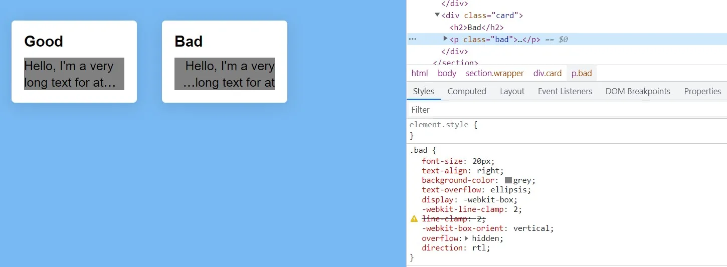
示例 2:针对line-clamp的js hack
这个hack基于一个事实,即word-break: break-all会在块边界内呈现省略号。
不幸的是,这将导致丑陋的断词。
为了解决这个问题,
- 我们将所有单词拆分成一个
<span>元素数组。
- 然后我们检查所有的高度:如果一个的高度大于第一个实例 - 它包含一个换行符
- 带有换行符的获得一个特殊类,具有
word-break: break-word属性
let overflows = document.querySelectorAll(".overflow");
fixOverflow(overflows);
function fixOverflow(overflows) {
overflows.forEach(function(text, i) {
let words = text.innerHTML
.split(" ")
.map((w) => {
return w.trim();
})
.filter(Boolean);
let wrapped = "";
text.textContent = "";
text.style.setProperty("word-break", "break-all");
let bbText = text.getBoundingClientRect();
let bottomText = bbText.y + bbText.height;
let span0 = document.createElement("span");
span0.textContent = words[0] + " ";
span0.classList.add("wordWrp");
text.appendChild(span0);
let height0 = span0.getBoundingClientRect().height;
let style = window.getComputedStyle(text);
let maxLines = parseFloat(style.webkitLineClamp);
let breaks = 0;
for (let i = 1; i < words.length; i++) {
let word = words[i];
let span = document.createElement("span");
span.textContent = word + " ";
span.classList.add("wordWrp");
text.appendChild(span);
let bbSpan = span.getBoundingClientRect();
let heightSpan = bbSpan.height;
let bottomSpan = bbSpan.y + bbSpan.height;
if (heightSpan > height0 && breaks < maxLines - 1 && bottomSpan < bottomText) {
span.classList.add("wordWrpLine");
breaks++;
}
}
});
}
const resizeObserver = new ResizeObserver(() => {
upDateOverflows();
});
overflows.forEach(function(text, i) {
resizeObserver.observe(text);
});
function upDateOverflows() {
overflows.forEach(function(text, i) {
let wordWraps = text.querySelectorAll(".wordWrp");
let bbText = text.getBoundingClientRect();
let bottom = bbText.y + bbText.height;
let height0 = wordWraps[0].getBoundingClientRect().height;
let style = window.getComputedStyle(text);
let maxLines = parseFloat(style.webkitLineClamp);
let breaks = 0;
for (let i = 1; i < wordWraps.length; i++) {
let wordWrap = wordWraps[i];
wordWrap.classList.remove("wordWrpLine");
let bb = wordWrap.getBoundingClientRect();
let height = bb.height;
let bottomSpan = bb.y + bb.height;
if (height > height0 && breaks < maxLines - 1 && bottomSpan < bottom) {
wordWrap.classList.add("wordWrpLine");
breaks++;
}
}
});
}
* {
  box-sizing: border-box;
}

body {
  height: 100vh;
  width: 100%;
  background: #78b9f3;
  margin: 0;
  font-family: "Arial";
}

.wrapper {
  display: flex;
  justify-content: center;
  align-items: center;
}

.card {
  background: #fff;
  box-shadow: 0 4px 24px 3px rgb(0 0 0 / 10%);
  padding: 20px;
  margin: 20px;
  width: 250px;
  height: auto;
  border-radius: 6px;
  resize: both;
  overflow: hidden;
}

p {
  font-size: 1em;
  line-height: 1.3em;
  margin: 0;
}

h2 {
  font-size: 1.5em;
  margin: 0 0 0.5em 0;
}

.overflow {
  font-size: 20px;
  text-align: right;
  background-color: grey;
  text-overflow: ellipsis;
  display: -webkit-box;
  -webkit-line-clamp: 2;
  line-clamp: 2;
  -webkit-box-orient: vertical;
}

.overflow:hover .wordWrp {
  outline: 1px solid red;
}

.maxLines2 {
  -webkit-line-clamp: 2;
  line-clamp: 2;
}

.maxLines3 {
  -webkit-line-clamp: 3;
  line-clamp: 3;
}

.maxLines4 {
  -webkit-line-clamp: 4;
  line-clamp: 4;
}

.wordWrpLine {
  word-break: break-word;
}

.wordWrpLine2 {
  background: red;
}
<h2>Resize cards</h2>
<section class="wrapper">
  <div class="card">
    <h2>Fix: 2 lines</h2>
    <p class=" maxLines2 overflow">Hello, I'm a very long text1 for at least three lines! Hello, I'm a very long text2 for at least three lines!</p>
  </div>

  <div class="card">
    <h2>Fix: 3 lines</h2>
    <p class=" maxLines3 overflow">Hello, I'm a very long text1 for at least three lines! Hello, I'm a very long text2 for at least three lines!</p>
  </div>

  <div class="card">
    <h2>Fix: 4 lines</h2>
    <p class=" maxLines4 overflow">Hello, I'm a very long text1 for at least three lines! Hello, I'm a very long text2 for at least three lines!</p>
  </div>

</section>
示例3: js模拟行截断
这种方法与之前的js方法非常相似-通过将元素文本分割成span元素。
这次我们完全通过添加自定义<span>元素来替换css省略号占位符。
根据某些边界框检查,溢出的“省略号”占位符将被放置:第一个离开溢出定义边界的span元素将是用于插入省略号的位置/索引。
let overflows = document.querySelectorAll(".overflow");
fixOverflow(overflows);
function fixOverflow(overflows) {
overflows.forEach(function(text) {
let spanWrps = text.querySelectorAll(".wordWrp");
let words = '';
let hasSpans = spanWrps.length ? true : false;
let spanEllipse = text.querySelector(".spanEllipse");
if (!spanEllipse) {
spanEllipse = document.createElement("span");
spanEllipse.classList.add('spanEllipse');
spanEllipse.textContent = ' …';
}
if (hasSpans) {
words = [...spanWrps].map((word) => {
return word.textContent
});
} else {
words = text.innerHTML
.split(" ")
.map((w) => {
return w.trim();
})
.filter(Boolean);
}
let bbText = text.getBoundingClientRect();
let bottomText = bbText.y + bbText.height;
if (!hasSpans) {
text.textContent = "";
}
for (let i = 0; i < words.length; i++) {
let word = words[i];
let span = '';
if (hasSpans) {
span = spanWrps[i];
span.classList.remove('wordWrpOverflow');
} else {
span = document.createElement("span");
span.textContent = word + " ";
text.appendChild(span);
span.classList.add("wordWrp");
}
let bbSpan = span.getBoundingClientRect();
let bottomSpan = bbSpan.y + bbSpan.height;
if (bottomSpan > bottomText) {
span.classList.add("wordWrpOverflow");
} else {
span.classList.remove("wordWrpOverflow");
}
}
let firstOverFlow = text.querySelector('.wordWrpOverflow');
if (firstOverFlow) {
let bbE = spanEllipse.getBoundingClientRect();
let bottomE = bbE.y + bbE.height;
let bbPrev = firstOverFlow.previousElementSibling.getBoundingClientRect();
let bottomPrev = bbPrev.y + bbPrev.height;
if (bottomE > bottomText && bottomPrev < bottomText) {
firstOverFlow.parentNode.insertBefore(spanEllipse, firstOverFlow.previousElementSibling);
} else {
if (bottomPrev > bottomText) {
firstOverFlow.parentNode.insertBefore(spanEllipse, firstOverFlow.previousElementSibling.previousElementSibling);
} else {
firstOverFlow.parentNode.insertBefore(spanEllipse, firstOverFlow);
}
}
}
else {
spanEllipse.remove();
}
});
}
const resizeObserver = new ResizeObserver(() => {
fixOverflow(overflows)
});
overflows.forEach(function(text, i) {
resizeObserver.observe(text);
});
* {
box-sizing: border-box;
}
body {
height: 100vh;
width: 100%;
background: #78b9f3;
margin: 0;
font-family: "Arial";
}
.card {
background: #fff;
padding: 20px;
margin: 20px;
height: auto;
border-radius: 6px;
resize: both;
overflow: auto;
}
p {
font-size: 1em;
line-height: 1.3em;
margin: 0;
}
h2 {
font-size: 1.5em;
margin: 0 0 0.5em 0;
}
:root {
--lineHeight: 1.2em;
}
.overflow {
font-size: 20px;
line-height: var(--lineHeight);
text-align: right;
overflow: hidden;
}
.maxLines2 {
max-height: calc(2 * var(--lineHeight));
}
.maxLines3 {
max-height: calc(3 * var(--lineHeight));
}
.maxLines4 {
max-height: calc(4 * var(--lineHeight));
}
.wordWrpOverflow {
visibility: hidden;
}
.spanEllipse+span {
display: block
}
.txt-cnt * {
text-align: center;
}
@media (min-width:720px) {
.card {
width: 33%;
}
.wrapper {
display: flex;
justify-content: center;
}
}
@media (min-width:1024px) {
.card {
width: 250px;
}
}
<section class="wrapper">


  <div class="card">
    <h2>Fix: 2 lines</h2>
    <p class=" maxLines2 overflow">Hello, I'm a very long text1 for at least three lines! Hello, I'm a very long text2 for at least three lines!</p>
  </div>


  <div class="card">
    <h2>Fix: 3 lines</h2>
    <p class=" maxLines3 overflow">Hello, I'm a very long text1 for at least three lines! Hello, I'm a very long text2 for at least three lines!</p>
  </div>

  <div class="card txt-cnt">
    <h2>Fix: 4 lines: <br />text-align:center</h2>
    <p class=" maxLines4 overflow">Hello, I'm a very long text1 for at least three lines! Hello, I'm a very long text2 for at least three lines!</p>
  </div>

</section>
排除支持proper text-overflow/line-clamp的浏览器
目前只有Firefox和某些iOS Safari版本似乎可以正确地渲染省略号。
为了避免这些浏览器进行不必要的js处理,您可以包含一个特性检测:
let firefoxOverflow = CSS.supports("text-overflow", "ellipsis ellipsis");
let safariWebkit = CSS.supports("-webkit-hyphens", "none");
let needsWorkaround = false;
if(!firefoxOverflow && !safariWebkit) {
  needsWorkaround = true;
  document.body.classList.add("needs-overflow-fix");
}
这肯定不适用于所有的火狐和Safari版本。
至少它
没有使用任何浏览器嗅探。
let supportText = "";
let firefoxOverflow = CSS.supports("text-overflow", "ellipsis ellipsis");
let safariWebkit = CSS.supports("-webkit-hyphens", "none");
let needsWorkaround = false;
if (!firefoxOverflow && !safariWebkit) {
needsWorkaround = true;
document.body.classList.add("needs-overflow-fix");
}
if (needsWorkaround) {
supportText = "needs workaround - use js";
} else {
supportText = "proper support – use css";
}
support.textContent = supportText;
if (needsWorkaround) {
let overflows = document.querySelectorAll(".overflow");
fixOverflow(overflows);
function fixOverflow(overflows) {
overflows.forEach(function (text) {
let spanWrps = text.querySelectorAll(".wordWrp");
let words = "";
let hasSpans = spanWrps.length ? true : false;
let spanEllipse = text.querySelector(".spanEllipse");
if (!spanEllipse) {
spanEllipse = document.createElement("span");
spanEllipse.classList.add("spanEllipse");
spanEllipse.textContent = " …";
}
if (hasSpans) {
words = [...spanWrps].map((word) => {
return word.textContent;
});
} else {
words = text.innerHTML
.split(" ")
.map((w) => {
return w.trim();
})
.filter(Boolean);
}
let bbText = text.getBoundingClientRect();
let bottomText = bbText.y + bbText.height;
if (!hasSpans) {
text.textContent = "";
}
for (let i = 0; i < words.length; i++) {
let word = words[i];
let span = "";
if (hasSpans) {
span = spanWrps[i];
span.classList.remove("wordWrpOverflow");
} else {
span = document.createElement("span");
span.textContent = word + " ";
text.appendChild(span);
span.classList.add("wordWrp");
}
let bbSpan = span.getBoundingClientRect();
let bottomSpan = bbSpan.y + bbSpan.height;
if (bottomSpan > bottomText) {
span.classList.add("wordWrpOverflow");
} else {
span.classList.remove("wordWrpOverflow");
}
}
let firstOverFlow = text.querySelector(".wordWrpOverflow");
if (firstOverFlow) {
let bbE = spanEllipse.getBoundingClientRect();
let bottomE = bbE.y + bbE.height;
let bbPrev = firstOverFlow.previousElementSibling.getBoundingClientRect();
let bottomPrev = bbPrev.y + bbPrev.height;
if (bottomE > bottomText && bottomPrev < bottomText) {
firstOverFlow.parentNode.insertBefore(
spanEllipse,
firstOverFlow.previousElementSibling
);
} else {
if (bottomPrev > bottomText) {
firstOverFlow.parentNode.insertBefore(
spanEllipse,
firstOverFlow.previousElementSibling.previousElementSibling
);
} else {
firstOverFlow.parentNode.insertBefore(spanEllipse, firstOverFlow);
}
}
}
else {
spanEllipse.remove();
}
});
}
const resizeObserver = new ResizeObserver(() => {
fixOverflow(overflows);
});
overflows.forEach(function (text, i) {
resizeObserver.observe(text);
});
}
* {
box-sizing: border-box;
}
body {
height: 100vh;
width: 100%;
background: #78b9f3;
margin: 0;
font-family: "Arial";
}
.needs-overflow-fix {
background: orange;
}
.card {
background: #fff;
padding: 20px;
margin: 20px;
height: auto;
border-radius: 6px;
resize: both;
overflow: auto;
}
p {
font-size: 1em;
line-height: 1.3em;
margin: 0;
}
h2 {
font-size: 1.5em;
margin: 0 0 0.5em 0;
}
:root {
--lineHeight: 1.2em;
}
.overflow {
font-size: 20px;
line-height: var(--lineHeight);
text-align: right;
overflow: hidden;
text-overflow: ellipsis;
display: -webkit-box;
-webkit-line-clamp: 2;
line-clamp: 2;
-webkit-box-orient: vertical;
}
.needs-overflow-fix .overflow {
text-overflow: unset;
overflow: hidden;
display: block;
-webkit-line-clamp: unset !important;
line-clamp: unset !important;
-webkit-box-orient: unset !important;
}
.maxLines2 {
-webkit-line-clamp: 2;
line-clamp: 2;
}
.maxLines3 {
-webkit-line-clamp: 3;
line-clamp: 3;
}
.maxLines4 {
-webkit-line-clamp: 4;
line-clamp: 4;
}
.needs-overflow-fix .maxLines2 {
max-height: calc(2 * var(--lineHeight));
}
.needs-overflow-fix .maxLines3 {
max-height: calc(3 * var(--lineHeight));
}
.needs-overflow-fix .maxLines4 {
max-height: calc(4 * var(--lineHeight));
}
.wordWrpOverflow {
visibility: hidden;
}
.spanEllipse + span {
display: block;
}
.txt-cnt * {
text-align: center;
}
@media (min-width: 720px) {
.card {
width: 33%;
}
.wrapper {
display: flex;
justify-content: center;
}
}
@media (min-width: 1024px) {
.card {
width: 250px;
}
}
<p style="text-align:center"><strong id="support" > </strong></p>
<section class="wrapper">
<div class="card">
<h2>Fix: 2 lines</h2>
<p class=" maxLines2 overflow">Hello, I'm a very long text1 for at least three lines! Hello, I'm a very long text2 for at least three lines!</p>
</div>
<div class="card">
<h2>Fix: 3 lines</h2>
<p class=" maxLines3 overflow">Hello, I'm a very long text1 for at least three lines! Hello, I'm a very long text2 for at least three lines!</p>
</div>
<div class="card txt-cnt">
<h2>Fix: 4 lines: <br />text-align:center</h2>
<p class="maxLines4 overflow">Hello, I'm a very long text1 for at least three lines! Hello, I'm a very long text2 for at least three lines! Hello, I'm a very long text2 for at least three lines!</p>
</div>
</section>
如果背景颜色从蓝色变为橙色-应用JS修复。
text-overflow还是line-clamp都不是实现可预测跨浏览器呈现的“万无一失”的概念。 - herrstrietzel