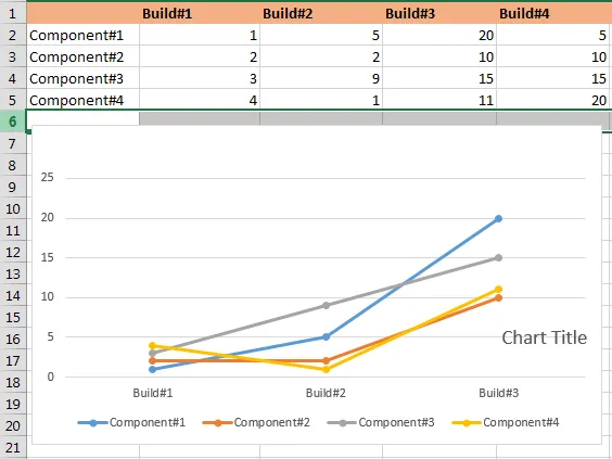
使用您在屏幕截图中提供的数据:
import matplotlib.pyplot as plt
import numpy as np

builds = np.array([1, 2, 3, 4])
y_stack = np.row_stack(([1, 2, 3, 4], [5, 2, 9, 1], [20, 10, 15, 1], [5, 10, 15, 20]))

fig = plt.figure(figsize=(11,8))
ax1 = fig.add_subplot(111)

ax1.plot(builds, y_stack[0,:], label='Component 1', color='c', marker='o')
ax1.plot(builds, y_stack[1,:], label='Component 2', color='g', marker='o')
ax1.plot(builds, y_stack[2,:], label='Component 3', color='r', marker='o')
ax1.plot(builds, y_stack[3,:], label='Component 4', color='b', marker='o')

plt.xticks(builds)
plt.xlabel('Builds')

handles, labels = ax1.get_legend_handles_labels()
lgd = ax1.legend(handles, labels, loc='upper center', bbox_to_anchor=(1.15,1))
ax1.grid('on')

plt.savefig('smooth_plot.png')
输出:
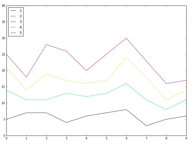
如果您只想绘制线条(基于代码中的随机数据):
import matplotlib.pyplot as plt
import numpy as np

fnx = lambda : np.random.randint(3, 10, 10)
y = np.row_stack((fnx(), fnx(), fnx(), fnx(), fnx()))

x = np.arange(10)
y_stack = np.cumsum(y, axis=0)

fig = plt.figure(figsize=(11,8))
ax1 = fig.add_subplot(111)

ax1.plot(x, y_stack[0,:], label=1)
ax1.plot(x, y_stack[1,:], label=2)
ax1.plot(x, y_stack[2,:], label=3)
ax1.plot(x, y_stack[3,:], label=4)
ax1.plot(x, y_stack[4,:], label=5)
ax1.legend(loc=2)

colormap = plt.cm.gist_ncar
colors = [colormap(i) for i in np.linspace(0, 1,len(ax1.lines))]
for i,j in enumerate(ax1.lines):
    j.set_color(colors[i])


plt.savefig('smooth_plot.png')
输出:
但是,如果您想要带有颜色填充的堆叠折线图,请使用以下代码(基于您代码中的随机数据):
import matplotlib.pyplot as plt
import numpy as np

fnx = lambda : np.random.randint(3, 10, 10)
y = np.row_stack((fnx(), fnx(), fnx(), fnx(), fnx()))


x = np.arange(10)
y_stack = np.cumsum(y, axis=0)

fig = plt.figure(figsize=(11,8))
ax1 = fig.add_subplot(111)

ax1.fill_between(x, 0, y_stack[0,:], facecolor="#CC6666", alpha=0.7)
ax1.fill_between(x, y_stack[0,:], y_stack[1,:], facecolor="#1DACD6", alpha=0.7)
ax1.fill_between(x, y_stack[1,:], y_stack[2,:], facecolor="#6E5160", alpha=0.7)
ax1.fill_between(x, y_stack[2,:], y_stack[3,:], facecolor="#CC6666", alpha=0.7)
ax1.fill_between(x, y_stack[3,:], y_stack[4,:], facecolor="#1DACD6", alpha=0.7)

plt.savefig('smooth_plot.png')
输出: 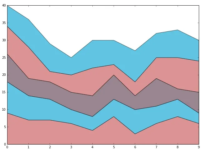
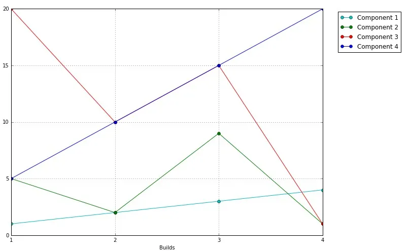
更新:
import matplotlib.pyplot as plt
import numpy as np

builds = np.array([1, 2, 3, 4])
y_stack = np.row_stack(([1, 5, 20, 5], [2, 2, 10, 10], [3, 9, 15, 15], [4, 1, 11, 20]))

fig = plt.figure(figsize=(11,8))
ax1 = fig.add_subplot(111)

ax1.plot(builds, y_stack[0,:], label='Component 1', color='c', marker='o')
ax1.plot(builds, y_stack[1,:], label='Component 2', color='g', marker='o')
ax1.plot(builds, y_stack[2,:], label='Component 3', color='r', marker='o')
ax1.plot(builds, y_stack[3,:], label='Component 4', color='b', marker='o')

plt.xticks(builds)
plt.xlabel('Builds')

handles, labels = ax1.get_legend_handles_labels()
lgd = ax1.legend(handles, labels, loc='upper center', bbox_to_anchor=(1.15,1))
ax1.grid('on')

plt.savefig('smooth_plot.png')
add_subplot,xticks,get_legend_handles_labels()等的详细说明/文档? - Ritz