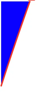
我正在尝试为使用CSS创建的三角形添加边框阴影。
#triangle-topleft {
   width: 0;
   height: 0;
   border-top: 300px solid blue;
   border-right: 100px solid transparent;
}<div id="triangle-topleft" />我尝试过但无法为右边框添加阴影。有没有一种简单的CSS方法可以实现这个效果?最终应该是这样的(只是用一个实际的阴影更好)。
filter。
#triangle-topleft {
      width: 0;
      height: 0;
      border-top: 300px solid blue;
      border-right: 100px solid transparent;
      filter: drop-shadow(3px 3px 3px hsla(0, 0%, 0%, 1));
}<div id="triangle-topleft" />div 来实现,该容器带有 overflow: hidden 属性。div 上设置所需的 box-shadow,并调整值以获得所需的外观。
#triangle-topleft {
  width: 300px;
  height: 300px;
  position: relative;
  overflow: hidden;
}

#triangle-topleft div {
  background: blue;
  width: 100%;
  height: 300px;
  transform: rotate(290deg);
  position: absolute;
  top: -35%;
  left: -80%;
  box-shadow: 4px 4px 8px red;
}<div id="triangle-topleft">
<div></div>
</div>您可以在这里结合使用linear-gradient和伪元素。
#triangle-topleft {
  width: 100px;
  height: 300px;
  /* gradient for triangle */
  background-image: linear-gradient(to right bottom, blue 50%, transparent 50%);
  position: relative;
}

#triangle-topleft:after {
  content: "";
  position: absolute;
  top: 0;
  left: 0;
  bottom: 0;
  right: 0;

  /* gradient for shadow */
  background-image: linear-gradient(to right bottom,
    rgba(17, 17, 17, 0.7) calc(50% - 5px),
    rgba(17, 17, 17, 0) 50%,
    transparent 50%);
  transform: translate(5px, 5px);
  z-index: -1;
}<div id="triangle-topleft"></div>您可以使用linear-gradient创建三角形及其“边框”。假设您想要5px的红色线宽。演示:
#triangle-topleft {
  /* desired width + red line width */
  width: 105px;
  height: 300px;
  /* subtract red line width using calc functon */
  background-image: linear-gradient(to right bottom,
    blue calc(50% - 5px),
    red calc(50% - 5px),
    red 50%, transparent 50%);
}<div id="triangle-topleft"></div>#triangle-topleft {
width: 0;
height: 0;
border-top: 300px solid blue;
border-right: 100px solid transparent;
position: relative;
}
#triangle-topleft:after {
content: "";
position: absolute;
top: 15px;
border-top: 315px solid red;
border-right: 105px solid transparent;
transform: translate(0, -100%);
z-index: -1;
}<div id="triangle-topleft"></div>这样的东西怎么样?
#triangle-topleft {
  position: relative;
  width: 0;
  height: 0;
  border-top: 300px solid blue;
  border-right: 100px solid transparent;
}

#triangle-topleft::before {
  content: '';
  position: absolute;
  top: 0;
  left: 0;
  width: 0;
  height: 0;
  border-top: 300px solid red;
  border-right: 100px solid transparent;
  transform: translate(5px, -100%);
  z-index: -1;
}

#triangle-topleft::after {
  content: '';
  position: absolute;
  bottom: 0;
  left: 0;
  width: 5px;
  height: 15px;
  background-color: red;
  z-index: -1;
}
基本上,这是将您拥有的内容添加2个伪元素 - ::before和::after,绝对定位它们,然后应用变换。
drop-shadow或者使用渐变或伪元素。 - Paulie_D