ggplot使用小饼图作为点来展示数据,使用的函数是geom_point。

13

我想用ggplot制作如下所示的图表。想法是绘制两个分类变量之间的“百分比匹配”。 通过改变点的大小很容易接近,但我想知道是否可能制作这些小饼图...

使用点的大小作为得分的度量来绘制此示例代码。

temp <- data.frame(Exercise=c(1, 1, 1, 2, 2, 2), 
    Name=c(1, 2, 3, 1, 2, 3), Score=c(0.2, 0.5, 0.3, 0.9, 1.0, 0.6))
ggplot(temp) + geom_point(aes(Exercise, Name, size=Score))

如何修改此代码以获得接近下图的效果?

示例图表


同样的问题:http://stackoverflow.com/questions/7836279/ggplot2-piecharts-instead-of-points-in-an-xy-scatterplot - mitchus
2个回答

7
使用图形作为点的形状有些棘手。但是,您可以通过使用facet_grid()来绕过此问题,并非常接近您的模型设计:
ggplot(temp) + 
  geom_bar(aes(x=1, y=Score), stat="identity") + 
  facet_grid(Exercise~Name) + 
  coord_polar(theta = "y") +
  scale_y_continuous(breaks = NULL) +
  scale_x_continuous(name = element_blank(), breaks = NULL)

enter image description here


谢谢你的回答。我希望不需要使用facet_grid来得出答案。 - midtiby
@midtiby facet_grid() 可能可以避免使用,但对我来说,其他替代方案似乎更糟糕;例如,调整视口。您是否有特定的原因要避免使用 facet_grid?也许您想在另一个变量上进行分面处理? - orizon

7

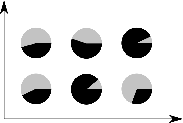
首先,修改您的原始数据框,使前6行包含原始score,并使最后6行包含1减去原始score。然后添加group列,其中包含这两个组的水平。

temp <- data.frame(Exercise=c(1, 1, 1, 2, 2, 2), 
                   Name=c(1, 2, 3, 1, 2, 3), Score=c(0.2, 0.5, 0.3, 0.9, 1.0, 0.6))
temp<-rbind(temp,temp)
temp$Score[7:12]<-1-temp$Score[1:6]
temp$group<-rep(c("poz","neg"),each=6)

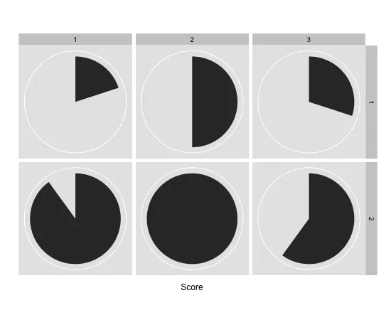
coord_polar()用于从条形图制作饼图,然后使用facet_grid()制作六个小图。 使用theme()去除轴、分面标签和网格线。

ggplot(temp,aes(x = factor(1),y=Score,fill=group)) + 
  geom_bar(width = 1, stat = "identity") + facet_grid(Exercise~Name)+
  coord_polar(theta = "y") +
  scale_fill_manual(values = c("black", "grey")) +
  theme_bw() + scale_x_discrete("",breaks=NULL) + scale_y_continuous("",breaks=NULL)+
  theme(panel.border=element_blank(),
        strip.text=element_blank(),
        strip.background=element_blank(),
        legend.position="none",
        panel.grid=element_blank())

enter image description here


谢谢你的回答。我会看看它是否可以根据我的需求进行调整。 - midtiby

网页内容由stack overflow 提供, 点击上面的
可以查看英文原文,
原文链接