类似的问题之前已经在这里问过,但是读完它们后,我还没有找到适用于我的站点的答案。
我使用Bootstrap构建了网站,但添加了一些自己的媒体查询。实时测试网站位于: http://agoodman.com.au
受媒体查询更改的部分是“我们的费用”和“地图”覆盖层。如果您在笔记本电脑上,调整浏览器大小会使这些部分显示为块。
我的样式表链接:
    <meta name="viewport" content="width=device-width, initial-scale=1.0">
    <link href="css/bootstrap.css" rel="stylesheet">
    <link href="css/user.css" rel="stylesheet">
"
“User.css”只是一个单独的文件,因为我想随时保留和更新bootstrap的主要框架。User.css覆盖了bootstrap中的样式。我在user.css中使用的媒体查询如下:
"@media screen or handheld(max-width: 979px) {
.fee-buttons {
height: auto;
font-weight: 600;
position: relative;
padding: 0;
margin: 0;
list-style: none;
}
.fee-buttons .transformation {
width: 100% !important;
height: 300px;
position: relative;
z-index: 10;
left:0;
}
.fee-buttons .hourly, .fee-buttons .membership {
float: none;
width: 100% !important;
}
li.button{
overflow:visible;
}
}
@media screen or handheld(max-width: 995px) {
#overlay {
position: relative;
display: block;
width: auto;
right: 0;
padding:1em;
}
}
如我所说,在桌面浏览器上,这个页面可以正常工作,但在移动端浏览器上却完全无法正常运行。我已经在 iPhone 4(使用 Safari)和 HTC Desire(使用默认的 Android 浏览器)上进行了测试,两者都以相同的方式显示 - 忽略媒体查询,只显示满屏幕的压缩和不美观的内容。
有什么想法吗?我在这里做错了什么?
编辑:
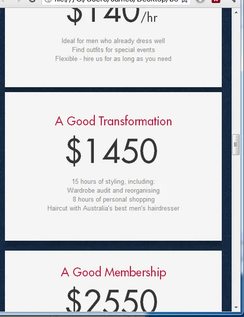
以下是应该在小屏幕宽度下看起来的样子的截图:
 以下是在 Android 和 iPhone 上当前的外观,设备忽略了我的媒体查询: