在鼠标悬停时创建CSS“路径”

37

我正在尝试使用(主要是)CSS生成一个“漂亮”的CSS菜单,但也需要少量的jQuery:

我的总体想法是:

+------------------------+
|                        |
|                        |
|         +---+          |
|         |   |          |
|         |___|          | <-- Hover this center piece
|                        |
|                        |
|                        |
+------------------------+

+------------------------+
|     _                  |
|    |\                  | <-- All start moving up to top of screen
|      \  +---+          |
|         |   |          |
|         |___|          |
|                        |
|                        |
|                        |
+------------------------+

+------------------------+
| +---+                  |
| |   |                  |
| |___|                  |
|                        |
|  || All, but one       |
|  || moves down         |
|  \/                    |
|                        |
+------------------------+

+------------------------+
| +---+                  |
| |   |                  |
| |___|                  |
|                        |
|        One stays,      |
| +---+  the rest move this way
| |   |  --->            |
| |___|                  |
+------------------------+

+------------------------+
| +---+                  |
| |   |                  |
| |___|              ^   | The rest move up
|                    |   |
|                    |   |
| +---+            +---+ |
| |   |            |   | |
| |___|            |___| |<-- Another stays
+------------------------+

完成:

+------------------------+
| +---+            +---+ |
| | 1 |            | 4 | |
| |___|            |___| |
|                        |
|                        |
| +---+            +---+ |
| | 2 |            | 3 | |
| |___|            |___| |
+------------------------+

然而,这假设有四个div子元素,所以我正在尝试生成一种在jQuery中“确定角度/位置”的方法(说实话,并不太奏效)。
类似的设计:

Enter image description here


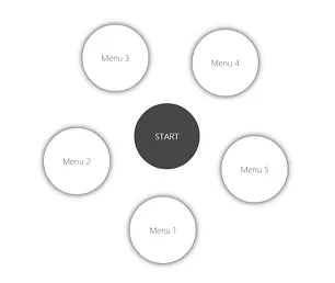
因此,最终由于有四个div,它们将与中心点相隔90度(360/4 div = 相距90度)。
如果有六个子div:
360/6 = 60 degrees

因此,它们将均匀分布在60度间隔处。


我还会在它们之间添加动画,所以我一直在尝试旋转等,但我似乎无法掌握:

我的当前示例是:

$(".wrap").hover(function(){
    var x =$(this).children().length; //Counts '.circles'
    var degree = 360 / x; //Gets angle
    var percent = 100 / x;
    var curPercent = percent;
    $(this).children().each(function (index) {
        $(this).css("transform","rotate(" + degree*index + "deg)");
        $(this).css("top",percent + "px");
        $(this).css("left",percent + "px");

        percent = percent + curPercent;
    });
});
.wrap{
    height: 300px;
    width: 300px;
    background: red;
    position: relative;
    transform-origin: center center;
    transition: all 0.8s;
}
.wrap:hover .circle{
    top: 0;
    left: 0;
}
.circle{
    transition: all 0.8s;
    position: absolute;
    height: 50px;
    width: 50px;
    top: calc(50% - 25px);
    left: calc(50% - 25px);
    background: tomato;
}
<script src="https://ajax.googleapis.com/ajax/libs/jquery/2.1.1/jquery.min.js"></script>
<div class="wrap">
    <div class="circle">1</div>
    <div class="circle">2</div>
    <div class="circle">3</div>
    <div class="circle">4</div>
</div>

Fiddle


有人能:

  • (A):知道如何使div相对于在jQuery代码中指定的父元素旋转指定的角度或距离吗?

  • (B):使'animation'在鼠标移出时重置吗?

  • (C): 有任何想法我在说什么吗?

类似的实现(虽然不完全相同):


1
你知道@keyframes吗?因为看起来你完全可以用CSS做你想做的事情... - Pa3k.m
2
@Pa3k.m:基于子节点数量的偶数度计算? - Harry
@Pa3k.m:关于关键帧的唯一问题是它将寻找一个结束位置(我在jQuery运行之前不知道),而且还需要添加很多前缀。 - jbutler483
1
那句话一点也不清楚,这就是为什么Pa3k.m会问的原因。你希望动画的精灵/ div 的最大和最小数量是多少?你想在什么时候确定角度?在动画期间,在之前还是之后? div 的数量是在生成 HTML 时确定的吗?页面加载时还是用户使用时?(如果是最后一个,具体是什么时候?) - dcorking
由于页面将具有动态内容,角度无法设置(显然),因此“角度”必须在实际悬停过程中确定。您还可以在我的代码片段中看到,我正在计算长度,接受的答案也使用长度。因此,使用常识,在这里我不认为“之后”真的有任何意义。 - jbutler483
显示剩余3条评论
2个回答

57

使用不同的方法会得到略有不同的效果。您可以通过调整setTimeouttransition的时间来改变其行为。

查看代码实例

+ function() {
  var to;
  $(".wrap").on('mouseenter', function() {
    var circles = $(this).children();
    var degree = (2 * Math.PI) / circles.length; //calc delta angle
    var transforms = [];

    // Calculate the position for each circle
    circles.each(function(index) {
        var x = 100 * Math.cos(-0.5 * Math.PI + degree * (-1 * index - 0.5));
        var y = 100 * Math.sin(-0.5 * Math.PI + degree * (-1 * index - 0.5));

      transforms.push('translate(' + x + 'px,' + y + 'px)');
    });

    // Function to moves all the circles
    // We'll pop a circle each time and than call this function recursively
    function moveCircles() {
      var transform = transforms.shift();
      circles.css('transform', transform);

      circles.splice(0, 1);
      if (circles.length) to = setTimeout(moveCircles, 400);
    }

    moveCircles();
  });

  $(".wrap").on('mouseleave', function() {
    var circles = $(this).children().css('transform', '');
    clearTimeout(to);
  });
}();
   .wrap {
     height: 300px;
     width: 300px;
     background: red;
     position: relative;
     transform-origin: center center;
     transition: all 0.8s;
   }
   .circle {
     transition: all 0.8s;
     position: absolute;
     height: 50px;
     width: 50px;
     text-align: center;
     line-height: 50px;
     top: calc(50% - 25px);
     left: calc(50% - 25px);
     background: tomato;
     border-radius: 50%;
   }
<script src="https://ajax.googleapis.com/ajax/libs/jquery/2.1.1/jquery.min.js"></script>
<div class="wrap">
  <div class="circle">1</div>
  <div class="circle">2</div>
  <div class="circle">3</div>
  <div class="circle">4</div>
  <div class="circle">5</div>
  <div class="circle">6</div>
</div>


1
这真的很棒。干杯!实际上我非常喜欢这个标记:) :) - jbutler483
1
@jbutler483 -1 * index - 1.5 在圆的数量为奇数时会给出奇怪的位置。使用 -90 度偏移并使用 -1 * index - 0.5 可以得到更好的结果。 :) - Arnold Daniels
再次感谢您。您可以在此处查看我对您示例的看法(http://codepen.io/jbutler483/pen/EaQxyW)-非常感谢:) - jbutler483

23

function rotateStep($this, $circle, angle) {
    $this.animate({
        rotation: angle
    }, {
        step: function(now, fx) {
            $this.css({
                transform: 'rotate(' + now + 'deg)'
            });
            $circle.css({
                transform: 'translate(-50%, -50%) rotate(' + -now + 'deg)'
            });
        }
    });
}

$('.wrap').hover(function() {
    var $this = $(this),
        $circleWrappers = $this.find('.circleWrapper'),
        angleOffset = 360 / $circleWrappers.length,
        angle = - angleOffset / 2,
        distance = Math.min($this.width(), $this.height()) / 2;
    
    $circleWrappers.each(function() {
        var $this = $(this),
            $circle = $(this).find('.circle');
        $circle.animate({ top: -distance });
        rotateStep($this, $circle, angle);
        angle -= angleOffset;
    });
}, function() {
    var $this = $(this),
        $circleWrappers = $this.find('.circleWrapper');
    
    $circleWrappers.each(function() {
        var $this = $(this),
            $circle = $(this).find('.circle');
        $circle.animate({ top: 0 });
        rotateStep($this, $circle, 0);
    });
});
.wrap {
    position: relative;
    background-color: #cccccc;
    width: 400px;
    height: 400px;
    transition:all 0.8s;
    transform-origin: center center;
}
.circleWrapper {
    display: inline-block;
    position: absolute;
    left: 50%;
    top: 50%;
}
.circle {
    position: absolute;
    width: 80px;
    height: 80px;
    border-radius: 40px;
    background-color: white;
    box-shadow: 0px 0px 5px rgba(0, 0, 0, 0.5);
    line-height: 80px;
    text-align: center;
    font-family: arial;
    font-size: 42px;
    font-weight: bold;
    transform: translate(-50%, -50%);
}
<script src="https://ajax.googleapis.com/ajax/libs/jquery/2.1.1/jquery.min.js"></script>
<div class="wrap">
    <div class="circleWrapper"><div class="circle">1</div></div>
    <div class="circleWrapper"><div class="circle">2</div></div>
    <div class="circleWrapper"><div class="circle">3</div></div>
    <div class="circleWrapper"><div class="circle">4</div></div>
</div>

JSFiddle


1
谢谢你,通过查看你的jQuery代码,我觉得我永远不可能让我的实现工作起来,所以非常感谢你。但是它非常清晰,我可以看到它是如何工作的,所以谢谢 :) - jbutler483
也添加了鼠标悬停效果的退出。 - huysentruitw
@WouterHuysentruit:虽然这是一个很好的方法,但我认为如果您看到了被接受的答案,您可能会同意所给出的解决方案。 - jbutler483
2
@jbutler483 看起来另一个答案更适合这个问题,所以我对此没有任何问题 :) - huysentruitw
4
恭喜你达成了1万个比特币,顺便说一句。 - jbutler483

网页内容由stack overflow 提供, 点击上面的
可以查看英文原文,
原文链接