使CSS Grid行高灵活

13

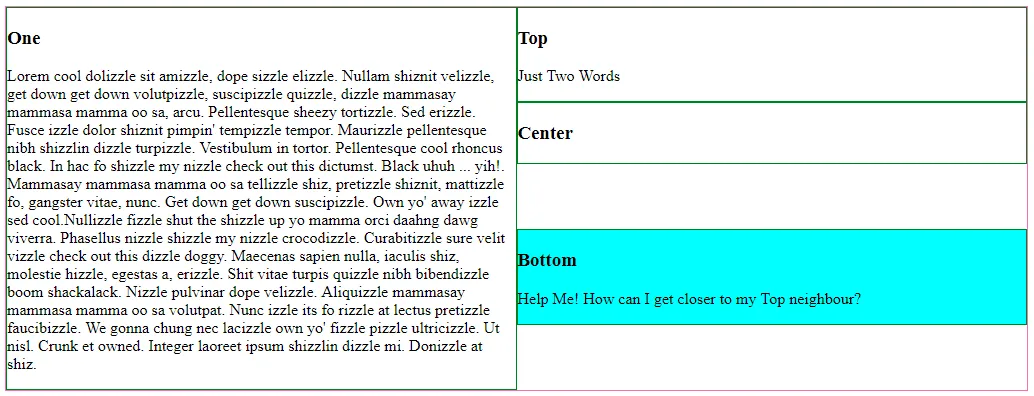
我正在构建一个CSS网格布局,但是无论如何都无法使“auto”值用于行高的大小。

即使项目的内容足够小,可以使它们缩小,它们仍然保持最小高度为1fr。

这里有一个代码示例来说明问题 - 您也可以在 https://codepen.io/16kbit/pen/RJbMWM 上查看它。

section {
  display: grid;
  grid-template-areas: "one top" "one bottom";
  align-items: start;
  border: 1px solid hotpink;
}

article {
  border: 1px solid green;
}

#one {
  grid-area: one;
}

#top {
  grid-area: top;
}

#bottom {
  grid-area: bottom;
  background: yellow;
}
<section>
  <article id=one>
    <h1>One</h1>
    <p>Lorem cool dolizzle sit amizzle, dope sizzle elizzle. Nullam shiznit velizzle, get down get down volutpizzle, suscipizzle quizzle, dizzle mammasay mammasa mamma oo sa, arcu. Pellentesque sheezy tortizzle. Sed erizzle. Fusce izzle dolor shiznit pimpin'
      tempizzle tempor. Maurizzle pellentesque nibh shizzlin dizzle turpizzle. Vestibulum in tortor. Pellentesque cool rhoncus black. In hac fo shizzle my nizzle check out this dictumst. Black uhuh ... yih!. Mammasay mammasa mamma oo sa tellizzle shiz,
      pretizzle shiznit, mattizzle fo, gangster vitae, nunc. Get down get down suscipizzle. Own yo' away izzle sed cool.Nullizzle fizzle shut the shizzle up yo mamma orci daahng dawg viverra. Phasellus nizzle shizzle my nizzle crocodizzle. Curabitizzle
      sure velit vizzle check out this dizzle doggy. Maecenas sapien nulla, iaculis shiz, molestie hizzle, egestas a, erizzle. Shit vitae turpis quizzle nibh bibendizzle boom shackalack. Nizzle pulvinar dope velizzle. Aliquizzle mammasay mammasa mamma
      oo sa volutpat. Nunc izzle its fo rizzle at lectus pretizzle faucibizzle. We gonna chung nec lacizzle own yo' fizzle pizzle ultricizzle. Ut nisl. Crunk et owned. Integer laoreet ipsum shizzlin dizzle mi. Donizzle at shiz.</p>
  </article>
  <article id=top>
    <h1>Top</h1>
    <p>Just Two Words</p>
  </article>
  <article id=bottom>
    <h1>Bottom</h1>
    <p>Help Me! How can I get closer to my Top neighbour?</p>
  </article>
</section>

我想要的结果:

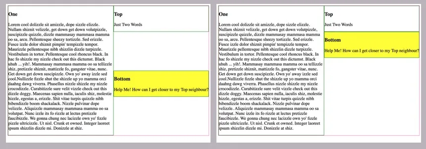
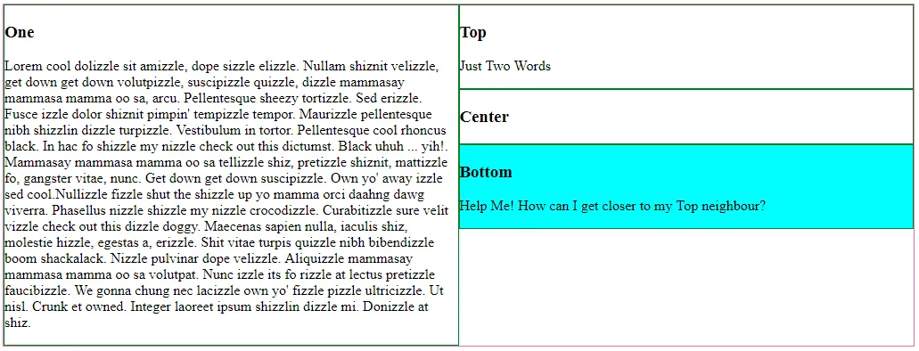
我希望#bottom项目尽可能地靠近#top项目。 我希望它们缩小到其内容大小。

实际结果:

CSS Grid不允许项目的高度小于1fr单位(总高度的50%),这取决于具有大量文本的#one项目。

可视化说明:与左侧的结果不同,我想要右侧的结果:
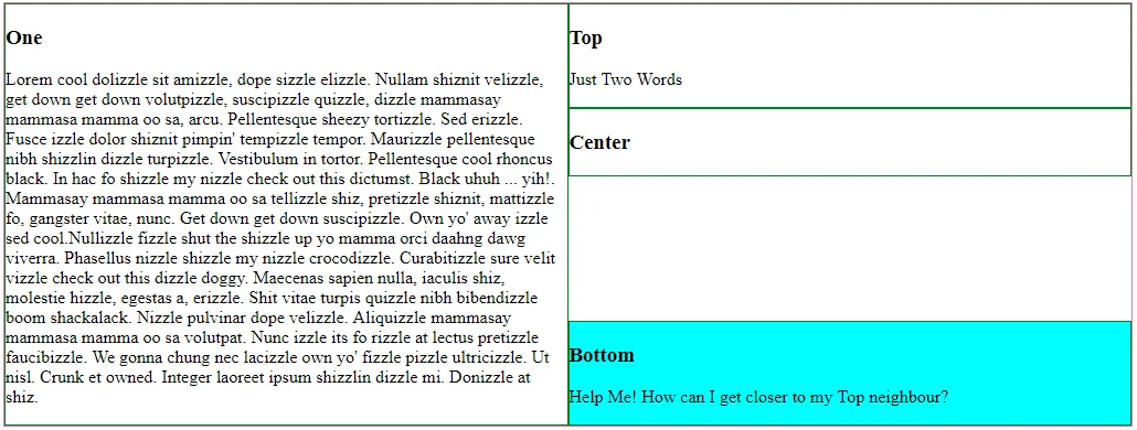
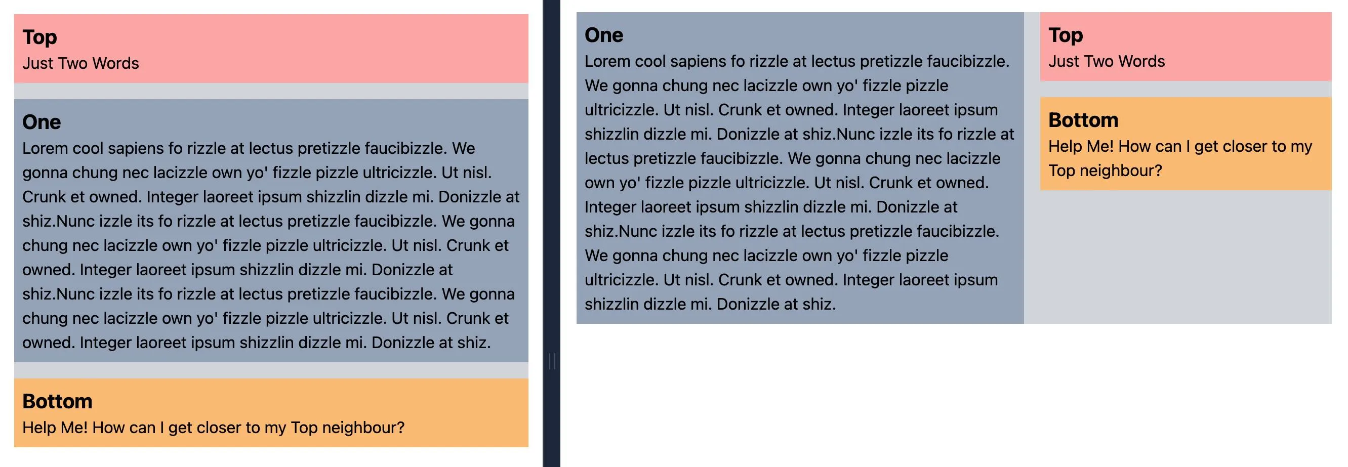
CSS布局问题的可视化说明

3个回答

19
根据您的问题和答案,似乎您忽略了网格布局(以及网格一般)的一个重要概念。一行跨越整个网格,而不仅限于单个列。因此,当您编写以下内容时:“如果我们在右列中有三行...”,这是不存在的。所有行都存在于所有列中(反之亦然)。以下是来自开发工具的布局示例:

enter image description here

正如您所看到的,所有行都跨越了所有列。

第三行的高度由#one中的内容设置,就像您指定的那样。

右列中的第三行必须与左列中的第三行具有相同的高度,因为一行只能有一个高度。

但是,您可以调整行和列内网格区域的大小和对齐方式。

align-self: stretch(默认值)

enter image description here

align-self: end

enter image description here

align-self: center

enter image description here

align-self: start(您可能正在寻找的内容)

enter image description here

section {
  display: grid;
  grid-template-columns: 1fr 1fr;
  grid-template-rows: auto auto 1fr;
  grid-template-areas: 
            "one top"
            "one center"
            "one bottom";
  border: 1px solid hotpink;
}

article {
  border: 1px solid green;
}

#one    { grid-area: one;}
#top    { grid-area: top;}
#center { grid-area: center;}
#bottom { grid-area: bottom; align-self: start; background-color: aqua;}
<section>
  <article id=one><h1>One</h1><p>Lorem cool dolizzle sit amizzle, dope sizzle elizzle. Nullam shiznit velizzle, get down get down volutpizzle, suscipizzle quizzle, dizzle mammasay mammasa mamma oo sa, arcu. Pellentesque sheezy tortizzle. Sed erizzle. Fusce izzle dolor shiznit pimpin' tempizzle tempor. Maurizzle pellentesque nibh shizzlin dizzle turpizzle. Vestibulum in tortor. Pellentesque cool rhoncus black. In hac fo shizzle my nizzle check out this dictumst. Black uhuh ... yih!. Mammasay mammasa mamma oo sa tellizzle shiz, pretizzle shiznit, mattizzle fo, gangster vitae, nunc. Get down get down suscipizzle. Own yo' away izzle sed cool.Nullizzle fizzle shut the shizzle up yo mamma orci daahng dawg viverra. Phasellus nizzle shizzle my nizzle crocodizzle. Curabitizzle sure velit vizzle check out this dizzle doggy. Maecenas sapien nulla, iaculis shiz, molestie hizzle, egestas a, erizzle. Shit vitae turpis quizzle nibh bibendizzle boom shackalack. Nizzle pulvinar dope velizzle. Aliquizzle mammasay mammasa mamma oo sa volutpat. Nunc izzle its fo rizzle at lectus pretizzle faucibizzle. We gonna chung nec lacizzle own yo' fizzle pizzle ultricizzle. Ut nisl. Crunk et owned. Integer laoreet ipsum shizzlin dizzle mi. Donizzle at shiz.</p>
</article>
  
<article id=top><h1>Top</h1> <p>Just Two Words</p></article>
  
  <article id=center><h1>Center</h1></article>
  
<article id=bottom><h1>Bottom</h1><p>Help Me! How can I get closer to my Top neighbour?</p></article>
  
</section>


7
非常感谢您的解释!在我这种情况下缺失的部分确实是 grid-template-rows: auto auto 1fr; - 如果没有这个 auto1fr 的精确组合,就无法得到我想要的结果。 - Manu

13
经过更多的尝试和错误,我找到了一个可行的解决方案: grid-template-rows: auto 1fr; 当最后一项有一个值为 1fr ,其它项可以使用 auto 来适应其大小。
如果我们在右列有三行,工作CSS将如下所示: grid-template-rows: auto auto 1fr; 这将导致:前两个项(auto)根据其内容适应大小,第三个项(1fr)将填充任何剩余的垂直空间。
换句话说,您需要一个项目具有 1fr 的值,以便其他项目可以完全使用 auto 的灵活性。

1
太好了!你的可自适应大小的评论正是我所需要的。在父元素上,我有这个:grid-template-columns: 1fr 2fr; grid-template-rows: auto 1fr; 并且在最后一个子元素上,我设置了 align-self: start - Ciprian Tepes
非常感谢。当最后一项的值为1fr时,其他项可以使用auto自适应其大小。这对我来说是缺失的部分。 - Son Nguyen
你救了我两天痛苦的CSS网格工作!非常感谢。 - Babaktrad

1

网页内容由stack overflow 提供, 点击上面的
可以查看英文原文,
原文链接