使用纯CSS实现复杂的比例三元素进度条设计

10

我已经制作了一个自定义进度条,由三个独立的部分组成(一个可以定制的中心块,左侧部分和右侧部分),但是我在对齐中心块时遇到了困难,在所有阶段都无法正确显示。

首先,我将使用三个图形布局展示期望的最终状态,然后描述当前问题,最后提供我的当前解决方法,它有缺陷并需要修复。


三种期望的状态:
起始状态下期望的结果,显示为左对齐的 1%
enter image description here

中间状态下期望的结果,中心块完美居中,显示为 50%
enter image description here

期望的结束状态,中心块完美右对齐,并停止在 100%
enter image description here


body{margin: 100px; background: #CCC}

.fullbar{
    background-color: blue;
    width: 100%;
}

.progress{
    background: green;
  margin: 10px 0 0 0;
    text-align: right;
    padding: 0 0px 1px 0px;
    line-height: 5px;
}

.number{
  background: inherit;
  color: #FFF;
    padding: 4px;
    padding: 0 2px 1px 3px;
 
}
<div class="fullbar">
<div class="progress" style="width:50%">
    <div class="number">50%</div>
</div>
</div>

问题
当状态为50%时,中心块应该水平地完美对齐在中间。但实际情况并非如此。线的末尾被居中显示,而不是包含实际数字 "50%" 的 div。

enter image description here


由于某种未知原因,中心块的代码视图没有正确渲染。也许我的大量CSS重置使我的进度条看起来与此处的裸代码不同。但目前还需要正确居中名称为number的div。 我的笨拙解决方案,不能正确工作,也不优雅
我尝试使用width:112%将中心部分包装为hack以满足进度条的需求,使中心块完美居中,如下所示:
<div class="fullbar">
  <div style="width:112%">
    <div class="progress" style="width:50%">
      <div class="number">50%</div>
    </div>
  </div>
</div>

然而,这使得50%看起来完美地水平居中,但最终状态的100%现在被推到了div边界的右侧,使解决方案不正确和无法使用。


主要问题和第一个赏金(50分)
希望找到另一种CSS(flex或calc)解决方案,其中所有三个理想状态(参见上面的三个图片)都完美对齐,其中状态适合开始状态,结束状态和介于“比例”之间的所有内容。


奖励问题和第二个赏金(100分)
A) 用纯CSS以缓入缓出的方式优雅地动画显示进度条(中心部分和左侧彩色条),在页面加载后延迟1秒。

B) 动画(和数字)应从0%开始,然后在动画期间在中心部件中显示的数字增加到XX%(在HTML中设置为%),并以正确的进度数字和正确的水平进度位置结束。


相关链接:https://dev59.com/fVoV5IYBdhLWcg3wA62x - Michael Benjamin
1
@MichaelBenjamin并不是因为这里的目标不仅仅是将元素居中。当为50%时,它需要居中,当为0%时左对齐,当为100%时右对齐(而且它不取决于屏幕尺寸)。 - Temani Afif
4个回答

13
您可以像以下这样做。我使用不同的颜色以更好地看到结果。

body {
  margin: 100px;
  background: #CCC
}

.fullbar {
  background-color: blue;
}

.progress {
  background: lightgreen;
  margin: 10px 0 0 0;
  height: 5px;
  position:relative; /* relative here */
  width:var(--p);
}

.number {
  position:absolute; /* absolute here */
  background: rgba(255,0,0,0.5);
  left:100%; /* push to the right side */
  transform:translateX(calc(-1*var(--p))); /* offset to the left based on --p */
  top:-10px;
  bottom:-10px;
  color: #FFF;
  padding: 0 2px 1px 3px;
}
<div class="fullbar">
  <div class="progress" style="--p:0%">
    <div class="number">0%</div>
  </div>
</div>

<div class="fullbar">
  <div class="progress" style="--p:20%">
    <div class="number">20%</div>
  </div>
</div>

<div class="fullbar">
  <div class="progress" style="--p:50%">
    <div class="number">50%</div>
  </div>
</div>

<div class="fullbar">
  <div class="progress" style="--p:80%">
    <div class="number">80%</div>
  </div>
</div>

<div class="fullbar">
  <div class="progress" style="--p:100%">
    <div class="number">100%</div>
  </div>
</div>

使用仅一个 div 的另一种思路:

body {
  margin: 100px;
  background: #CCC
}

.progress {
  margin: 20px 0;
  height: 10px;
  position: relative;
  background: linear-gradient(lightgreen 0 0) 0/var(--p) 100% no-repeat blue;
}

.progress::before {
  content: attr(style);
  font-family: monospace;
  font-size:20px;
  white-space:nowrap;
  text-indent: -4ch;
  overflow: hidden;
  position: absolute;
  background: rgba(255, 0, 0, 0.8);
  border:5px solid transparent;
  top:50%;
  left: var(--p);
  transform: translate(calc(-1*var(--p)),-50%);
  color: #FFF;
}
<div class="progress" style="--p:0%"></div>

<div class="progress" style="--p:20%"></div>

<div class="progress" style="--p:50%"></div>


<div class="progress" style="--p:80%"></div>

<div class="progress" style="--p:100%"></div>

更新

带有动画效果:

body {
  margin: 100px;
  background: #CCC
}

.progress {
  margin: 20px 0;
  height: 10px;
  position: relative;
  background: linear-gradient(lightgreen 0 0) 0/var(--p) 100% no-repeat blue;
  animation:p1 1s 1s both;
}

.progress::before {
  content: attr(style);
  font-family: monospace;
  font-size:20px;
  white-space:nowrap;
  text-indent: -4ch;
  overflow: hidden;
  position: absolute;
  background: rgba(255, 0, 0, 0.8);
  border:5px solid transparent;
  top:50%;
  left: var(--p);
  transform: translate(calc(-1*var(--p)),-50%);
  color: #FFF;
  animation:p2 1s 1s both;
}
@keyframes p1 {from {background-size:0 100%}}
@keyframes p2 {from {left:0;transform: translate(0%,-50%)}}
<div class="progress" style="--p:0%"></div>

<div class="progress" style="--p:20%"></div>

<div class="progress" style="--p:50%"></div>

<div class="progress" style="--p:80%"></div>

<div class="progress" style="--p:100%"></div>

对于数字动画,我将使用@property,但目前只在Chrome和Edge上可用:

body {
  margin: 100px;
  background: #CCC
}

@property --p {
  syntax: '<number>';
  inherits: true;
  initial-value: 0;
}
@property --s {
  syntax: '<integer>';
  inherits: true;
  initial-value: 0;
}

.progress {
  margin: 20px 0;
  height: 10px;
  position: relative;
  background: linear-gradient(lightgreen 0 0) 0/calc(var(--p,0)*1%) 100% no-repeat blue;
  animation:p1 1s 1s both;
  --s:var(--p);
  counter-set:num var(--s);
}

.progress::before {
  content: counter(num) "%";
  font-family: monospace;
  font-size:20px;
  white-space:nowrap;
  overflow: hidden;
  position: absolute;
  background: rgba(255, 0, 0, 0.8);
  border:5px solid transparent;
  top:50%;
  left: calc(var(--p)*1%);
  transform: translate(calc(-1%*var(--p)),-50%);
  color: #FFF;
}
@keyframes p1 {from {--p:0;--s:0}}
<div class="progress" style="--p:0"></div>

<div class="progress" style="--p:20"></div>

<div class="progress" style="--p:50"></div>


<div class="progress" style="--p:80"></div>

<div class="progress" style="--p:100"></div>

在没有更多支持的情况下,您可以像下面这样伪造它:

body {
  margin: 100px;
  background: #CCC
}

.progress {
  margin: 20px 0;
  height: 10px;
  position: relative;
  background: linear-gradient(lightgreen 0 0) 0/var(--p) 100% no-repeat blue;
  animation:p1 1s 1s both;
}

.progress::before {
  content: attr(style);
  font-family: monospace;
  font-size:20px;
  white-space:nowrap;
  text-indent: -4ch;
  overflow: hidden;
  position: absolute;
  background: rgba(255, 0, 0, 0.8);
  border:5px solid transparent;
  top:50%;
  left: var(--p);
  transform: translate(calc(-1*var(--p)),-50%);
  color: #FFF;
  animation:p2 1s 1s both,p3 0.8s 1s both;
}
@keyframes p1 {from {background-size:0% 100%}}
@keyframes p2 {from {left:0%;transform: translate(0%,-50%)}}
@keyframes p3 { /* put some randome number to fake the animation*/
  0%  {content:"--p:0%"}
  15% {content:"--p:5%"}
  30% {content:"--p:9%"}
  45% {content:"--p:10%"}
  60% {content:"--p:11%"}
  75% {content:"--p:40%"}
  90% {content:"--p:20%"}
}
<div class="progress" style="--p:0%"></div>

<div class="progress" style="--p:20%"></div>

<div class="progress" style="--p:50%"></div>


<div class="progress" style="--p:80%"></div>

<div class="progress" style="--p:100%"></div>

或者像下面这样的一些疯狂想法:

body {
  margin: 100px;
  background: #CCC
}

.progress {
  margin: 20px 0;
  height: 10px;
  position: relative;
  background: linear-gradient(lightgreen 0 0) 0/calc(var(--p)*1%) 100% no-repeat blue;
  animation:p1 1s 1s both;
}

.progress::before {
  content: "0% \A 1% \A 2% \A 3% \A 4% \A 5% \A 6% \A 7% \A 8% \A 9% \A 10% \A 11% \A 12% \A 13% \A 14% \A 15% \A 16% \A 17% \A 18% \A 19% \A 20% \A 21% \A 22% \A 23% \A 24% \A 25% \A 26% \A 27% \A 28% \A 29% \A 30% \A 31% \A 32% \A 33% \A 34% \A 35% \A 36% \A 37% \A 38% \A 39% \A 40% \A 41% \A 42% \A 43% \A 44% \A 45% \A 46% \A 47% \A 48% \A 49% \A 50% \A 51% \A 52% \A 53% \A 54% \A 55% \A 56% \A 57% \A 58% \A 59% \A 60% \A 61% \A 62% \A 63% \A 64% \A 65% \A 66% \A 67% \A 68% \A 69% \A 70% \A 71% \A 72% \A 73% \A 74% \A 75% \A 76% \A 77% \A 78% \A 79% \A 80% \A 81% \A 82% \A 83% \A 84% \A 85% \A 86% \A 87% \A 88% \A 89% \A 90% \A 91% \A 92% \A 93% \A 94% \A 95% \A 96% \A 97% \A 98% \A 99% \A 100%";
  font-family: monospace;
  font-size:20px;
  width:4ch;
  line-height:1em;
  height:1em;
  text-align:center;
  overflow: hidden;
  position: absolute;
  background: rgba(255, 0, 0, 0.8);
  border:5px solid transparent;
  top:50%;
  left: calc(var(--p)*1%);
  transform: translate(calc(-1%*var(--p)),-50%);
  color: #0000;
  text-shadow:0 calc(var(--p)*-1em) 0 #fff;
  animation:p2 1s 1s both,p3 1s 1s steps(var(--p)) both;
}
@keyframes p1 {from {background-size:0% 100%}}
@keyframes p2 {from {left:0%;transform: translate(0%,-50%)}}
@keyframes p3 {from {text-shadow:0 0 0 #fff}}
<div class="progress" style="--p:0"></div>

<div class="progress" style="--p:20"></div>

<div class="progress" style="--p:50"></div>

<div class="progress" style="--p:80"></div>

<div class="progress" style="--p:100"></div>


1
@Sam 不要使用填充(padding),因为它会破坏文本缩进技巧。考虑使用透明边框代替填充,并用轮廓(outline)替换边框(border):https://jsfiddle.net/k40ey3gc/1/ - Temani Afif
1
@Sam,你可以保留它直到期限结束(一周),也许会有更多的答案发布 ;) - Temani Afif
1
@Sam 添加了更多的动画想法。 - Temani Afif
1
永恒的!棒极了!所有问题都得到了解答。这是一件真正独一无二的杰作,适合公众使用! - Sam
1
@Sam,赏金系统只考虑最新的答案(在设置赏金之后添加的答案),但没关系,不需要浪费100个声望点;) - Temani Afif
显示剩余9条评论

2

@Temani的解决方案 nailed it。他已经完成了所有的工作,我在这里只是为他的最后一个解决方案添加一些内容。

我所做的改变如下:

  • 进度条的左侧和右侧现在是两个单独的(伪)元素,并使用flex-grow按正确比例增长 - 使用较少的calc
  • 拇指不再需要手动定位。通过使用flex-box和伪元素进行定位。
  • 拇指又成为了一个独立的元素。这样,我可以使数字再次成为真正的文本,而不是text-shadow。您还可以使用JS捕获事件,如果您想将此项转换为滑块。
  • 删除透明边框。我认为它有点太过于hacky。只需将行高从1em增加到2em,并添加偏移量(2em-1em)*-0.5=-0.5em

body {
  margin: 0;
  padding: 20px;
  background: #EEE;
  font-family: sans-serif;
}

.progress {
  display: flex;
  align-items: center;
  margin: 20px;
  animation-delay: 1s;
  animation-duration: 1s;
  animation-fill-mode: forwards;
}

.progress::before, .progress::after {
  content: '';
  height: 10px;
  animation: inherit;
}

.progress::before {
  background-color: #1306F8;
  flex-grow: 0;
  animation-name: p_before;
}

.progress::after {
  background-color: #E1E1E1;
  flex-grow: 100;
  animation-name: p_after;
}

.progress .thumb {
  height: 1em;
  padding: .3em .4em;
  font-size: 20px;
  line-height: 2em;
  text-align: center;
  color: #FFF;
  background-color: #1306F8;
  overflow: hidden;
  z-index: 1;
  animation: inherit;
}

.progress .thumb::before {
  content: "0% \A 1% \A 2% \A 3% \A 4% \A 5% \A 6% \A 7% \A 8% \A 9% \A 10% \A 11% \A 12% \A 13% \A 14% \A 15% \A 16% \A 17% \A 18% \A 19% \A 20% \A 21% \A 22% \A 23% \A 24% \A 25% \A 26% \A 27% \A 28% \A 29% \A 30% \A 31% \A 32% \A 33% \A 34% \A 35% \A 36% \A 37% \A 38% \A 39% \A 40% \A 41% \A 42% \A 43% \A 44% \A 45% \A 46% \A 47% \A 48% \A 49% \A 50% \A 51% \A 52% \A 53% \A 54% \A 55% \A 56% \A 57% \A 58% \A 59% \A 60% \A 61% \A 62% \A 63% \A 64% \A 65% \A 66% \A 67% \A 68% \A 69% \A 70% \A 71% \A 72% \A 73% \A 74% \A 75% \A 76% \A 77% \A 78% \A 79% \A 80% \A 81% \A 82% \A 83% \A 84% \A 85% \A 86% \A 87% \A 88% \A 89% \A 90% \A 91% \A 92% \A 93% \A 94% \A 95% \A 96% \A 97% \A 98% \A 99% \A 100%";
  position: relative;
  display: block;
  text-align: center;
  white-space: pre-line;
  margin-top: -0.5em;
  top: 0;
  animation: inherit;
  animation-timing-function: steps(var(--p));
  animation-name: p_thumb;
}

@keyframes p_before { to { flex-grow:             var(--p)  } }
@keyframes p_after  { to { flex-grow: calc( 100 - var(--p)) } }
@keyframes p_thumb  { to { top:       calc(-2em * var(--p)) } }
<div class="progress" style="--p:0"><div class="thumb"></div></div>
<div class="progress" style="--p:20"><div class="thumb"></div></div>
<div class="progress" style="--p:40"><div class="thumb"></div></div>
<div class="progress" style="--p:60"><div class="thumb"></div></div>
<div class="progress" style="--p:80"><div class="thumb"></div></div>
<div class="progress" style="--p:100"><div class="thumb"></div></div>

正如我所说的那样,Temani做了大部分工作,并且应该按计划(奖励现有的答案)获得赏金。

2
到目前为止,回答都非常好,特别是Temani Afif的text-indent技巧。我最初考虑了做类似的事情,但想要走一个稍微不同的方向。最终,我采用了一种解决方案,利用了新的CSS Houdini @property定义和一些counter-reset诡计,将数字CSS自定义属性转换为字符串,然后我们可以在添加的伪选择器的content属性中引用它们。以下是我的解决方案的完整代码片段,详细说明也在下面。

@property --progress-value {
  syntax: "<integer>";
  inherits: true;
  initial-value: 0;
}
:root {
  --progress-bar-color: #cfd8dc;
  --progress-value-color: #2196f3;
  --progress-empty-color-h: 4.1;
  --progress-empty-color-s: 89.6;
  --progress-empty-color-l: 58.4;
  --progress-filled-color-h: 122.4;
  --progress-filled-color-s: 39.4;
  --progress-filled-color-l: 49.2;
}

html, body {
  height: 100%;
}

body {
  display: flex;
  align-items: center;
  justify-content: space-evenly;
  flex-direction: column;
  margin: 0;
  font-family: "Roboto Mono", monospace;
}

progress[value] {
  display: block;
  position: relative;
  -webkit-appearance: none;
     -moz-appearance: none;
          appearance: none;
  height: 6px;
  border: 0;
  --border-radius: 10px;
  border-radius: var(--border-radius);
  counter-reset: progress var(--progress-value);
  --progress-value-string: counter(progress) "%";
  --progress-max-decimal: calc(var(--value, 0) / var(--max, 0));
  --progress-value-decimal: calc(var(--progress-value, 0) / var(--max, 0));
  --progress-value-percent: calc(var(--progress-value-decimal) * 100%);
  --progress-value-color: hsl(
    calc((var(--progress-empty-color-h) + (var(--progress-filled-color-h) - var(--progress-empty-color-h)) * var(--progress-value-decimal)) * 1deg)
    calc((var(--progress-empty-color-s) + (var(--progress-filled-color-s) - var(--progress-empty-color-s)) * var(--progress-value-decimal)) * 1%)
    calc((var(--progress-empty-color-l) + (var(--progress-filled-color-l) - var(--progress-empty-color-l)) * var(--progress-value-decimal)) * 1%)
  );
  -webkit-animation: calc(1s * var(--progress-max-decimal)) ease-out 0s 1 normal both progress;
          animation: calc(1s * var(--progress-max-decimal)) ease-out 0s 1 normal both progress;
}
@supports selector(::-moz-progress-bar) {
  progress[value] {
    --progress-value-decimal: calc(var(--value, 0) / var(--max, 0));
  }
}

progress[value]::-webkit-progress-bar {
  background-color: var(--progress-bar-color);
  border-radius: var(--border-radius);
  overflow: hidden;
}

progress[value]::-webkit-progress-value {
  width: var(--progress-value-percent) !important;
  background-color: var(--progress-value-color);
  border-radius: var(--border-radius);
}

progress[value]::-moz-progress-bar {
  width: var(--progress-value-percent) !important;
  background-color: var(--progress-value-color);
  border-radius: var(--border-radius);
}

progress[value]::after {
  display: flex;
  align-items: center;
  justify-content: center;
  --size: 32px;
  width: var(--size);
  height: var(--size);
  position: absolute;
  left: var(--progress-value-percent);
  top: 50%;
  transform: translate(-50%, -50%);
  background-color: var(--progress-value-color);
  border-radius: 50%;
  content: attr(value);
  content: var(--progress-value-string, var(--value));
  font-size: 12px;
  font-weight: 700;
  color: #fff;
}

@-webkit-keyframes progress {
  from {
    --progress-value: 0;
  } to {
    --progress-value: var(--value);
  }
}

@keyframes progress {
  from {
    --progress-value: 0;
  } to {
    --progress-value: var(--value);
  }
}
<progress value="0" max="100" style="--value: 0; --max: 100;"></progress>
<progress value="25" max="100" style="--value: 25; --max: 100;"></progress>
<progress value="50" max="100" style="--value: 50; --max: 100;"></progress>
<progress value="75" max="100" style="--value: 75; --max: 100;"></progress>
<progress value="100" max="100" style="--value: 100; --max: 100;"></progress>

CodePen链接:cdpn.io/e/RwpyZGo

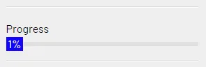
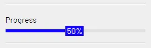
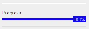
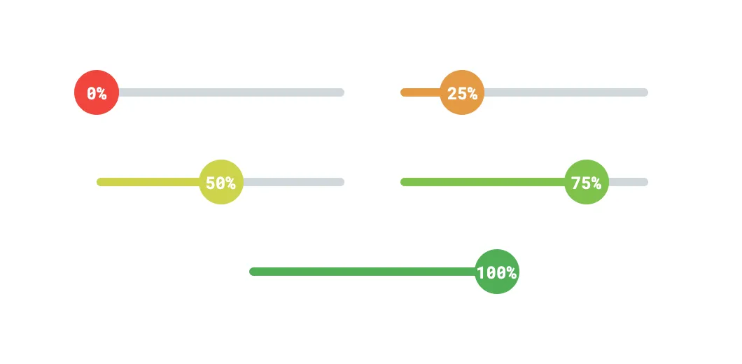
最终产品(截图,请在上面的代码片段底部点击“运行片段”以查看动画效果)。

CSS样式化的动画进度条

详细解释

HTML已经内置了一个<progress>元素,并包含几个伪元素,因此我真的想坚持使用它并围绕它进行样式设计。当与CSS Houdini的新@property定义相结合时,这被证明是非常成功的,它允许我们创建更动态的动画等等。

事实上,Temani Afif发布了另一个很棒的答案,关于这个问题,他在这里写了一篇很棒的文章(We can finally animate CSS gradient by Temani Afif)。

使用新的@property定义不仅允许我们动画化进度条的实际值,我们可以用它来改变进度条内进度值的宽度和%标签,还可以在进度变化时生成动态颜色变化。

在我下面的示例中,我选择从红色到绿色过渡以表示进度。如果您希望使用单一颜色而不是这种变化的颜色,请将所有--progress-value-color HSL值替换为单一颜色值。

同样地,我在animation行中使用了一个calc()来调整每个进度条动画的animation-duration,以使它们以相同的速率移动,因此每个进度条不是同时开始和完成动画,而是在相同的时间通过相同的值。这意味着,如果两个进度条达到50%,其中一个的值为50%,那么该进度条将停止动画,而另一个进度条将继续动画到其新值。

如果您希望所有进度条都开始和结束的时间同步,只需用单个时间值(例如750毫秒、3秒等)替换那个calc()即可。请保留HTML标记。

@property --progress-value {
  syntax: "<integer>";
  inherits: true;
  initial-value: 0;
}
:root {
  --progress-bar-color: #cfd8dc;
  --progress-value-color: #2196f3;
  --progress-empty-color-h: 4.1;
  --progress-empty-color-s: 89.6;
  --progress-empty-color-l: 58.4;
  --progress-filled-color-h: 122.4;
  --progress-filled-color-s: 39.4;
  --progress-filled-color-l: 49.2;
}

html, body {
  height: 100%;
}

body {
  display: flex;
  align-items: center;
  justify-content: space-evenly;
  flex-direction: column;
  margin: 0;
  font-family: "Roboto Mono", monospace;
}

progress[value] {
  display: block;
  position: relative;
  -webkit-appearance: none;
     -moz-appearance: none;
          appearance: none;
  height: 6px;
  border: 0;
  --border-radius: 10px;
  border-radius: var(--border-radius);
  counter-reset: progress var(--progress-value);
  --progress-value-string: counter(progress) "%";
  --progress-max-decimal: calc(var(--value, 0) / var(--max, 0));
  --progress-value-decimal: calc(var(--progress-value, 0) / var(--max, 0));
  --progress-value-percent: calc(var(--progress-value-decimal) * 100%);
  --progress-value-color: hsl(
    calc((var(--progress-empty-color-h) + (var(--progress-filled-color-h) - var(--progress-empty-color-h)) * var(--progress-value-decimal)) * 1deg)
    calc((var(--progress-empty-color-s) + (var(--progress-filled-color-s) - var(--progress-empty-color-s)) * var(--progress-value-decimal)) * 1%)
    calc((var(--progress-empty-color-l) + (var(--progress-filled-color-l) - var(--progress-empty-color-l)) * var(--progress-value-decimal)) * 1%)
  );
  -webkit-animation: calc(1s * var(--progress-max-decimal)) ease-out 0s 1 normal both progress;
          animation: calc(1s * var(--progress-max-decimal)) ease-out 0s 1 normal both progress;
}
@supports selector(::-moz-progress-bar) {
  progress[value] {
    --progress-value-decimal: calc(var(--value, 0) / var(--max, 0));
  }
}

progress[value]::-webkit-progress-bar {
  background-color: var(--progress-bar-color);
  border-radius: var(--border-radius);
  overflow: hidden;
}

progress[value]::-webkit-progress-value {
  width: var(--progress-value-percent) !important;
  background-color: var(--progress-value-color);
  border-radius: var(--border-radius);
}

progress[value]::-moz-progress-bar {
  width: var(--progress-value-percent) !important;
  background-color: var(--progress-value-color);
  border-radius: var(--border-radius);
}

progress[value]::after {
  display: flex;
  align-items: center;
  justify-content: center;
  --size: 32px;
  width: var(--size);
  height: var(--size);
  position: absolute;
  left: var(--progress-value-percent);
  top: 50%;
  transform: translate(-50%, -50%);
  background-color: var(--progress-value-color);
  border-radius: 50%;
  content: attr(value);
  content: var(--progress-value-string, var(--value));
  font-size: 12px;
  font-weight: 700;
  color: #fff;
}

@-webkit-keyframes progress {
  from {
    --progress-value: 0;
  } to {
    --progress-value: var(--value);
  }
}

@keyframes progress {
  from {
    --progress-value: 0;
  } to {
    --progress-value: var(--value);
  }
}
<progress value="0" max="100" style="--value: 0; --max: 100;"></progress>
<progress value="25" max="100" style="--value: 25; --max: 100;"></progress>
<progress value="50" max="100" style="--value: 50; --max: 100;"></progress>
<progress value="75" max="100" style="--value: 75; --max: 100;"></progress>
<progress value="100" max="100" style="--value: 100; --max: 100;"></progress>

CodePen链接:cdpn.io/e/RwpyZGo


对于每个进度条,我们需要声明valuemax作为属性以及CSS自定义属性(变量),这显然并不理想。但是,CSSWG目前正在对attr()进行几项改进,这将使我们很快能够以任何指定格式访问这些属性值,而无需像我在上面的示例中那样增加使用CSS自定义属性。

attr()的浏览器支持

CSS attr browser support

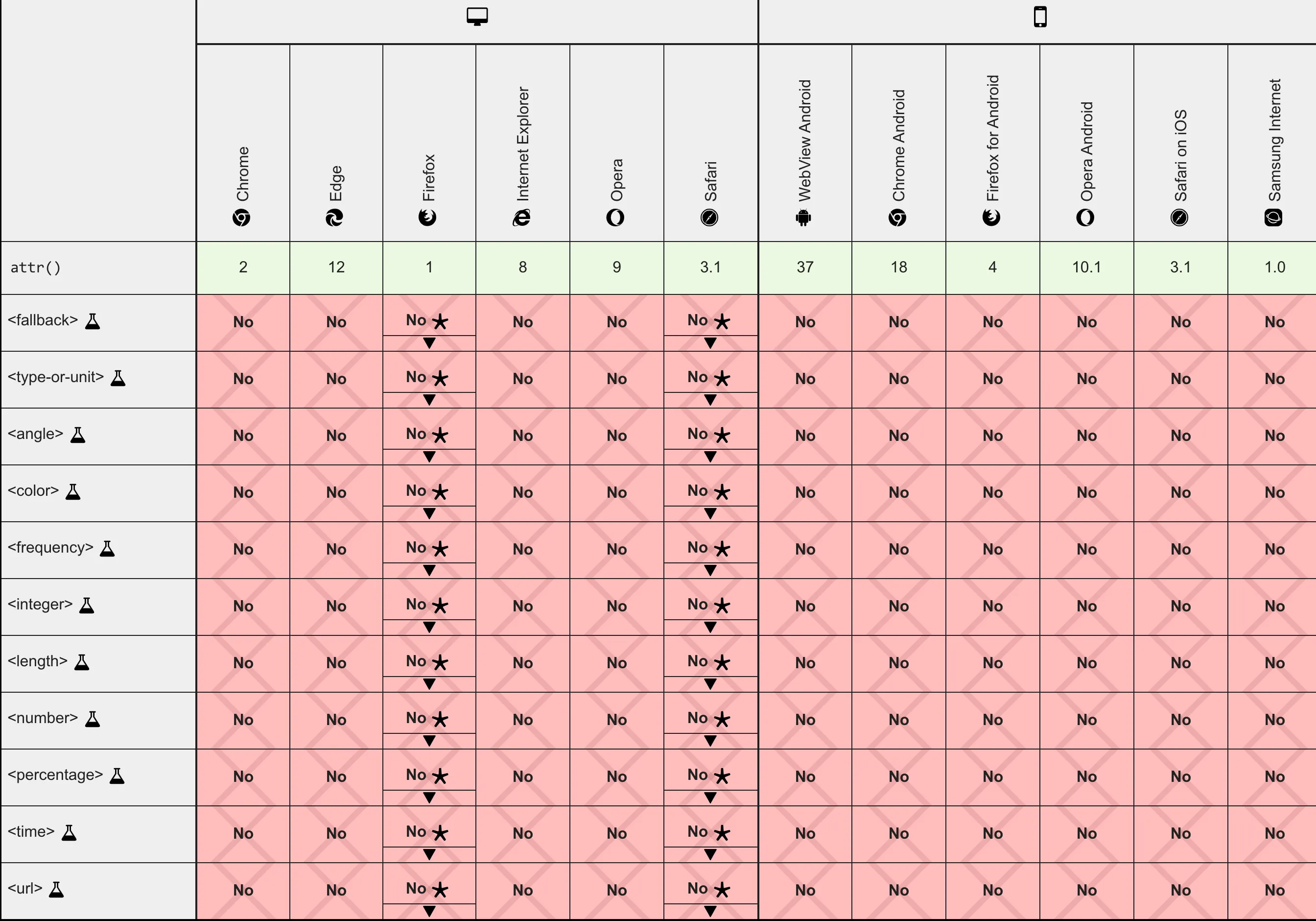
正如您可以在此处^从官方MDN关于attr()的文档中看到的浏览器支持部分,目前对于attr()的这些附加功能,如回退和类型或单位,支持非常有限。我们还需要能够在任何CSS属性(特别是CSS自定义属性)中使用attr(),而不仅仅是content属性,才能完全避免使用CSS自定义属性的解决方法。

这些改进目前处于“编辑草案”状态,没有生产浏览器支持,但这可能会在明年早些时候发生变化。因此,现在我们需要除了属性之外还要使用CSS自定义属性。另外,这个新的属性定义在Firefox中尚未得到支持,但我的解决方案包括一个@supports查询回退,仍然可以确保进度条的宽度和颜色根据其值正确显示。

一旦所有这些CSS和Houdini更新在所有主要浏览器中都可用,希望明年就能实现所有这些,只需使用本机HTML属性即可:

<progress value="0" max="100"></progress>
<progress value="25" max="100"></progress>
<progress value="50" max="100"></progress>
<progress value="75" max="100"></progress>
<progress value="100" max="100"></progress>

在这种情况下,我们不再使用CSS自定义属性值--value--max,而是可以通过以下方式在CSS中设置它们:

progress[value] {
  --value: attr(value number);
}
progress[max] {
  --max: attr(max number);
}

其余的逻辑将保持不变。关于attr()的更多细节,请参考此处的MDN文档:attr()


感谢Brandon McConnell提供的清晰且文档化/澄清的答案。详细解释您是如何(以及为什么)得出这个解决方案的过程,使您赢得了我的奖励。事实上,我们都知道Temani Afif是CSS天才,他创造了这个难题的杰作;) :) - Sam

1
除了我的其他定制解决方案外,我还想发布一个回答,特别回答您最初提出的问题,而不是提供不同或替代性解决方案。
您内部元素未能完美居中的原因是其div本质上占用了其父元素的100%宽度,由于其应用了内联width样式,因此占用了其父元素宽度的50%。文本被右对齐,这意味着文本的右侧将紧贴中间的50%标记,但它不会在.fullbar元素内完全居中。
不过,不需要太多定制,我个人更喜欢将.number元素绝对定位(position: absolute),这样其祖先元素的大小就不受其自身大小的影响。这样可以使其独立。
以下是我们如何实现这一点:

html, body { height: 100%; }

body {
    display: flex;
    align-items: center;
    justify-content: center;
  margin: 0;
  padding: 0 20px;
  background-color: #ccc;
}

.fullbar {
  background-color: blue;
  width: 100%;
  height: 10px;
}

.progress {
  position: relative;
  background: green;
  height: 100%;
}

.number {
  display: flex;
  align-items: center;
  justify-content: center;
  position: absolute;
  right: 0;
  top: 50%;
  transform: translate(50%, -50%);
  background: inherit;
  color: #fff;
  padding: 4px;
  padding: 0 2px 1px 3px;
}
<div class="fullbar">
  <div class="progress" style="width: 50%">
    <div class="number">50%</div>
  </div>
</div>

最后,如果您想使用CSS自定义属性使原始解决方案成为单行工作,我们可以这样做:

html, body { height: 100%; }

body {
    display: flex;
    align-items: center;
    justify-content: center;
  margin: 0;
  padding: 0 20px;
  background-color: #ccc;
}

.progress {
  counter-reset: progress var(--value);
  --value-percent: calc(var(--value) * 1%);
  position: relative;
  width: 100%;
  height: 10px;
  background-color: blue;
}

.progress::before {
  content: '';
  display: block;
  position: relative;
  width: var(--value-percent);
  height: 100%;
  background: green;
}

.progress::after {
  content: counter(progress) '%';
  display: flex;
  align-items: center;
  justify-content: center;
  position: absolute;
  left: var(--value-percent);
  top: 50%;
  transform: translate(-50%, -50%);
  background: green;
  color: #fff;
  padding: 2px 4px;
}
<div class="progress" style="--value: 50"></div>


网页内容由stack overflow 提供, 点击上面的
可以查看英文原文,
原文链接