我正在创建一个在线商店,想用图片和“图像颜色更改器”来做出好的动画效果,就像其他在线商店一样。
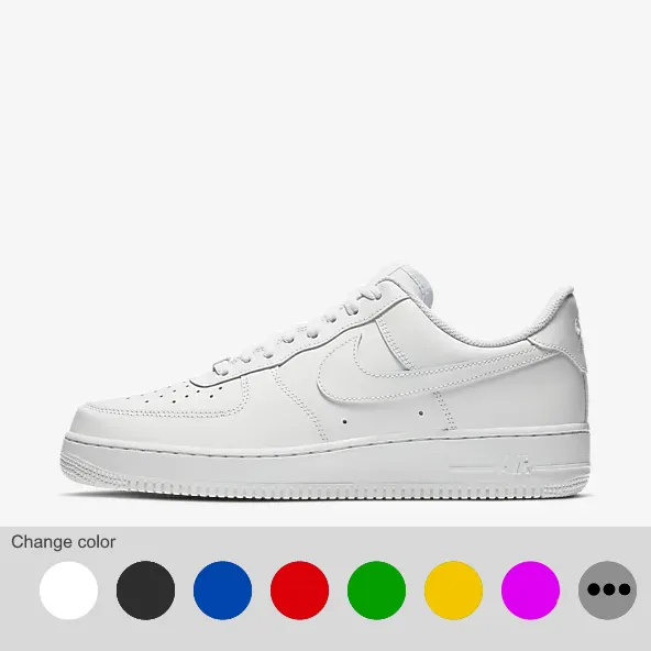
当你将鼠标移动到图像上方时,我希望它会显示一个带有点和颜色更改选项的条形。
我已经配置了图像和箭头以在图像之间切换,以及图像下方的点,但我只想在鼠标在上方时显示这些点。
类似于 这个。
我已经有代码,但我不知道在哪里和如何编写代码才能实现这一目标。
当你将鼠标移动到图像上方时,我希望它会显示一个带有点和颜色更改选项的条形。
我已经配置了图像和箭头以在图像之间切换,以及图像下方的点,但我只想在鼠标在上方时显示这些点。
类似于 这个。
我已经有代码,但我不知道在哪里和如何编写代码才能实现这一目标。
let slideIndex = 1;
showSlides(slideIndex);

// Next/previous controls
function plusSlides(n) {
  showSlides(slideIndex += n);
}

// Thumbnail image controls
function currentSlide(n) {
  showSlides(slideIndex = n);
}

function showSlides(n) {
  let i;
  let slides = document.getElementsByClassName("mySlides");
  let dots = document.getElementsByClassName("dot");
  if (n > slides.length) {
    slideIndex = 1
  }
  if (n < 1) {
    slideIndex = slides.length
  }
  for (i = 0; i < slides.length; i++) {
    slides[i].style.display = "none";
  }
  for (i = 0; i < dots.length; i++) {
    dots[i].className = dots[i].className.replace(" active", "");
  }
  slides[slideIndex - 1].style.display = "block";
  dots[slideIndex - 1].className += " active";
}
* {
box-sizing: border-box
}
/* Slideshow container */
.slideshow-container {
max-width: 1000px;
position: relative;
margin: auto;
}
/* Hide the images by default */
.mySlides {
display: none;
}
/* Next & previous buttons */
.prev,
.next {
cursor: pointer;
position: absolute;
top: 50%;
width: auto;
margin-top: -22px;
padding: 16px;
color: white;
font-weight: bold;
font-size: 18px;
transition: 0.6s ease;
border-radius: 0 3px 3px 0;
user-select: none;
}
/* Position the "next button" to the right */
.next {
right: 0;
border-radius: 3px 0 0 3px;
}
/* On hover, add a black background color with a little bit see-through */
.prev:hover,
.next:hover {
background-color: rgba(0, 0, 0, 0.8);
}
/* Caption text */
.text {
color: #f2f2f2;
font-size: 15px;
padding: 8px 12px;
position: absolute;
bottom: 8px;
width: 100%;
text-align: center;
}
/* Number text (1/3 etc) */
.numbertext {
color: #f2f2f2;
font-size: 12px;
padding: 8px 12px;
position: absolute;
top: 0;
}
/* The dots/bullets/indicators */
.dot {
cursor: pointer;
height: 10px;
width: 10px;
margin: 0 2px;
background-color: #bbb;
border-radius: 50%;
display: inline-block;
transition: background-color 0.6s ease;
}
.active,
.dot:hover {
background-color: #717171;
}<!-- Slideshow container -->
<div class="slideshow-container">
<!-- Full-width images with number and caption text -->
<div class="mySlides fade">
<div class="numbertext">1 / 4</div>
<img src="https://imgur.com/cO9OxGF.png" style="width:100%">
</div>
<div class="mySlides fade">
<div class="numbertext">2 / 4</div>
<img src="https://imgur.com/mN2ZEE5.png" style="width:100%">
</div>
<div class="mySlides fade">
<div class="numbertext">3 / 4</div>
<img src="https://imgur.com/l1Q0Irp.png" style="width:100%">
</div>
<div class="mySlides fade">
<div class="numbertext">4 / 4</div>
<img src="https://imgur.com/2qQaYoG.png" style="width:100%">
</div>
<!-- Next and previous buttons -->
<a class="prev" onclick="plusSlides(-1)">❮</a>
<a class="next" onclick="plusSlides(1)">❯</a>
</div>
<br>
<!-- The dots/circles -->
<div style="text-align:center">
<span class="dot" onclick="currentSlide(1)" mouseenter=""></span>
<span class="dot" onclick="currentSlide(2)"></span>
<span class="dot" onclick="currentSlide(3)"></span>
<span class="dot" onclick="currentSlide(4)"></span>
</div>