TailwindCss 固定导航栏

56

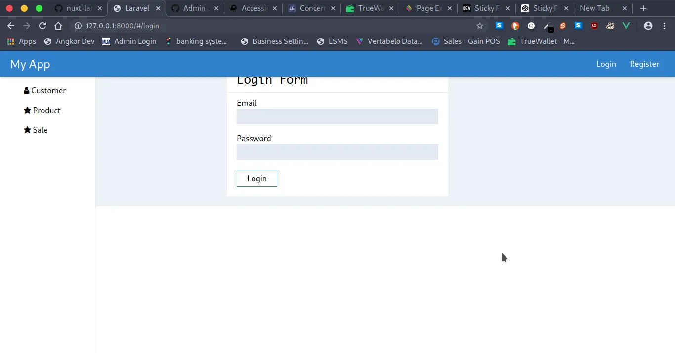
我正在尝试在 Tailwind CSS 中创建一个固定的导航栏,并使主页面滚动时保持粘性,但无论我尝试什么,都无法让它正常工作...

这是我已经实现的内容:

输入图像描述

这是我的代码:

<!-- NavBar -->
<header class="fixed bg-blue-600 shadow-md  z-50 w-full px-5 py-2 flex justify-between items-center">
    <router-link to="/" class="text-2xl text-white">My App</router-link>
    <div>
        <router-link to="/login" class="text-white hover:bg-gray-700 px-3 rounded py-1">Login</router-link>
        <router-link to="/register" class="text-white hover:bg-gray-700 px-3 rounded py-1">Register</router-link>
    </div>
</header>
<div class="flex">
    <!-- Sidebar -->
    <aside class="fixed bg-white h-screen py-5 shadow">
        <div class="flex flex-col text-left">
            <router-link to="/" class="hover:bg-gray-400 px-12 py-2 rounded">
                <i class="fa fa-dashboard"></i>
                <span class="">Dashboard</span>    
            </router-link>
        </div>
    </aside>
    <!-- Main Page -->
    <main class="bg-gray-200  flex-1">
        <transition name="slide-fade">
            <router-view></router-view>
        </transition>
    </main>
</div>
5个回答

194

如果有人仍在寻找解决方法,这里是使用正确的tailwind类的解决方案。

我的布局看起来像这样:

<div>
   <header class="sticky top-0 z-50"></header>
   <main class=relative></main>
   <footer></footer>
</div>

这在Chrome中完美运行,但在Safari中不“粘性”。 - CJ Thompson
刚在Safari中测试过,对我来说很好用(也就是粘性的)。 - jfunk
在 Safari 和 Firefox 中也适用于我。 - luxo
这个在2022年不起作用。我正在将它应用于<nav>,但是它就是不起作用。有趣的是Tailwind文档上也是这样。下面是我的代码:<nav className="sticky top-0 flex w-full items-center justify-between py-6"> - AnatuGreen
非常感谢,这对我有用。 这是我所做的:<header className="sticky top-0 z-50"> <div className="relative"> <nav> </nav> </div> </header> - Zain Sadaqat

14

这里提供了只使用 Flexbox 的解决方案。

CodeSandbox link

<!DOCTYPE html>
<html lang="en">
  <head>
    <meta charset="UTF-8" />
    <meta name="viewport" content="width=device-width, initial-scale=1.0" />
    <meta http-equiv="X-UA-Compatible" content="ie=edge" />
    <title>Sticky-header-and-footer-with-tailwind</title>
    <link
      href="https://cdn.jsdelivr.net/npm/tailwindcss/dist/tailwind.min.css"
      rel="stylesheet"
    />
  </head>

  <body>
    <div class="flex flex-col h-screen">
      <header class="py-5 bg-gray-700 text-white text-center">
        Sticky Header and Footer with Tailwind
      </header>
      <main class="flex-1 overflow-y-auto p-5">
        What is Lorem Ipsum? Lorem Ipsum is simply dummy text of the printing
        and typesetting industry. Lorem Ipsum has been the industry's standard
        dummy text ever since the 1500s, when an unknown printer took a galley
        of type and scrambled it to make a type specimen book. It has survived
        not only five centuries, but also the leap into electronic typesetting,
        the 1914 translation by H. Rackham.
      </main>
      <footer class="py-5 bg-gray-700 text-center text-white">
        Tailwind is Awesome 
      </footer>
    </div>
  </body>
</html>


在 iPhone 和 Chrome 上使用此方法存在滚动问题。当您滚动到底部时,似乎出现了两个不同的滚动条,并且无法正常工作。 - Savandy

12
使用Tailwind中的“Fixed NavBar”。 以下是模板代码,供您开始使用:

<!DOCTYPE html>
<html lang="en">
<head>
    <meta charset="UTF-8">
    <meta name="viewport" content="width=device-width, initial-scale=1.0">
    <meta http-equiv="X-UA-Compatible" content="ie=edge">
    <title>Tailwind Starter Template - Fixed Header : Tailwind Toolbox</title>
    <meta name="author" content="name">
    <meta name="description" content="description here">
    <meta name="keywords" content="keywords,here">
    <link href="https://unpkg.com/tailwindcss/dist/tailwind.min.css" rel="stylesheet"> <!--Replace with your tailwind.css once created-->
    <link href="https://afeld.github.io/emoji-css/emoji.css" rel="stylesheet"> <!--Totally optional :) -->
    
</head>
<body class="bg-gray-400 font-sans leading-normal tracking-normal">

    <!--Nav-->
    <nav class="bg-gray-800 p-2 mt-0 fixed w-full z-10 top-0">
        <div class="container mx-auto flex flex-wrap items-center">
            <div class="flex w-full md:w-1/2 justify-center md:justify-start text-white font-extrabold">
                <a class="text-white no-underline hover:text-white hover:no-underline" href="#">
                    <span class="text-2xl pl-2"><i class="em em-grinning"></i> Brand McBrandface</span>
                </a>
            </div>
            <div class="flex w-full pt-2 content-center justify-between md:w-1/2 md:justify-end">
                <ul class="list-reset flex justify-between flex-1 md:flex-none items-center">
                  <li class="mr-3">
                    <a class="inline-block py-2 px-4 text-white no-underline" href="#">Active</a>
                  </li>
                  <li class="mr-3">
                    <a class="inline-block text-gray-600 no-underline hover:text-gray-200 hover:text-underline py-2 px-4" href="#">link</a>
                  </li>
                  <li class="mr-3">
                    <a class="inline-block text-gray-600 no-underline hover:text-gray-200 hover:text-underline py-2 px-4" href="#">link</a>
                  </li>
                    <li class="mr-3">
                    <a class="inline-block text-gray-600 no-underline hover:text-gray-200 hover:text-underline py-2 px-4" href="#">link</a>
                  </li>
                </ul>
            </div>
        </div>
    </nav>


    <!--Container-->
    <div class="container shadow-lg mx-auto bg-white mt-24 md:mt-16 h-screen">
        
    <p>Here you Go!</p>
        
    </div>


</body>
</html>


2

你可以尝试另一种简单的组合。

<nav class="w-full fixed top-0 z-50">

  <!--Your content inside navbar -->
  <div class="container-fluid"></div>

</nav>

根据给定的源代码,它应该是这样的。
<div>
   <header class="fixed top-0 z-50"></header>
   <main class=relative></main>
   <footer></footer>
</div>

1
尝试在Tailwind导航栏中使用Flex。

<link href="https://cdn.jsdelivr.net/npm/boxicons@latest/css/boxicons.min.css" rel="stylesheet"/>
<link href="https://unpkg.com/tailwindcss@^2/dist/tailwind.min.css" rel="stylesheet"/>
<nav class="bg-gray-100 fixed inset-x-0">
      <div class="max-w-6xl mx-auto px-4">
        <div class="flex justify-between">
            <div class="flex space-x-4">
                <!-- logo -->
                 <div> <a href="#" class="flex items-center py-5 px-2 text-gray-700 hover:text-gray-900"> <i class='bx bxl-medium-old mr-1 text-xl mb-1 text-blue-400'></i> 
        <span class="font-bold">Moto Dev</span> </a> </div> <!-- primary nav -->
                <div class="hidden md:flex items-center space-x-1"> <a href="#" class="py-5 px-3 text-gray-700 hover:text-gray-900">Home</a> <a href="#" class="py-5 px-3 text-gray-700 hover:text-gray-900">Contact</a> <a href="#" class="py-5 px-3 text-gray-700 hover:text-gray-900">Pricing</a> <a href="#" class="py-5 px-3 text-gray-700 hover:text-gray-900">Features</a> </div>
            </div> <!-- secondary nav -->
            <div class="hidden md:flex items-center space-x-1"> <a href="" class="py-5 px-3">Login</a> <a href="" class="py-2 px-3 bg-yellow-400 text-white hover:bg-yellow-300 text-sm hover:text-yellow-800 rounded transition duration-300">Signup</a> </div> <!-- mobile button goes here -->
            <div class="md:hidden flex items-center"> <button class="mobile-menu-button focus:outline-none"> <i class='bx bx-menu text-3xl mt-1'></i> </button> </div>
        </div>
      </div> <!-- mobile menu -->
         <div class="mobile-menu hidden md:hidden"> <a href="#" class="block py-2 px-4 text-sm hover:bg-gray-200">Home</a> <a href="#" class="block py-2 px-4 text-sm hover:bg-gray-200">Contact</a> <a href="#" class="block py-2 px-4 text-sm hover:bg-gray-200">Pricing</a> 
    <a href="#" class="block py-2 px-4 text-sm hover:bg-gray-200">Features</a> </div>
       </nav>
<!-- content goes here -->
     <div class="py-32 bg-red-500 h-screen p-3"> </div>

或者访问Tailwind CSS导航栏


网页内容由stack overflow 提供, 点击上面的
可以查看英文原文,
原文链接