我有一个基于websocket的终端会话。我希望字体大小增加以填充div,使其始终为80个字符宽。最好的方法是什么?如果有CSS-only的方法就更好了,但是我已经在使用jQuery,所以Vanilla JavaScript或jQuery解决方案也可以。
在一行中,将等宽字体缩放以适应固定数量的字符
9
- Phil Lello
5
这似乎不是您想要处理此事的方式,但无论如何,http://fittextjs.com/。 - Nickfmc
你考虑使用em作为宽度测量单位如何? - jbutler483
你可能会发现这个Codepen演示很有用:http://codepen.io/dcdev/pen/sICnf - davidcondrey
@jbutler483,最初在排版中,“em”被定义为字母“M”的宽度,但在CSS中,它被定义为高度。请参见http://www.w3.org/WAI/GL/css2em.htm:“*多年来,“em”的含义已经发生了变化...因此,该术语现在意味着字体的高度-而不是字母“M”的宽度。”* - Rick Hitchcock
刚刚在GitHub上创建了fixie.js,基于我的答案中的示例代码。它类似于FitText和BigText,但适用于固定宽度字体。值得一提的是,在支持最广泛的浏览器中选择em作为字体大小单位并采用标尺方法是关键。 - dperish
7个回答
4
对于支持小数字体大小或CSS
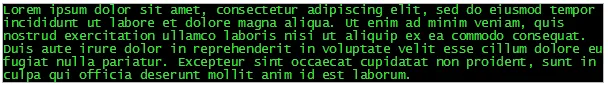
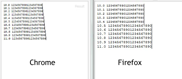
在这张截图中,第四行恰好有80个字符:
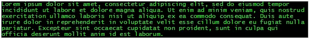
下面是使用12px字体的相同文本:
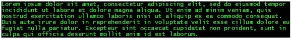
在这种情况下,您必须缩小或扩大容器来匹配字体:
如果浏览器不支持小数字体大小,则会调整容器的宽度以匹配字体大小。
然后删除该span。
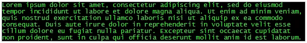
text-rendering: geometricPrecision的浏览器,您可以获得一个固定宽度的字体,以完美适应任何边界。在这张截图中,第四行恰好有80个字符:
下面是使用12px字体的相同文本:
在这种情况下,您必须缩小或扩大容器来匹配字体:
word-wrap: break-word;。它使用getClientRects()来确定二进制搜索的上限和下限,以进行最佳字体大小的二进制搜索。如果浏览器不支持小数字体大小,则会调整容器的宽度以匹配字体大小。
然后删除该span。
$('div').each(function() {
  var x= $('<span>'+Array(80).join('x')+'</span>').appendTo(this),
      lo= 0.1,
      hi= 50,
      mid;
  do {
    mid= (lo+hi)/2;
    $(this).css({
      fontSize: mid
    });
    if(x[0].getClientRects().length > 1) {
      hi= mid;
    }
    else {
      lo= mid;
    }
  } while(Math.abs(hi-lo)>0.001);
  while(x[0].getClientRects().length === 1) {
    $(this).css({
      width: '-=1'
    });
  }
  while(x[0].getClientRects().length === 2) {
    $(this).css({
      width: '+=1'
    });
  }
  x.remove();
});
已在Chrome、IE、Firefox、Safari和Opera中进行了测试。
Fiddle
- Rick Hitchcock
4
这是一个基于the8472的回答的纯CSS示例:
div,textarea{
    width:100%;
    max-width: 100%;
    box-sizing: border-box;
    -moz-box-sizing: border-box;
    font-family:  "Lucida Console", Monaco, monospace;
    font-size: 1.99vw; /* The text overflows in safari using (int)2 */
    white-space: nowrap;
    overflow-x:hidden;

    /* styling */
    background:#09f;
    min-height: 100px;
    margin-bottom: 30px;
}
它是如何工作的?
为了获得正确的字体大小,将160除以每行要适合的字符数,减去0.01。
http://jsfiddle.net/mb2L4mee/1/
已在Chrome、FF和Safari中测试。
- Etienne Martin
6
1任何公式可以将1.99与80个字符相关联吗? - flup
这并不涉及真正的数学,只是为了解决Safari浏览器问题的一种快速而简单的方法。 - Etienne Martin
我的意思是,比如说我想要显示76个字符或35个字符,那我应该输入哪个数字?如何从一行中的字符数计算出视图空间的百分比?这与字体有关吗? - flup
1每行字符数除以160。减去0.01是因为Safari。 - Etienne Martin
1这将取决于字体面部比例和div大小,它可能不是100%。 无论如何,1 vw = 1%视口宽度,字体大小定义其高度... - miguel-svq
这将允许每行83个字符而不是80个。如果您添加更多文本并删除“white-space:nowrap”,则会在扩展和缩小视口时看到它在不同的单词处换行。 - Rick Hitchcock
2
一种方法是计算固定font-size下80个字符行的大小,并在resize事件上注册一个函数来根据终端大小调整font-size。
<div id="terminal">
    <div class="text">
        Some text
    </div>
</div>

function scale(lineWith) { /* lineWidth based on 80char 10px font-size */
    var ratio = $('#terminal').width() / lineWith;
    $('.text').css('font-size', (10 * ratio) + 'px');
}
$(window).resize(function(){
    scale(lineWith)
});
示例:http://jsfiddle.net/44x56zsu/
在Chrome(版本39.0.2171.99 m)中,这似乎调整得很好。
但是,我认为在所有浏览器中都不可能将font-size精确调整到适合容器大小,因为小数值会被四舍五入。
字体大小测试:http://jsfiddle.net/ahaq49t1/
一些浏览器中的此舍入问题会防止使用字体属性进行完全调整。
- Tobías
1
不确定这是否是最优雅的解决方案,还需要进一步完善。但您可以测量字体大小。创建一个隐藏的测量条以查看字体在像素上的宽度。 使用所需数量的字符填充它(此处仅用20作为演示目的):
<span id="measureBar">12345678901234567890</span>
不断增加度量条的字体大小,并找到最大宽度,使其仍然不超过 div 的宽度:
$(
  function() {
    var $measureBar = $('#measureBar');
    var $console = $('#console');
    $measureBar.css('font-size', '1px');
    for (i = 1; $measureBar.width() <= $console.width(); i++) {
      $measureBar.css('font-size', i + 'px');
    }
    $console.css('font-size', (i - 1) + 'px');
  }
)
#console {
background-color: black;
color: white;
}
#measureBar {
display: none;
}
#measureBar,
#console {
font-family: courier;
}<script src="https://ajax.googleapis.com/ajax/libs/jquery/2.1.1/jquery.min.js"></script>
<span id="measureBar">12345678901234567890</span>
<div id="console">12345678901234567890 Text that should be twenty characters wide.</div>- flup
1
在一定范围内,纯CSS可能是可行的。如果您知道div占用视口的比例,则可以根据视口宽度缩放字体。
.terminal {font-size: 1vw;}将导致一个字体大小(垂直)相当于视口的1%。由于等宽字体还具有固定的宽高比,因此宽度取决于字体和视口大小的宽高比。- the8472
0
我曾经面临过非常相似的需求,并想出了一个相当简单的解决方案。一旦我有些空闲时间,我将围绕这个示例代码编写一个jQuery插件。
正如其他答案中提到的那样,关键是使用em作为字体大小单位。此外,为了在所有(现代)浏览器中实现类似的布局,对于必须处理各种固定宽度字体的解决方案,标尺方法是我发现最可靠的方法。
function fixieRemeasure() {
    var offset =  document.getElementById("fixie").offsetWidth,
        ruler = (document.getElementById("fixieRuler").offsetWidth * 1.01),
        fontSize = (offset / ruler);
    document.getElementById("fixie").style.fontSize = fontSize + "em";
}

function fixieInit(columns) {
    document.getElementById("fixieRuler").innerText =
            new Array(columns + 1).join("X").toString();
    fixieRemeasure();
}

(function () {
    fixieInit(80);
    window.onresize = function () { fixieRemeasure(); };
} ());
#fixie {
padding: 0 2px 0 6px;
font-size: 1em;
background-color: #000;
color: #0F0;
}
#fixieRuler {
font-size: 1em;
visibility: hidden;
}<code id="fixieRuler"></code>
<div id="fixie">
<pre>+------------------------------------------------------------------------------+
| |
| ,%%%, |
| ,%%%` %==-- |
| ,%%`( '| |
| ,%%@ /\_/ |
| ,%.-"""--%%% "@@__ |
| %%/ |__`\ |
| .%'\ | \ / // |
| ,%' > .'----\ | [/ |
| < <<` || |
| `\\\ || |
| )\\ )\ |
| ^^^jgs^^"""^^^^^^""^^^^^^^^^^^^^^^^^^^^^^^^^^^^^^^^^^^^^^^^^^^^^^^^^^ |
| ASCII Art: http://www.chris.com/ascii/index.php?art=animals/horses |
+------------------------------------------------------------------------------+</pre>
</div>这只是一个概念验证,其中存在一些相当明显的问题。主要是,resize方法被连续调用,应该用类似于onResizeEnd的东西替换,并在生产使用之前正确地附加到DOM上。为了组件化,我会使用类选择器而不是id,并且还会动态地插入/删除标尺元素。
希望它有所帮助。
更新
我创建了一个新项目,fixie.js on github,基于这个示例代码。在性能和模块化方面仍有一些工作要做,但它在所有浏览器中都运行良好,我相信它提供了最简单的方法来解决问题,只需要最少量的样板代码。
唯一的要求是您在em中为预先设置字体大小,并为它们提供格式为'fixie_COLS'的类名:
<pre class="fixie_80">I'll be 80 columns</pre>
将会有jQuery和Web组件的实现。这是MIT许可证的,欢迎任何贡献:https://github.com/dperish/fixie.js
- dperish
网页内容由stack overflow 提供, 点击上面的可以查看英文原文,
原文链接
原文链接