假设我有这个数据集(实际数据集有30多列和数千个ID)
    df <- data.frame(id = 1:5,
              admission = c("Severe", "Mild", "Mild", "Moderate", "Severe"),
              d1 = c(NA, "Moderate", "Mild", "Moderate", "Severe"),
              d2 = c(NA, "Moderate", NA, "Mild", "Moderate"),
              d3 = c(NA, "Severe", NA, "Mild", NA),
              d4 = c(NA, NA, NA, "Mild", NA),
              outcome = c("Dead", "Dead", "Alive", "Alive", "Dead"))
我想制作一个桑基图,以展示病人每日的严重程度变化情况。当观察值达到NA(表示已经达到某个结果)时,我希望节点直接链接到该结果。
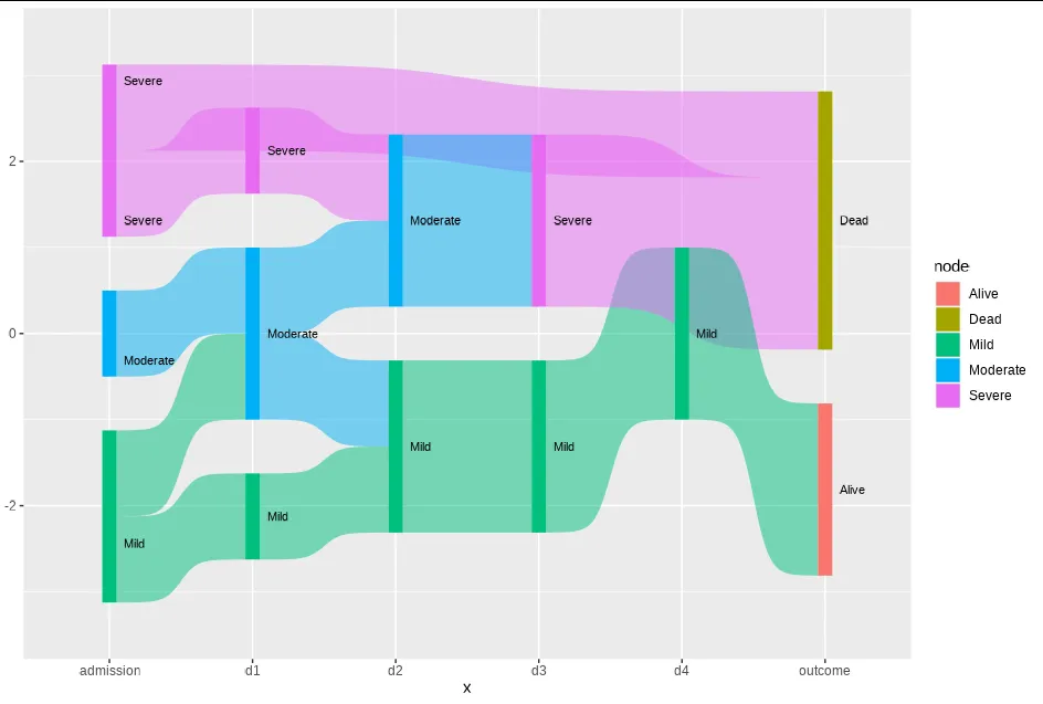
以下是图表预期效果:
 图片来自@qdread提出的问题,这里
使用能够实现吗?
图片来自@qdread提出的问题,这里
使用能够实现吗?这是我的当前代码:
df.sankey <- df %>%
    make_long(admission, d1, d2, d3, d4, outcome)
ggplot(df.sankey, aes(x = x,
                     next_x = next_x,
                     node = node,
                     next_node = next_node,
                     fill = factor(node),
                     label = node)) +
    geom_sankey(flow. Alpha = 0.5,
                node. Color = NA,
                show. Legend = TRUE) +
    geom_sankey_text(size = 3, color = "black", fill = NA, hjust = 0, position = position_nudge(x = 0.1))
编辑
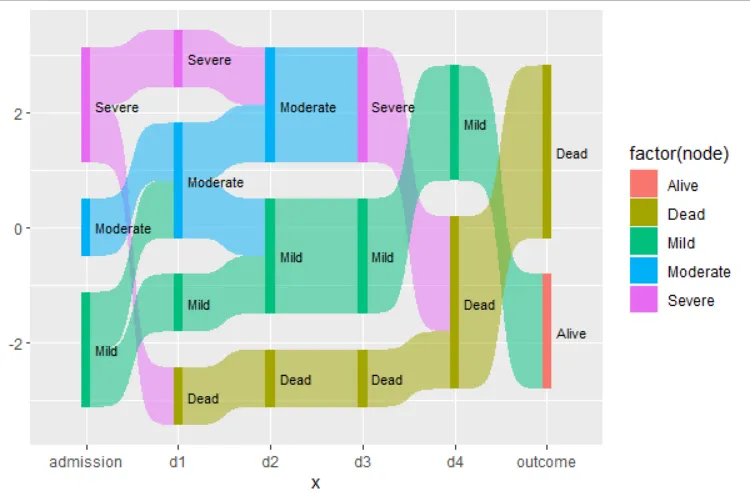
根据@Allan Cameron提供的解决方案,我成功地绕过了带有NA值的节点。然而,由于指向targets的链接没有排序,所以图表看起来相当复杂。
    do.call(rbind, apply(df, 1, function(x) {
    x <- na.omit(x[-1])
    data.frame(x = names(x), node = x,
               next_x = dplyr::lead(names(x)),
               next_node = dplyr::lead(x), row.names = NULL)
})) %>%
    ggplot(df.sankey, aes(x = x,
                          next_x = next_x,
                          node = node,
                          next_node = next_node,
                          fill = factor(node),
                          label = node)) +
    geom_sankey(flow.alpha = 0.5,
                node.color = NA,
                show.legend = TRUE) +
    geom_sankey_text(size = 3, color = "black", fill = NA, hjust = 0, position = position_nudge(x = 0.1))
这导致了这个图表:
 是否可能对Outcome的target链接进行排序,以便所有具有Severe值的链接得到聚合?
感谢您提前的帮助。