如何使用CSS形状来掩盖图像?
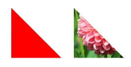
参考图片
我已经用CSS边框样式创建了一个形状,但无法将图像覆盖在上面。
CSS
#triangle-topleft {
  width: 0;
  height: 0;
  border-top: 100px solid red;
  border-right: 100px solid transparent;
}
选项1 - SVG
<svg width="100" height="100">
  <defs>
    <pattern id="a" patternUnits="userSpaceOnUse" width="100" height="100">
      <image xlink:href="http://lorempixel.com/300/300" x="0" y="0" width="100" height="100" />
    </pattern>
  </defs>
  <polygon points="0,0 100,0 50,100" fill="url(#a)" />
</svg>
已在Chrome、Firefox、IE9+上测试通过
选项2 - clip-path
.element {
  display:inline-block;
  -webkit-clip-path: polygon(50% 0%, 0% 100%, 100% 100%);
  clip-path: polygon(50% 0%, 0% 100%, 100% 100%);
}<div class="element">
<img src="https://s3.amazonaws.com/uifaces/faces/twitter/ok/128.jpg" />
</div>关于clip-path的很棒的教程: https://css-tricks.com/clipping-masking-css/
生成这种形状的工具: http://bennettfeely.com/clippy/
你可以使用 渐变 来实现。以下是一个示例代码:
div {
  width: 100px;
  height: 100px;
  background-image: linear-gradient(to bottom left, white 50%, transparent 0),
    url('http://lorempixel.com/100/100');
}<div></div>