我想绘制这个简单神经网络的输出:
model.compile(loss='binary_crossentropy', optimizer='adam', metrics=['accuracy'])
history = model.fit(x_test, y_test, nb_epoch=10, validation_split=0.2, shuffle=True)

model.test_on_batch(x_test, y_test)
model.metrics_names
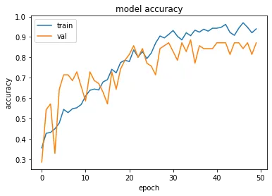
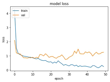
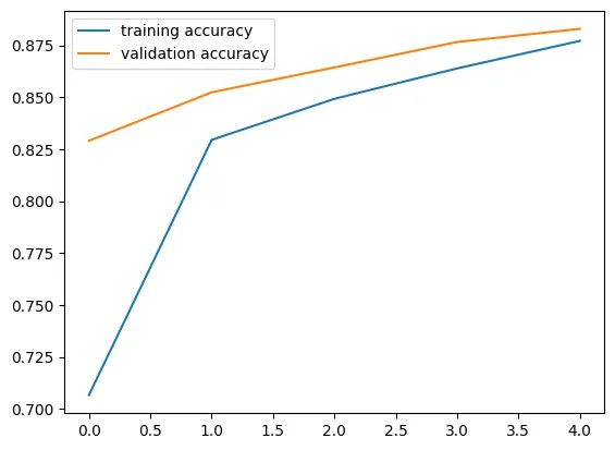
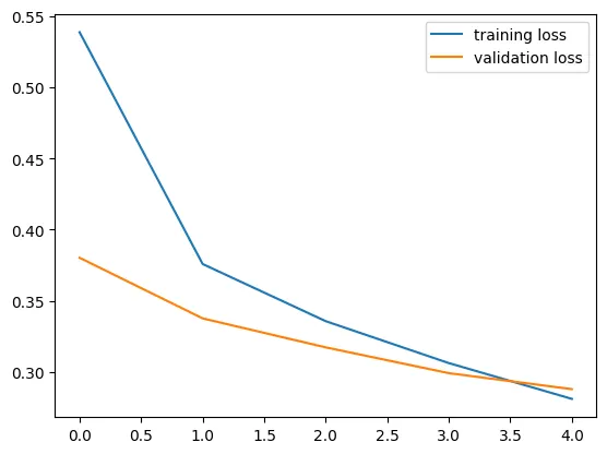
我已经绘制了训练和验证的准确度和损失:
print(history.history.keys())
#  "Accuracy"
plt.plot(history.history['acc'])
plt.plot(history.history['val_acc'])
plt.title('model accuracy')
plt.ylabel('accuracy')
plt.xlabel('epoch')
plt.legend(['train', 'validation'], loc='upper left')
plt.show()
# "Loss"
plt.plot(history.history['loss'])
plt.plot(history.history['val_loss'])
plt.title('model loss')
plt.ylabel('loss')
plt.xlabel('epoch')
plt.legend(['train', 'validation'], loc='upper left')
plt.show()
现在我想添加和绘制测试集的准确性,使用model.test_on_batch(x_test, y_test),但是从model.metrics_names中我获得了相同的值'acc'用于绘制训练数据准确性plt.plot(history.history['acc'])。我该如何绘制测试集准确性?