我有一个包含 six 个按钮开关的 mat-button-toggle-group。
在桌面上,所有按钮应该在一行中显示。在较小的屏幕上,该组应该分成两行显示按钮,就像这样: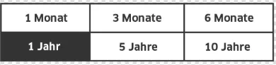
这是我的代码(我正在使用 flexbox-grid):
<mat-button-toggle-group class="col-xs-12">
      <mat-button-toggle class="col-xs-4 col-lg-2" value="1">1 Monat</mat-button-toggle>
      <mat-button-toggle class="col-xs-4 col-lg-2" value="3">3 Monate</mat-button-toggle>
      <mat-button-toggle class="col-xs-4 col-lg-2" value="6">6 Monate</mat-button-toggle>
      <mat-button-toggle class="col-xs-4 col-lg-2" value="12">1 Jahr</mat-button-toggle>
      <mat-button-toggle class="col-xs-4 col-lg-2" value="60">5 Jahre</mat-button-toggle>
      <mat-button-toggle class="col-xs-4 col-lg-2" value="120">10 Jahre</mat-button-toggle>
  </mat-button-toggle-group>
在桌面上运行正常,但在移动屏幕尺寸上,只有3个按钮可见(应该在第二行的三个按钮不可见):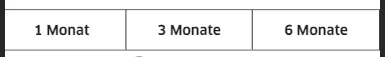
如何让我的mat-button-toggle-group分成两行?