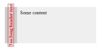
我有一段需要旋转和截断的文本:
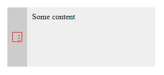
但是如果我在它上面应用省略号:
overflow: hidden;
text-overflow: ellipsis;
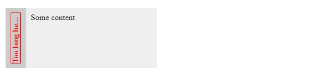
旋转的文本会变得太短:
.box {
  position: relative;
  width: 300px;
}

.box-header {
  position: absolute;
  top: 0;
  bottom: 0;
  display: flex;
  align-items: center;
  justify-content: center;
  width: 20px;
  padding: 10px;
  font-weight: bold;
  background: #ccc;
  color: red;
  min-width: 0;
}

.box-header > div {
  transform: rotate(-90deg);
  white-space: nowrap;
  overflow: hidden;
  text-overflow: ellipsis;
  border: 1px solid red;
}

.box-content {
  margin-left: 40px;
  padding: 10px;
  background: #eee;
}

.some-content {
  height: 100px;
}<div class="box">
<div class="box-header">
<div>Too long header text</div>
</div>
<div class="box-content">
<div class="some-content">Some content</div>
</div>
</div>