我通过创建自定义的SliverPersistentHeaderDelegate来解决了这个问题。
只需重写stretchConfiguration属性的getter方法即可。以下是我的代码,希望对你有用。
class LargeCustomHeader extends SliverPersistentHeaderDelegate {
LargeCustomHeader(
{this.children,
this.title = '',
this.childrenHeight = 0,
this.backgroundImage,
this.titleHeight = 44,
this.titleMaxLines = 1,
this.titleTextStyle = const TextStyle(
fontSize: 30,
letterSpacing: 0.5,
fontWeight: FontWeight.bold,
height: 1.2,
color: ColorConfig.primaryContrastColor)}) {}
final List<Widget> children;
final String title;
final double childrenHeight;
final String backgroundImage;
final int _fadeDuration = 250;
final double titleHeight;
final int titleMaxLines;
final double _navBarHeight = 56;
final TextStyle titleTextStyle;
@override
Widget build(
BuildContext context, double shrinkOffset, bool overlapsContent) {
return Container(
constraints: BoxConstraints.expand(),
decoration: BoxDecoration(
color: Colors.black,
),
child: Stack(
fit: StackFit.loose,
children: <Widget>[
if (this.backgroundImage != null) ...[
Positioned(
top: 0,
left: 0,
right: 0,
bottom: 0,
child: FadeInImage.assetNetwork(
placeholder: "assets/images/image-placeholder.png",
image: backgroundImage,
placeholderScale: 1,
fit: BoxFit.cover,
alignment: Alignment.center,
imageScale: 0.1,
fadeInDuration: const Duration(milliseconds: 500),
fadeOutDuration: const Duration(milliseconds: 200),
),
),
Positioned(
top: 0,
left: 0,
right: 0,
bottom: 0,
child: Container(
color: Color.fromRGBO(0, 0, 0, 0.6),
),
),
],
Positioned(
bottom: 0,
left: 0,
right: 0,
top: _navBarHeight + titleHeight,
child: AnimatedOpacity(
opacity: (shrinkOffset >= childrenHeight / 3) ? 0 : 1,
duration: Duration(milliseconds: _fadeDuration),
child: Column(
crossAxisAlignment: CrossAxisAlignment.stretch,
children: <Widget>[if (children != null) ...children],
))),
Positioned(
top: _navBarHeight,
left: 0,
right: 0,
height: titleHeight,
child: Padding(
padding: const EdgeInsets.only(
right: 30, bottom: 0, left: 30, top: 5),
child: AnimatedOpacity(
opacity: (shrinkOffset >= childrenHeight + (titleHeight / 3))
? 0
: 1,
duration: Duration(milliseconds: _fadeDuration),
child: Text(
title,
style: titleTextStyle,
maxLines: titleMaxLines,
overflow: TextOverflow.ellipsis,
),
),
),
),
Container(
color: Colors.transparent,
height: _navBarHeight,
child: AppBar(
elevation: 0.0,
backgroundColor: Colors.transparent,
title: AnimatedOpacity(
opacity:
(shrinkOffset >= childrenHeight + (titleHeight / 3))
? 1
: 0,
duration: Duration(milliseconds: _fadeDuration),
child: Text(
title,
),
)),
)
],
));
}
@override
double get maxExtent => _navBarHeight + titleHeight + childrenHeight;
@override
double get minExtent => _navBarHeight;
@override
OverScrollHeaderStretchConfiguration get stretchConfiguration =>
OverScrollHeaderStretchConfiguration(
stretchTriggerOffset: maxExtent,
onStretchTrigger: () {},
);
double get maxShrinkOffset => maxExtent - minExtent;
@override
bool shouldRebuild(SliverPersistentHeaderDelegate oldDelegate) {
return true;
}
}
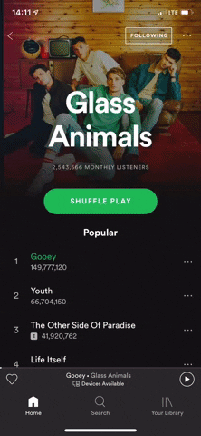
 .
.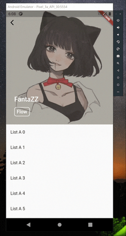
SliverAppBar的大小。我尝试修改您的代码,使其也增加大小,但显然这并不起作用,因为它会干扰其他滚动项。 - enyoSliverPersistentHeader而不是SliverAppBar,所以我不确定这个方法是否同样适用。 - enyo