如果您从表格中删除
thead标签,并将
th绑定在
tbody内,则可以使用以下带有CSS代码的jQuery来获取响应式表格:
HTML:
<table class="table table-striped">
<tbody>
<tr>
<th class="col-sm-1">Col 1
</th>
<th class="col-sm-2">Col 2
</th>
<th class="col-sm-6">Col 3
</th>
<th class="col-sm-1">Col 4
</th>
<th class="col-sm-1">Col 5
</th>
<th class="col-sm-1">Col 6
</th>
</tr>
<tr>
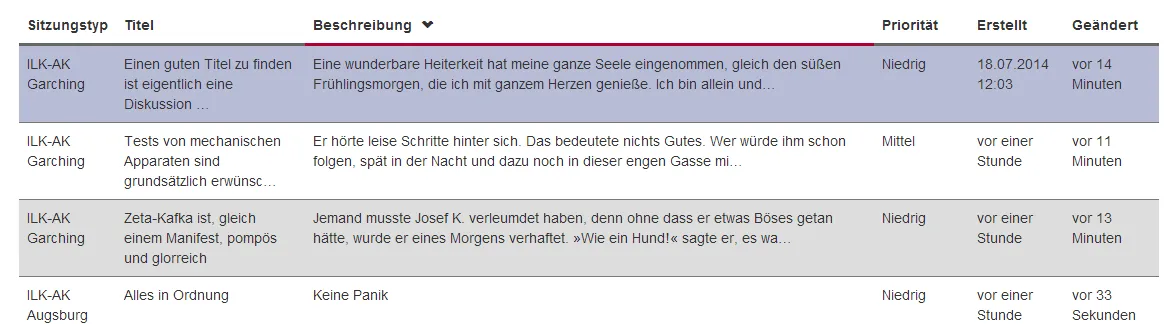
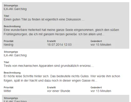
<td>ILK-AK Garching
</td>
<td>Einen guten Titel zu finden ist eigentlich eine Diskussion …
</td>
<td>Eine wunderbare Heiterkeit hat meine ganze Seele eingenommen, gleich den süßen Frühlingsmorgen, die ich mit ganzem Herzen genieße. Ich bin allein und…
</td>
<td>Niedrig
</td>
<td>
<time datetime="2014-07-18T12:03:38.9570000">18.07.2014 12:03</time>
</td>
<td>
<time datetime="2014-08-20T14:15:39.3830000">20.08.2014 14:15</time>
</td>
</tr>
<tr>
<td>ILK-AK Garching
</td>
<td>Zeta-Kafka ist, gleich einem Manifest, pompös und glorreich
</td>
<td>Jemand musste Josef K. verleumdet haben, denn ohne dass er etwas Böses getan hätte, wurde er eines Morgens verhaftet. »Wie ein Hund!« sagte er, es wa…
</td>
<td>Niedrig
</td>
<td>
<time rel="timeago" datetime="2014-08-20T13:41:22.3500000">20.08.2014 13:41</time>
</td>
<td>
<time rel="timeago" datetime="2014-08-20T14:16:39.8170000">20.08.2014 14:16</time>
</td>
</tr>
<tr>
<td>ILK-AK Garching
</td>
<td>Tests von mechanischen Apparaten sind grundsätzlich erwünsc…
</td>
<td>Er hörte leise Schritte hinter sich. Das bedeutete nichts Gutes. Wer würde ihm schon folgen, spät in der Nacht und dazu noch in dieser engen Gasse mi…
</td>
<td>Mittel
</td>
<td>
<time datetime="2014-08-20T13:41:51.0870000">20.08.2014 13:41</time>
</td>
<td>
<time datetime="2014-08-20T14:18:21.2200000">20.08.2014 14:18</time>
</td>
</tr>
</tbody>
</table>
CSS
.div-table {
display: table;
font-size: 14px;
border-bottom: 1px solid #dddddd;
color: #8d8d8d;
margin: 0;
width: 100%;
}
.table-container {
display: table;
width: 100%;
}
.table-head {
display: table-header-group;
font-weight: 600 !important;
text-align: center;
border: solid 1px #ddd;
color: #333;
background: rgb(242, 242, 242);
font-size: inherit;
vertical-align: middle;
}
.table-head .column {
background: #f2f2f2;
color: #7d7d7d;
border: solid 1px #ddd;
}
.table-row {
display: table-row;
padding: 3px 6px;
color: #333;
border-collapse: collapse;
text-align: center;
vertical-align: middle;
}
.table-row .column:nth-child(1) {
border-left: 1px solid #eeeeee;
}
.table-row:last-child .column {
border-bottom: none;
}
.table-row:hover {
background: #f9f9f9;
}
.column {
display: table-cell;
padding: 8px 3px;
color: #333;
border-bottom: 1px solid #eeeeee;
border-right: 1px solid #eeeeee;
vertical-align:middle;
}
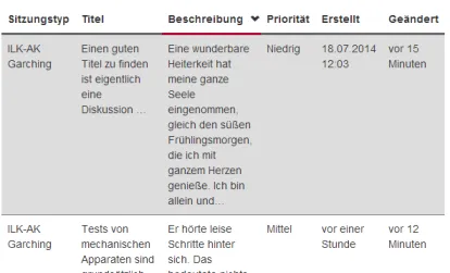
@media all and (max-width:768px) {
.div-table, .table-row, .column, .column:before {
display: block;
}
.div-table, .table-row .column:last-child {
border-bottom: none;
}
.table-head {
position: absolute;
top: -1000em;
left: -1000em;
}
.table-row {
border: 1px solid #eeeeee;
margin: 20px 0;
}
.table-row .column {
border-right:none;
text-align: left;
}
.table-row .column:nth-child(1) {
border-left: none;
border-right: none;
}
.table-row .column:last-child {
border-right: none;
}
.table-row:last-child .column, .column {
border-bottom: 1px solid #eeeeee;
}
.table-row:hover {
background: #fff;
}
.column:before {
font-weight: bold;
padding-right: 20px;
font-size: 12px;
content:"" attr(data-label)"";
}
.column:hover {
background: #f9f9f9;
}
}
jQuery代码
$(document).ready(function () {
var gridClass = $('.table');
var head_col_count = $(gridClass).find('tbody th').size();
for (i = 0; i <= head_col_count; i++) {
var head_col_label = $(gridClass).find('tbody th:nth-child(' + i + ')').text();
$(gridClass).find('tr td:nth-child(' + i + ')').replaceWith(function () {
return $('<div class="column" data-label="' + head_col_label + '">').append($(this).contents());
});
}
$(gridClass).replaceWith(function () {
return $('<div class="div-table">').append($(this).contents());
});
$('.div-table tbody tr:first-child').replaceWith(function () {
return $('<div class="table-head">').append($(this).contents());
});
$('.div-table tbody').replaceWith(function () {
return $('<div class="table-container">').append($(this).contents());
});
$('.div-table tr').replaceWith(function () {
return $('<div class="table-row">').append($(this).contents());
});
$('.div-table th').replaceWith(function () {
return $('<div class="column">').append($(this).contents());
});
});
这里可以找到全屏演示。 Jsfiddle.net编辑链接。
然而,如果您希望使用当前的HTML标记,则需要稍微更改脚本。