将包裹物品放置在网格的中心位置

5

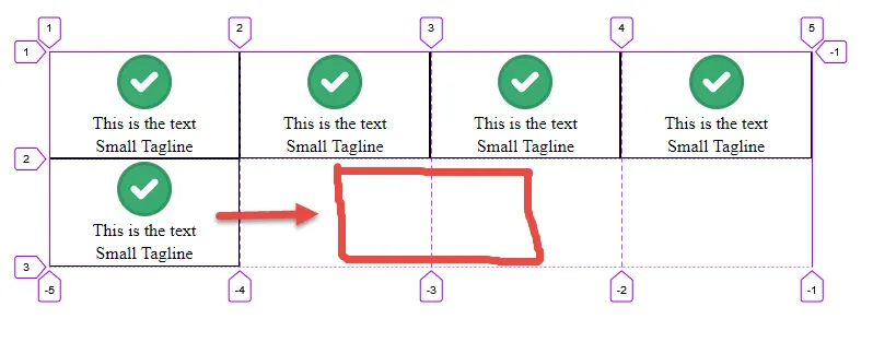
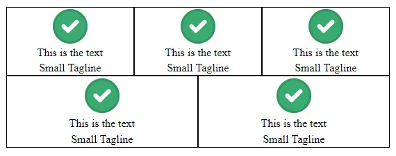
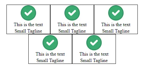
我有一个CSS网格布局,看起来像下面这样:
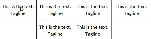
enter image description here

这对我来说非常完美,但是当我降低屏幕的分辨率时,网格的响应性会使网格看起来像这样:

Actually After lowering the screen size.

相反,我希望包装的项目能够使左右两侧的空白对齐,并且它们应该像这样看起来:

This is how it should come after lowering the screen size.

我该如何实现以上的效果?这些项的数量是动态的。可能会有偶数个项目,这将使左右空白均匀分布更好看。但如果项目数为奇数,则空白仍应等距分布。我尝试使用 grid-auto-flowalign-items,但它们似乎没有帮助。

.accordioninnergrid {
  display: grid;
  grid-template-columns: repeat(auto-fit, minmax(240px, 1fr));
}

.innerbox {
  display: flex;
  border: 1px solid black;
  flex-direction: column;
  align-items: center;
  word-wrap: break-word;
  width: auto;
}

.innerbox>p,
img {
  margin: 1%;
}
<div class="accordioninnergrid">
  <div class="innerbox">
    <img src="some-image" width="50%" height="50%" />
    <p>
      This is the text
    </p>
    <p>
      Small Tagline
    </p>
  </div>
  <div class="innerbox">
    <img src="some-image" width="50%" height="50%" />
    <p>
      This is the text
    </p>
    <p>
      Small Tagline
    </p>
  </div>
  <div class="innerbox">
    <img src="some-image" width="50%" height="50%" />
    <p>
      This is the text
    </p>
    <p>
      Small Tagline
    </p>
  </div>

  <div class="innerbox">
    <img src="some-image" width="50%" height="50%" />
    <p>
      This is the text
    </p>
    <p>
      Small Tagline
    </p>
  </div>

  <div class="innerbox">
    <img src="some-image" width="50%" height="50%" />
    <p>
      This is the text
    </p>
    <p>
      Small Tagline
    </p>
  </div>
</div>


你无法使用CSS网格实现这一点,你需要使用flexbox。 - Temani Afif
1个回答

4
这是一个使用网格或弹性布局存在问题的布局。两者都没有简单的解决方案。
使用网格布局,无法自动将项目放置在中间列中。那么网格如何知道需要将网格项放置在第3、4和5列,以使它们居中显示?
更糟糕的是,如果只有四列和一个要居中的项目怎么办?该项目必须跨越第2和第3列。

enter image description here

没有自动执行此操作的网格函数。必须由作者定义。


使用Flex,上述问题就不存在了。但是这里存在一个权衡。Flex有一个Grid没有的问题。
这个问题源于代码的这一部分:
.accordioninnergrid {
  display: grid;
  grid-template-columns: repeat(auto-fit, minmax(240px, 1fr));
}

“grid-template-columns”规则指定每列的最小宽度为240px,最大宽度为“1fr”(即所有可用空间)。
在flex中,可以使用“flex-grow”属性代替“fr”函数。
但是,在flex容器中,没有列轨道阻碍跨越行移动,“flex-grow”可以自由地扩展项目跨越整个行。”

enter image description here

简而言之,flex-grow 和居中不能共存。
如果去掉flex-grow,那么您就可以使用 flex 进行居中对齐。但是,当然会有另一个取舍:您将失去自由空间消耗功能。

enter image description here

.accordioninnergrid {
  display: flex;
  flex-wrap: wrap;
  justify-content: center;
}

.innerbox {
  flex: 1 0 140px; /* fg, fs, fb -- try fg: 0 */
  display: flex;
  border: 1px solid black;
  flex-direction: column;
  align-items: center;
  word-wrap: break-word;
}

.innerbox > p,
img {
  margin: 1%;
}
<div class="accordioninnergrid">
  <div class="innerbox">
    <img src="http://i.imgur.com/60PVLis.png" width="50" height="50" alt="">
    <p>
      This is the text
    </p>
    <p>
      Small Tagline
    </p>
  </div>
  <div class="innerbox">
    <img src="http://i.imgur.com/60PVLis.png" width="50" height="50" alt="">
    <p>
      This is the text
    </p>
    <p>
      Small Tagline
    </p>
  </div>
  <div class="innerbox">
    <img src="http://i.imgur.com/60PVLis.png" width="50" height="50" alt="">
    <p>
      This is the text
    </p>
    <p>
      Small Tagline
    </p>
  </div>

  <div class="innerbox">
    <img src="http://i.imgur.com/60PVLis.png" width="50" height="50" alt="">
    <p>
      This is the text
    </p>
    <p>
      Small Tagline
    </p>
  </div>

  <div class="innerbox">
    <img src="http://i.imgur.com/60PVLis.png" width="50" height="50" alt="">
    <p>
      This is the text
    </p>
    <p>
      Small Tagline
    </p>
  </div>
</div>


更多细节请参见:


1
感谢 @Michael 的精彩回答。确实很有帮助! - Rebooting

网页内容由stack overflow 提供, 点击上面的
可以查看英文原文,
原文链接