我在设置弹性容器内图像的最大高度和最大宽度时遇到了故障。
以下是弹性容器的CSS:
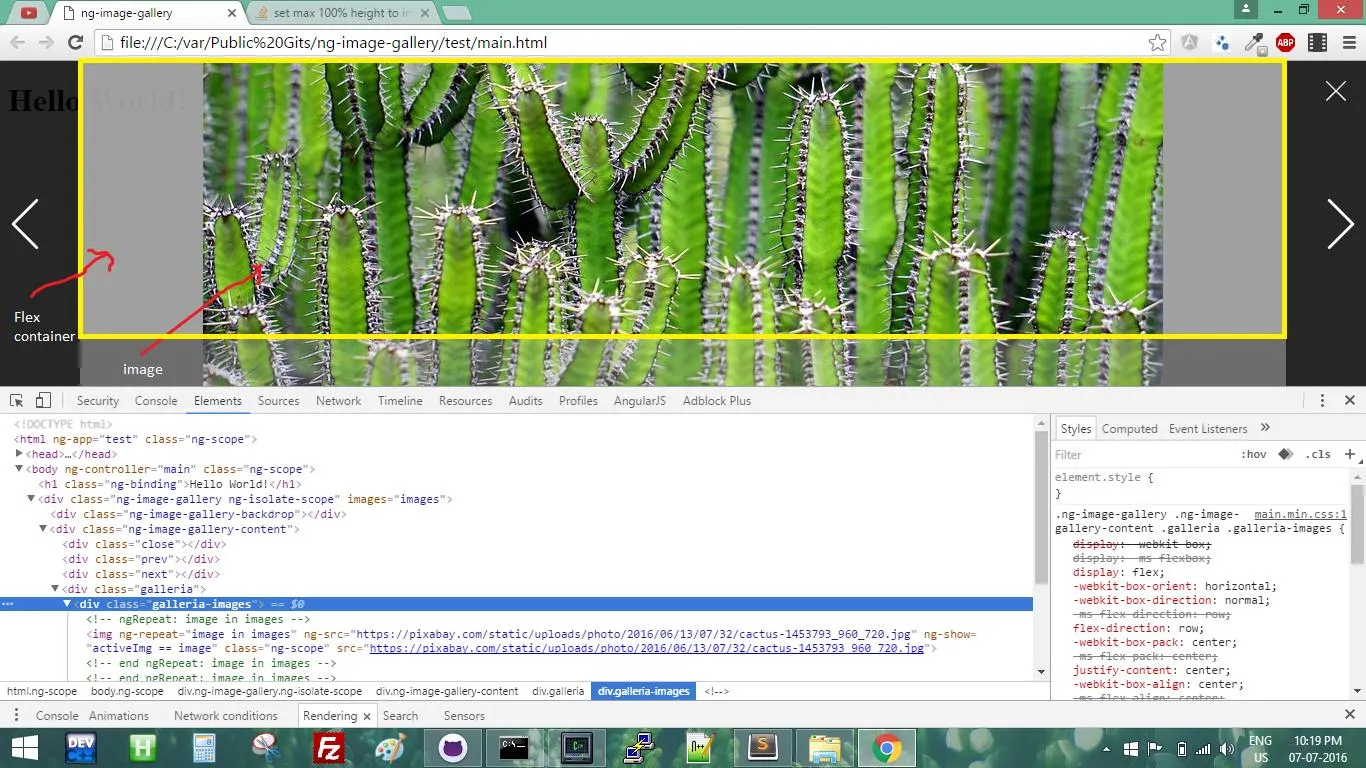
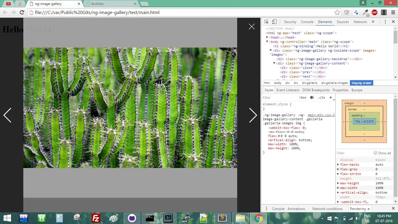
现在我的应用程序需要将一个子图像放到一个flex容器中,该容器在两个轴上都居中。但是它的高度和宽度不应超过父容器(flex容器)。我也不希望图像缩小或增大以保持其宽高比。因此,我编写了以下CSS代码。
但是这对我来说现在不起作用。尽管 flex 容器具有灵活的高度,但其中的图像仍然溢出。
以下是弹性容器的CSS:
.galleria-images{
  display: flex;
  flex-direction: row;
  justify-content: center;
  align-items:center;
  flex : 1; /* It's also a flex item hence take default height available in viewport */
}
现在我的应用程序需要将一个子图像放到一个flex容器中,该容器在两个轴上都居中。但是它的高度和宽度不应超过父容器(flex容器)。我也不希望图像缩小或增大以保持其宽高比。因此,我编写了以下CSS代码。
img{
    flex:0 0 auto;
    vertical-align: bottom;
    max-width: 100%;
    max-height: 100%;
}
但是这对我来说现在不起作用。尽管 flex 容器具有灵活的高度,但其中的图像仍然溢出。
.galleria {
  position: absolute;
  top: 0;
  bottom: 0;
  left: 80px;
  right: 80px;
  background-color: rgba(100, 100, 100, 0.5);
  overflow: hidden;
  display: flex;
  flex-direction: column;
}
.galleria .galleria-images {
  display: flex;
  flex-direction: row;
  justify-content: center;
  align-items: center;
  flex: 1;
  background-color: rgba(200, 200, 200, 0.7);
}
.galleria .galleria-images img {
  flex: 0 0 auto;
  vertical-align: bottom;
  max-width: 100%;
  max-height: 100%;
}
.galleria .galleria-thumbs {
  flex: 0 0 50px;
  background-color: rgba(200, 200, 200, 0.3);
}<div class="galleria">
<div class="galleria-images">
<img src="https://pixabay.com/static/uploads/photo/2016/06/13/07/32/cactus-1453793_960_720.jpg">
</div>
<div class="galleria-thumbs">
</div>
</div>