有没有一种方法可以自动将渐变添加到图像中?

3

enter image description here

这是我的代码:

<div class='my-posts-container' id='<%=postobj._id%>'>
        <%var menuid='menu'+postobj._id%>
        <%var imagesource='../'+postobj.blob.path%>
        <div class="my-posts-container-header">
             <%-include('postheader.ejs',{friend:postobj.username,postid:postobj._id});%> 
        </div>
        <div class="menu hide" id="<%=menuid%>" >
            <ul >
                <li><button onclick="viewpost('<%=postobj._id%>')"  >view</button></li>
                <li><button onclick="removepost('<%=postobj._id%>')"  >remove</button></li>
                <!-- <li><button onclick="copypostlink('<%=postobj._id%>')"  >copy link</button></li>
                <li><button onclick="editthispost('<%=postobj._id%>')"  >edit</button></li> -->
            </ul>
        </div>
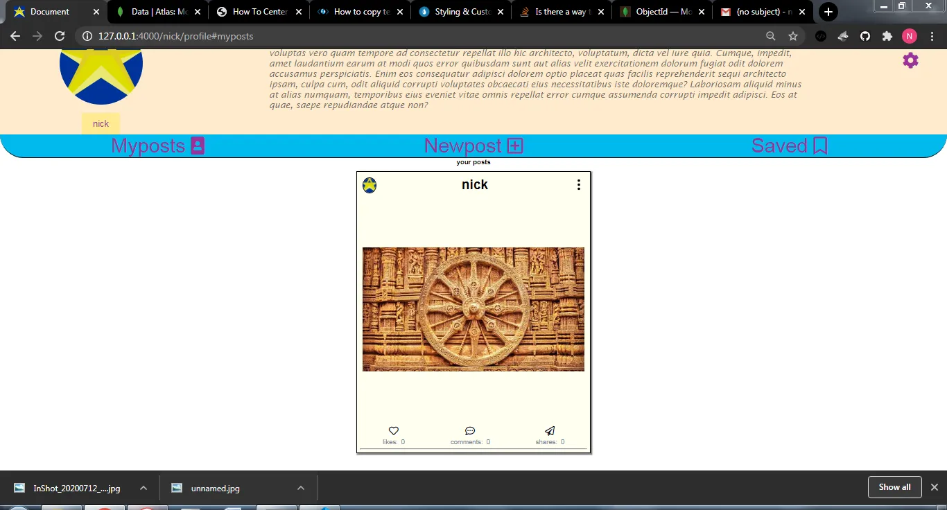
        <div class="post-image" >
            
                <img src="<%=imagesource%>" alt="image" height="400px" width="400px" style="margin: 5px;object-fit: contain;" ondblclick="like('<%=postobj._id%>')">
    
        </div>
       
        <span>
            <%-include('likecommentsharesave.ejs',{postid:postobj._id,username:username,likes:postobj.likes})%>
        </span>
        <hr>
        <div class="caption"> 
            <%=postobj.caption%> 
        </div>
        

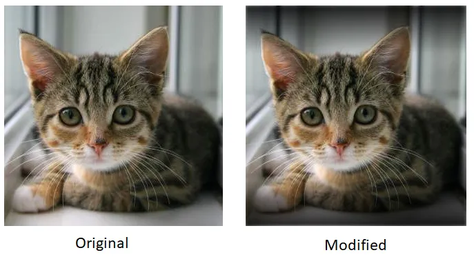
我希望保持我的图像尺寸为400px * 400px,但在.post_image div中添加背景颜色,基本上,我想根据图像标记中的任何图像向背景添加渐变,就像这样:

enter image description here

希望整个 400 X 400 的尺寸都能被覆盖,是否有可能实现?如果不行,你能给我其他建议吗?谢谢。


1
似乎这不仅是渐变,还有水印。 - gpl
1
我看到的实际上是相同的图像,但是透明度降低了。 - Nikhil Singh
1
“gradient” 在那里的目的是什么? - gpl
1
渐变是我认为实现这种效果的一种方式,但现在我认为这是不可能的。 - Nikhil Singh
1
我认为使用高度放大的同一张图片(如上所示)是实现它的最佳方式。透明颜色和渐变在这里并没有帮助。 - gpl
显示剩余2条评论
2个回答

3
你可以使用CSS来实现类似的效果。
考虑使用这个样式表。
<style type="text/css">
  .blured {
    width:320px;
    height:320px;
    position: relative;
    overflow: hidden;
  }

  .blured .blur {
    height:70px;
    width:100%;
    position:absolute;
    filter: blur(7px);
  }

  .blured .top {
    top:0px;
    background: linear-gradient(#000000d9, #00000000)
  }

  .blured .bottom {
    bottom:0px;
    background: linear-gradient(#00000000, #000000d9)
  }
</style>

接下来使用以下标记

<div class='blured' style='background-image:url("http://placekitten.com/320/320")'>
  <div class='blur top'></div>
  <div class='blur bottom'></div>
</div>

结果将会是这个样子:

enter image description here

你可以尝试使用 linear-gradient 颜色和 blur() 值来实现接近你要求的输出。
参考资料:

2
您所描述的效果实际上是可以实现的。您只需要在图像上方叠加一个尺寸较小的相同图像即可。下面的图像将被模糊处理,并将跨越其余的 400px x 400px 区域。
要实现这一点,您需要将包含 div 的位置字段设置为 relative,并将两个图像的位置都设置为 absolute。我已将置于顶部的图像高度减小至 200px,并保持了与下面的图像相同的图像宽度,以便与问题中的图像风格相似。使用 filter: blur() 对较大的图像进行模糊处理。模糊处理可以使图像的边缘变得柔和(删除 clip 属性,您就会知道)。使用 clip 属性使边缘看起来“清晰”。
我已经使用了这张图片。运行下面的代码片段可以看到它的效果:

<!DOCTYPE html>
<html>
<style>
*{box-sizing: border-box;}
.container {
    margin: auto;
    position: relative;
    width: 50%;
}
.outer {
    filter: blur(5px);
    position: absolute;
    z-index: -1;
    clip: rect(0,400px,400px,0);
    
}
.inner {
    position: absolute;
    top: 100px; 
}
</style>
<div class="container">
    <img src="https://istack.dev59.com/Y1ELT.webp" class="outer" height="400px" width="400px">
    <img src="https://istack.dev59.com/Y1ELT.webp" class="inner" height="200px" width="400px">
</div>
</html>

这部分回答了你的问题。现在,为了根据大小自动化图像放置,您可以使用JavaScript检索和更新图像尺寸:

var image = new Image();

image.onload = function() {
  var height = image.height;
  var width = image.width;

}

image.src = "<source>";

下面的图片将始终是400 x 400 px,如果它的实际检索尺寸小于400 x 400 px,您可以根据其实际检索尺寸更新顶部图像的属性。否则,请将其压缩至400 x 400 px以覆盖下方的整个图片。

网页内容由stack overflow 提供, 点击上面的
可以查看英文原文,
原文链接