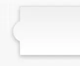
有没有一种用HTML/CSS制作这个的好方法?基本上是一个带有圆形“凸起”的div。使用伪类很容易实现,但我的问题是如何使投影将其视为形状的一部分。
当我单独应用投影到圆圈时,它不能可靠地工作。我知道有一种方法可以做到这一点,但我不确定浏览器支持情况如何。
你们会推荐最好的解决方案吗?谢谢!
有没有一种用HTML/CSS制作这个的好方法?基本上是一个带有圆形“凸起”的div。使用伪类很容易实现,但我的问题是如何使投影将其视为形状的一部分。
当我单独应用投影到圆圈时,它不能可靠地工作。我知道有一种方法可以做到这一点,但我不确定浏览器支持情况如何。
你们会推荐最好的解决方案吗?谢谢!
position: relative(或absolute)属性div {
margin: 100px;
width: 100px;
height: 100px;
box-shadow: 0 0 10px black;
border-radius: 10px;
position: relative;
}
div:before {
display: block;
content: "";
width: 40px;
height: 40px;
position: absolute;
left: -20px;
top: 30px;
border-radius: 20px;
box-shadow: 0 0 10px black;
clip: rect(-10px, 20px, 50px, -10px);
}
说实话,如果你想让一个图像在Mozilla、Safari和Chrome上正常工作,这是可以通过CSS3实现的,但我不推荐这样做。
是的,你可以做到这一点,但需要大量手动调整才能达到使用图像更容易实现的效果。
问题实际上在于阴影,为了解决这个问题,您需要使用定位和z-index创建一个元素三明治。您需要一个圆形元素放置在矩形元素后面,然后在矩形元素上方放置一个圆形元素的副本。然后还有另一个问题,即使用CSS3属性(如阴影和渐变)会导致浏览器兼容性问题。
这里有一个jsFiddle示例。
显然,示例中的问题是使渐变完美匹配,我没有花太多时间去解决它。
#circ {
    border-radius: 40px;
    width:40px;
    height:40px;
    box-shadow: 0px 0px 10px #999;
    position: absolute;
    left: 37px;
    top: 77px;
    background: #fcfcfc;
    position:absolute;
    left: 40px;
    top:75px;
    /* Old browsers */
    background: -moz-linear-gradient(top, #fcfcfc 0%, #cccccc 100%);
    /* FF3.6+ */
    background: -webkit-gradient(linear, left top, left bottom, color-stop(0%, #fcfcfc), color-stop(100%, #cccccc));
    /* Chrome,Safari4+ */
    background: -webkit-linear-gradient(top, #fcfcfc 0%, #cccccc 100%);
    /* Chrome10+,Safari5.1+ */
    background: -o-linear-gradient(top, #fcfcfc 0%, #cccccc 100%);
    /* Opera 11.10+ */
    background: -ms-linear-gradient(top, #fcfcfc 0%, #cccccc 100%);
    /* IE10+ */
    background: linear-gradient(to bottom, #fcfcfc 0%, #cccccc 100%);
    /* W3C */
    filter: progid:DXImageTransform.Microsoft.gradient(startColorstr='#fcfcfc', endColorstr='#cccccc', GradientType=0);
    /* IE6-9 */
    z-index: -1;
}
#rect {
    width:200px;
    height:80px;
    background: #fcfcfc;
    position:relative;
    left: 50px;
    top:50px;
    box-shadow: 0px 0px 10px #999;
    /* Old browsers */
    background: -moz-linear-gradient(top, #fcfcfc 0%, #cccccc 100%);
    /* FF3.6+ */
    background: -webkit-gradient(linear, left top, left bottom, color-stop(0%, #fcfcfc), color-stop(100%, #cccccc));
    /* Chrome,Safari4+ */
    background: -webkit-linear-gradient(top, #fcfcfc 0%, #cccccc 100%);
    /* Chrome10+,Safari5.1+ */
    background: -o-linear-gradient(top, #fcfcfc 0%, #cccccc 100%);
    /* Opera 11.10+ */
    background: -ms-linear-gradient(top, #fcfcfc 0%, #cccccc 100%);
    /* IE10+ */
    background: linear-gradient(to bottom, #fcfcfc 0%, #cccccc 100%);
    /* W3C */
    filter: progid:DXImageTransform.Microsoft.gradient(startColorstr='#fcfcfc', endColorstr='#cccccc', GradientType=0);
    /* IE6-9 */
}

#circ2 {
    border-radius: 40px;
    width:40px;
    height:40px;
    position: absolute;
    left: 37px;
    top: 77px;
    background: #fcfcfc;
    position:absolute;
    left: 40px;
    top:75px;
        /* Old browsers */
    background: -moz-linear-gradient(top, #fcfcfc 0%, #cccccc 100%);
    /* FF3.6+ */
    background: -webkit-gradient(linear, left top, left bottom, color-stop(0%, #fcfcfc), color-stop(100%, #cccccc));
    /* Chrome,Safari4+ */
    background: -webkit-linear-gradient(top, #fcfcfc 0%, #cccccc 100%);
    /* Chrome10+,Safari5.1+ */
    background: -o-linear-gradient(top, #fcfcfc 0%, #cccccc 100%);
    /* Opera 11.10+ */
    background: -ms-linear-gradient(top, #fcfcfc 0%, #cccccc 100%);
    /* IE10+ */
    background: linear-gradient(to bottom, #fcfcfc 0%, #cccccc 100%);
    /* W3C */
    filter: progid:DXImageTransform.Microsoft.gradient(startColorstr='#fcfcfc', endColorstr='#cccccc', GradientType=0);
    /* IE6-9 */
}
你可以在css3中使用border-radius函数,但最好的方法是使用图像来实现。
以下是border-radius的示例:
<div id="wrap">
<div class="round">
    Border
</div>
</div>
html,body{
    background-color: #ccc;
    padding: 0;
    margin: 0;
}

#wrap{

    background-color: #fff;
    padding: 20px;
    width: 44%;
    margin: 20px;
    position: absolute;
    z-index: 1;
}

.round{
    width: 200px;
    padding: 20px;
    background-color: #fff;
    border-radius: 50px;
}