不像正方形那样工作的CSS三角形?

3
我想知道是否有办法创建一个真正的三角形形状?或者通过伪造来尽可能接近真实的三角形形状?
每当你用诸如svg之类的东西画一个三角形时,你总是被限制于一个透明的、镜像的三角形,因为元素被绘制为框。
我做了一个例子,因为我觉得很难解释这个问题:

http://codepen.io/stephan-v/pen/gaxdjm

svg {
  width: 100px;
  height: 100px;
  position: absolute;
  right: 0;
  top: 0;
}
svg polygon {
  fill: rgba(168, 210, 71, 0.6);
  cursor: pointer;
}
svg polygon:hover {
  fill: rgba(168, 210, 71, 0.9);
  cursor: pointer;
}
article {
  position: relative;
  width: 200px;
  height: 200px;
  background-color: whitesmoke;
  border: 1px solid lightgrey;
}
article a {
  display: block;
  width: 100%;
  height: 100%;
}
<article>
  <a href="#">
  </a>
  <svg>
    <polygon points="0,0 100,0 100,100" />
  </svg>
</article>

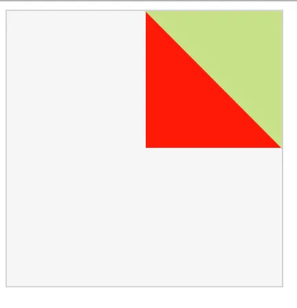
我将整篇文章和SVG三角形都设置为链接。但由于三角形被呈现为块状,因此有一小部分完全是三角形的镜像,无法点击。
为了这个项目,我想移除不能点击的那一部分。也就是红色部分:

triangle with a mirrored square


你想以什么方式移除它?例如,如果您只希望可见的三角形处理点击事件,则可以向<polygon>元素添加事件侦听器。请参见此编辑 - Phylogenesis
我无法通过你的链接进行复现 :( - Thomas Ayoub
我已经有一个事件监听器,我想防止红色部分阻挡下面的内容。 - Stephan-v
4个回答

5

CSS变换

使用纯CSS可以创建一个元素并将其旋转以创建三角形效果。

我已经简化了代码,让你可以清楚地理解发生的事情。

div {
  width: 200px;
  height: 200px;
  background: lightgrey;
  position: relative;
  overflow: hidden;
}
div > a {
  width: 50%;
  height: 50%;
  position: absolute;
  left: 65%;
  top: 0;
  transform-origin: left top;
  transform: rotate(-45deg);
  background: blue;
}
<div>
  <a href="#link"></a>
</div>

CSS Clip-path

另一种方法是使用clip-path。目前它的支持不是很好,但似乎是下一个即将推出的CSS特性。

div {
  width: 200px;
  height: 200px;
  background: lightgrey;
  position: relative;
  overflow: hidden;
}
div > a {
  width: 50%;
  height: 50%;
  position: absolute;
  left: 65%;
  top: 0;
  -webkit-clip-path: polygon(100% 0, 0 0, 100% 100%);
  clip-path: polygon(100% 0, 0 0, 100% 100%);
  background: blue;
}
<div>
  <a href="#link"></a>
</div>


喜欢第一个解决方案。做这个的方式相当聪明 :) - Stephan-v

2
一个快速的解决方案是在 svg 元素上使用 pointer-event:none;。更多关于 pointer-events 的信息请参见 MDN 上的 pointer-events。有关浏览器支持,请参见 canIuse

svg {
  width: 100px;
  height: 100px;
  position: absolute;
  right: 0;
  top: 0;
  pointer-events: none;
}
svg polygon {
  fill: rgba(168, 210, 71, 0.6);
  cursor: pointer;
}
svg polygon:hover {
  fill: rgba(168, 210, 71, 0.9);
  cursor: pointer;
}
article {
  position: relative;
  width: 200px;
  height: 200px;
  background-color: whitesmoke;
  border: 1px solid lightgrey;
}
article a {
  display: block;
  width: 100%;
  height: 100%;
}
<article>
  <a href="#"></a>
  <svg>
    <polygon points="0,0 100,0 100,100" />
  </svg>
</article>

另一种方法是将第二个链接放在一个容器中,通过旋转和 overflow: hidden; 实现所需的效果。示例:

div{
  position:relative;
  width:200px; height:200px;
  overflow:hidden;
}
a {display:block}

#l1{
  width:100%; height:100%;
  background:grey;
}
span{
  position:absolute;
  left:50%;top:0;
  width:50%; height:72%;
  transform-origin:0 0;
  transform:rotate(-45deg);
  overflow:hidden;
}
#l2{
  width: 100%; height:70%;
  transform-origin:inherit;
  transform:rotate(45deg);
  background:gold;
}
<div>
  <a id="l1" href="#link1"></a>
  <span>
    <a id="l2" href="#link2"></a>
   </span>
</div>


0

#triangle {
  width: 0px;
  height: 0px;
  border-left: 30px solid transparent;
  border-right: 30px solid transparent;
  border-top: 30px solid #f00;
}
<div id='triangle'></div>

希望这能对你有所帮助。

0

这是一个使用边框操作的纯CSS三角形代码片段:

#triangle{
    width: 0; 
    height: 0; 
    border-bottom: 25px solid transparent;
    border-right: 25px solid black;
}

这样你就不必使用SVG来添加它了。

  • 请注意,这种方法仍然可以作为一个正方形工作,但是您可以设置z-index将其置于任何其他您想要点击的内容后面。

网页内容由stack overflow 提供, 点击上面的
可以查看英文原文,
原文链接