删除某些因子水平的图例条目

33

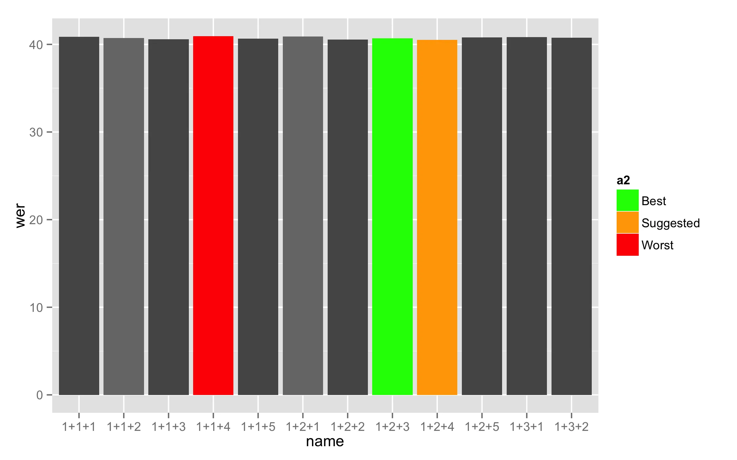
是否可以删除对应于某些因子水平的图例元素?

在我的示例中,我希望删除灰色因子水平(1-5)的图例条目,仅保留“最佳”,“建议”和“最差”级别。

我已经尝试了许多方法,但大多数方法要么删除了每组25个条形图的灰色着色,要么只剩下我着上红色、黄色和绿色的条形图。

# ggplot2
barplot <- ggplot(training_results.barplot, mapping=aes(x=name, fill=factor(a))) # filling based on a column ##mapping=aes(x=name, fill=factor(a))
barplot <- barplot + geom_histogram(stat = "identity", aes(name,wer)) ##colour="black"
barplot <- barplot + scale_fill_manual(values=c("#555555", "#777777", "#555555", "#777777", "#555555", color.best, color.suggested, color.worst), labels=c(NA,NA,NA,NA,NA,"Best","Suggested","Worst")) # 6th = best; 7th = suggested; 8th = worst
barplot <- barplot + everyNthLabel(training_results$name,5) # only show every 5th label on x-axis
barplot <- barplot + theme_minimal()
barplot <- barplot + theme(axis.text.x = element_text(angle = 90, hjust = 1, vjust = 0.5),legend.position=c(.5, .9)) # rotate labels on x-axis ##, legend.position="none"
barplot <- barplot + coord_cartesian(ylim = c(35, 45))
# Legend
barplot <- barplot + guides(fill = guide_legend(title="Models", title.position="top", direction="horizontal"))
# Axis labels
barplot <- barplot + xlab("Number of EM-Training Iterations") + opts(axis.title.x = theme_text(vjust=-0.3))
barplot <- barplot + ylab("Word Error Rate (WER)") + opts(axis.title.y = theme_text(vjust=0.2))

目前为止的结果; 图例中应省略NA值。

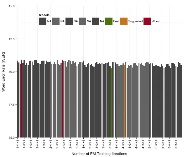
我正在使用的数据如下,其中a是填充颜色应该依赖的因子;a = 6、7和8标记了突出显示的情况(分别为绿色、黄色和红色)。

    a b c  name  corr   acc    H   D    S   I    N   wer
1   1 1 1 1+1+1 66.63 59.15 4167 238 1849 468 6254 40.85
2   1 1 2 1+1+2 66.66 59.29 4169 235 1850 461 6254 40.71
3   1 1 3 1+1+3 66.81 59.42 4178 226 1850 462 6254 40.58
4   8 1 4 1+1+4 66.57 59.08 4163 223 1868 468 6254 40.92
5   1 1 5 1+1+5 66.89 59.34 4183 226 1845 472 6254 40.66
6   1 2 1 1+2+1 66.63 59.10 4167 240 1847 471 6254 40.90
7   1 2 2 1+2+2 66.82 59.45 4179 228 1847 461 6254 40.55
8   1 2 3 1+2+3 66.74 59.31 4174 225 1855 465 6254 40.69
9   1 2 4 1+2+4 67.00 59.50 4190 226 1838 469 6254 40.50
10  1 2 5 1+2+5 66.90 59.19 4184 230 1840 482 6254 40.81
11  1 3 1 1+3+1 66.68 59.16 4170 227 1857 470 6254 40.84
12  1 3 2 1+3+2 66.76 59.23 4175 226 1853 471 6254 40.77
etc.
1个回答

52

首先,由于您用于 fill 的变量是数值型的,则将其转换为因子(例如使用不同名称a2),并根据需要设置因子级别的标签(每个级别需要不同的标签,因此对于前五个数字,我使用相同的数字)。

training_results.barplot$a2 <- factor(training_results.barplot$a,
                                      labels = c("1", "2", "3", "4", "5", "Best", "Suggested", "Worst"))

现在使用这个新变量作为fill =。 这将按照所需方式制作图例中的标签。在scale_fill_manual()中使用参数breaks=,您可以设置需要在图例中显示的级别,但删除参数labels=。 只有当两个参数具有相同的长度时才能使用。

ggplot(training_results.barplot, mapping = aes(x = name, y = wer, fill = a2))  + 
  geom_bar(stat = "identity") +
  scale_fill_manual(breaks = c("Best", "Suggested", "Worst"),
                    values = c("#555555", "#777777", "#555555", "#777777", 
                            "#555555", "green", "orange", "red")) 

在这里输入图像描述

这是本答案使用的数据:

training_results.barplot<-structure(list(a = c(1L, 2L, 1L, 8L, 3L, 4L, 5L, 6L, 7L, 1L, 
1L, 1L), b = c(1L, 1L, 1L, 1L, 1L, 2L, 2L, 2L, 2L, 2L, 3L, 3L
), c = c(1L, 2L, 3L, 4L, 5L, 1L, 2L, 3L, 4L, 5L, 1L, 2L), name = structure(1:12, .Label = c("1+1+1", 
"1+1+2", "1+1+3", "1+1+4", "1+1+5", "1+2+1", "1+2+2", "1+2+3", 
"1+2+4", "1+2+5", "1+3+1", "1+3+2"), class = "factor"), corr = c(66.63, 
66.66, 66.81, 66.57, 66.89, 66.63, 66.82, 66.74, 67, 66.9, 66.68, 
66.76), acc = c(59.15, 59.29, 59.42, 59.08, 59.34, 59.1, 59.45, 
59.31, 59.5, 59.19, 59.16, 59.23), H = c(4167L, 4169L, 4178L, 
4163L, 4183L, 4167L, 4179L, 4174L, 4190L, 4184L, 4170L, 4175L
), D = c(238L, 235L, 226L, 223L, 226L, 240L, 228L, 225L, 226L, 
230L, 227L, 226L), S = c(1849L, 1850L, 1850L, 1868L, 1845L, 1847L, 
1847L, 1855L, 1838L, 1840L, 1857L, 1853L), I = c(468L, 461L, 
462L, 468L, 472L, 471L, 461L, 465L, 469L, 482L, 470L, 471L), 
    N = c(6254L, 6254L, 6254L, 6254L, 6254L, 6254L, 6254L, 6254L, 
    6254L, 6254L, 6254L, 6254L), wer = c(40.85, 40.71, 40.58, 
    40.92, 40.66, 40.9, 40.55, 40.69, 40.5, 40.81, 40.84, 40.77
    )), .Names = c("a", "b", "c", "name", "corr", "acc", "H", 
"D", "S", "I", "N", "wer"), class = "data.frame", row.names = c("1", 
"2", "3", "4", "5", "6", "7", "8", "9", "10", "11", "12"))

非常感谢您的努力,Didzis。使用您的补丁可以使图形呈现,但图例完全消失了。可能是ggplot2无法在上面定义的“values”和“breaks”之间找到映射关系吗? - sam
我无法回答你的问题,因为你没有让问题可重现(没有提供数据)。我使用鸢尾花数据测试了类似的情况,那个是成功的。 - Didzis Elferts
我在上面提供了数据集的开头。你能分享一下你的模拟吗?我认为难点在于每25个柱子改变颜色(从深灰到浅灰),同时突出显示若干个不同的柱子。 - sam
我更新了我的答案,并提供了一个现在应该可行的解决方案。 - Didzis Elferts
7
这个不再起作用了。 - January
显示剩余4条评论

网页内容由stack overflow 提供, 点击上面的
可以查看英文原文,
原文链接