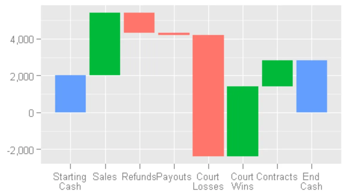
我找到了几个在R中创建瀑布图的软件包,看起来像这样:
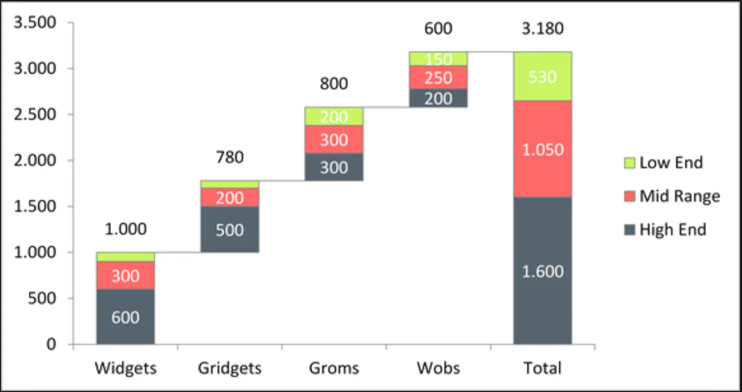
 但我找不到一种创建堆叠瀑布图的方法,它看起来像这样:
 一个解决办法是使用堆叠柱状图。但那不是一种优雅的方式。所以,我想知道是否有更好的方法在R中创建堆叠瀑布图。
但我找不到一种创建堆叠瀑布图的方法,它看起来像这样:
一个解决办法是使用堆叠柱状图。但那不是一种优雅的方式。所以,我想知道是否有更好的方法在R中创建堆叠瀑布图。 但我找不到一种创建堆叠瀑布图的方法,它看起来像这样:
一个解决办法是使用堆叠柱状图。但那不是一种优雅的方式。所以,我想知道是否有更好的方法在R中创建堆叠瀑布图。一旦您拥有“正确”的数据,使用ggplot2轻松创建“主”图。要使用颜色、文本、线条等选择复制所需的图形需要更多工作,但是可以完成。
使用ggplot2绘制瀑布图的技巧是创建一个包含分组(x值-我在代码中将其称为x.axis.Var)的数据集,以您想要绘制的确切顺序。之后,您需要获取每个类别(图例中的类别-cat.Var)中条形的起始和结束点。然后,创建另一个包含按类别合计的组。您还需要一个数字索引来操作柱形图。最后,获取一个包含按组合计的列,用于显示柱形上方的数字。
假设您的数据框如下:
df <-
  data.frame(
    x.axis.Var = rep(c("Widgets", "Gridgets", "Groms", "Wobs"), 3),
    cat.Var = rep(c("High End", "Mid Range", "Low End"), each = 4),
    values = c(600, 500, 300, 200, # high end
               300, 200, 300, 250, # mid range
               100, 80, 200, 150   # low end
               )
  )
或者,
   x.axis.Var   cat.Var values
1     Widgets  High End    600
2    Gridgets  High End    500
3       Groms  High End    300
4        Wobs  High End    200
5     Widgets Mid Range    300
6    Gridgets Mid Range    200
7       Groms Mid Range    300
8        Wobs Mid Range    250
9     Widgets   Low End    100
10   Gridgets   Low End     80
11      Groms   Low End    200
12       Wobs   Low End    150
按照上述步骤获取新的数据框:
df.tmp <- df %>%
  # \_Set the factor levels in the order you want ----
  mutate(
    x.axis.Var = factor(x.axis.Var,
                        levels = c("Widgets", "Gridgets", "Groms", "Wobs")),
    cat.Var = factor(cat.Var,
                        levels = c("Low End", "Mid Range", "High End"))
  ) %>%
  # \_Sort by Group and Category ----
  arrange(x.axis.Var, desc(cat.Var)) %>%
  # \_Get the start and end points of the bars ----
  mutate(end.Bar = cumsum(values),
         start.Bar = c(0, head(end.Bar, -1))) %>%
  # \_Add a new Group called 'Total' with total by category ----
  rbind(
    df %>%
      # \___Sum by Categories ----
      group_by(cat.Var) %>%
      summarise(values = sum(values)) %>%
      # \___Create new Group: 'Total' ----
      mutate(
        x.axis.Var = "Total",
        cat.Var = factor(cat.Var,
                         levels = c("Low End", "Mid Range", "High End"))
      ) %>%
      # \___Sort by Group and Category ----
      arrange(x.axis.Var, desc(cat.Var)) %>%
      # \___Get the start and end points of the bars ----
      mutate(end.Bar = cumsum(values),
             start.Bar = c(0, head(end.Bar, -1))) %>%
      # \___Put variables in the same order ----
      select(names(df),end.Bar,start.Bar)
  ) %>%
  # \_Get numeric index for the groups ----
  mutate(group.id = group_indices(., x.axis.Var)) %>%
  # \_Create new variable with total by group ----
  group_by(x.axis.Var) %>%
  mutate(total.by.x = sum(values)) %>%
  # \_Order the columns ----
  select(x.axis.Var, cat.Var, group.id, start.Bar, values, end.Bar, total.by.x)
这将产生:
x.axis.Var cat.Var   group.id start.Bar values end.Bar total.by.x
   <fct>      <fct>        <int>     <dbl>  <dbl>   <dbl>      <dbl>
 1 Widgets    High End         1         0    600     600       1000
 2 Widgets    Mid Range        1       600    300     900       1000
 3 Widgets    Low End          1       900    100    1000       1000
 4 Gridgets   High End         2      1000    500    1500        780
 5 Gridgets   Mid Range        2      1500    200    1700        780
 6 Gridgets   Low End          2      1700     80    1780        780
 7 Groms      High End         3      1780    300    2080        800
 8 Groms      Mid Range        3      2080    300    2380        800
 9 Groms      Low End          3      2380    200    2580        800
10 Wobs       High End         4      2580    200    2780        600
11 Wobs       Mid Range        4      2780    250    3030        600
12 Wobs       Low End          4      3030    150    3180        600
13 Total      High End         5         0   1600    1600       3180
14 Total      Mid Range        5      1600   1050    2650       3180
15 Total      Low End          5      2650    530    3180       3180
然后,我们可以使用geom_rect创建“主”图:
ggplot(df.tmp, aes( x = x.axis.Var, fill = cat.Var)) +
  # Waterfall Chart
  geom_rect(aes(x = x.axis.Var,
                xmin = group.id - 0.25, # control bar gap width
                xmax = group.id + 0.25,
                ymin = end.Bar,
                ymax = start.Bar)
            )
获取:
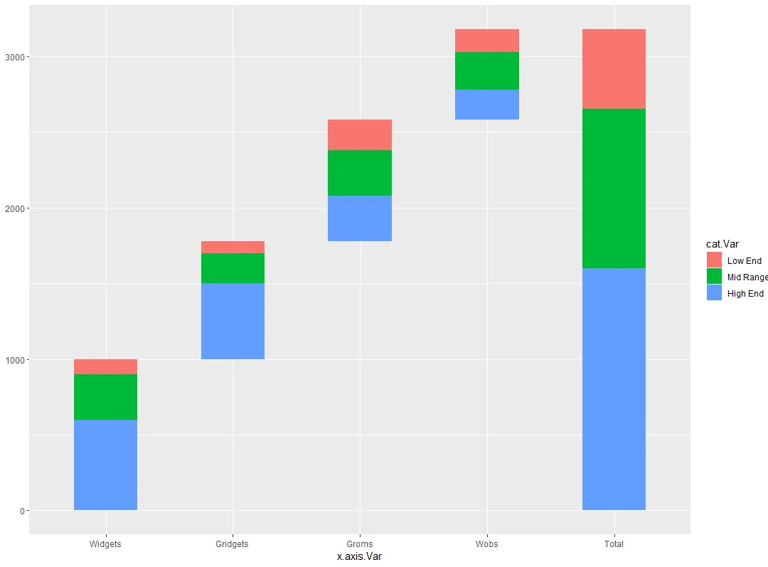
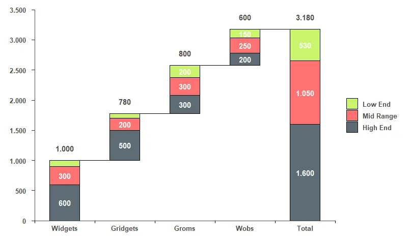
因此,组和类别的顺序是正确的。为了以与原始图表相同的方式绘制瀑布图,我将对上面的代码进行一些更改。我将使用x = group.id而不是x = x.axis.Var,因为这样可以允许我对刻度标记进行所需的更改。具有此更改和设计更改的代码如下:
ggplot(df.tmp, aes(x = group.id, fill = cat.Var)) +
  # \_Simple Waterfall Chart ----
  geom_rect(aes(x = group.id,
                xmin = group.id - 0.25, # control bar gap width
                xmax = group.id + 0.25,
                ymin = end.Bar,
                ymax = start.Bar),
            color="black",
            alpha=0.95) +
  # \_Lines Between Bars ----
  geom_segment(aes(x=ifelse(group.id == last(group.id),
                            last(group.id),
                            group.id+0.25),
                   xend=ifelse(group.id == last(group.id),
                               last(group.id),
                               group.id+0.75),
                   y=ifelse(cat.Var == "Low End",
                            end.Bar,
                            # these will be removed once we set the y limits
                            max(end.Bar)*2),
                   yend=ifelse(cat.Var == "Low End",
                               end.Bar,
                               # these will be removed once we set the y limits
                               max(end.Bar)*2)),
               colour="black") +
  # \_Numbers inside bars (each category) ----
  geom_text(
    mapping =
      aes(
        label = ifelse(values < 150,
                       "",
                       ifelse(nchar(values) == 3,
                              as.character(values),
                              sub("(.{1})(.*)", "\\1.\\2",
                                  as.character(values)
                              )
                            )
                       ),
        y = rowSums(cbind(start.Bar,values/2))
        ),
    color = "white",
    fontface = "bold"
    ) +
  # \_Total for each category above bars ----
  geom_text(
    mapping =
      aes(
        label = ifelse(cat.Var != "Low End",
                       "",
                       ifelse(nchar(total.by.x) == 3,
                              as.character(total.by.x),
                              sub("(.{1})(.*)", "\\1.\\2",
                                  as.character(total.by.x)
                                )
                            )
                      ),
        y = end.Bar+200
      ),
    color = "#4e4d47",
    fontface = "bold"
  ) +
  # \_Change colors ----
  scale_fill_manual(values=c('#c8f464','#ff6969','#55646e')) +
  # \_Change y axis to same scale as original ----
  scale_y_continuous(
    expand=c(0,0),
    limits = c(0, 3500),
    breaks = seq(0, 3500, 500),
    labels = ifelse(nchar(seq(0, 3500, 500)) < 4,
                    as.character(seq(0, 3500, 500)),
                    sub("(.{1})(.*)", "\\1.\\2",
                        as.character(seq(0, 3500, 500))
                    )
    )
  ) +
  # \_Add tick marks on x axis to look like the original plot ----
  scale_x_continuous(
    expand=c(0,0),
    limits = c(min(df.tmp$group.id)-0.5,max(df.tmp$group.id)+0.5),
    breaks = c(min(df.tmp$group.id)-0.5,
               unique(df.tmp$group.id),
               unique(df.tmp$group.id) + 0.5
               ),
    labels =
      c("",
        as.character(unique(df.tmp$x.axis.Var)),
        rep(c(""), length(unique(df.tmp$x.axis.Var)))
      )
  ) +
  # \_Theme options to make it look like the original plot ----
  theme(
    text = element_text(size = 14, color = "#4e4d47"),
    axis.text = element_text(size = 10, color = "#4e4d47", face = "bold"),
    axis.text.y = element_text(margin = margin(r = 0.3, unit = "cm")),
    axis.ticks.x =
      element_line(color =
                     c("black",
                       rep(NA, length(unique(df.tmp$x.axis.Var))),
                       rep("black", length(unique(df.tmp$x.axis.Var))-1)
                     )
                   ),
    axis.line = element_line(colour = "#4e4d47", size = 0.5),
    axis.ticks.length = unit(.15, "cm"),
    axis.title.x =       element_blank(),
    axis.title.y =       element_blank(),
    panel.background =   element_blank(),
    plot.margin =        unit(c(1, 1, 1, 1), "lines"),
    legend.text =        element_text(size = 10,
                                      color = "#4e4d47",
                                      face = "bold",
                                      margin = margin(l = 0.25, unit = "cm")
                                      ),
    legend.title =       element_blank()
  )
最终的图表如下:
# ************************************************************************* ----
# Packages ----
# ************************************************************************* ----

library("ggplot2")
library("dplyr")

# ************************************************************************* ----
# Original data ----
# ************************************************************************* ----

df <-
  data.frame(
    x.axis.Var = rep(c("Widgets", "Gridgets", "Groms", "Wobs"), 3),
    cat.Var = rep(c("High End", "Mid Range", "Low End"), each = 4),
    values = c(600, 500, 300, 200, # high end
               300, 200, 300, 250, # mid range
               100, 80, 200, 150   # low end
               )
  )

# ************************************************************************* ----
# Data for Waterfall Chart ----
# ************************************************************************* ----

df.tmp <- df %>%
  # \_Set the factor levels in the order you want ----
  mutate(
    x.axis.Var = factor(x.axis.Var,
                        levels = c("Widgets", "Gridgets", "Groms", "Wobs")),
    cat.Var = factor(cat.Var,
                        levels = c("Low End", "Mid Range", "High End"))
  ) %>%
  # \_Sort by Group and Category ----
  arrange(x.axis.Var, desc(cat.Var)) %>%
  # \_Get the start and end points of the bars ----
  mutate(end.Bar = cumsum(values),
         start.Bar = c(0, head(end.Bar, -1))) %>%
  # \_Add a new Group called 'Total' with total by category ----
  rbind(
    df %>%
      # \___Sum by Categories ----
      group_by(cat.Var) %>%
      summarise(values = sum(values)) %>%
      # \___Create new Group: 'Total' ----
      mutate(
        x.axis.Var = "Total",
        cat.Var = factor(cat.Var,
                         levels = c("Low End", "Mid Range", "High End"))
      ) %>%
      # \___Sort by Group and Category ----
      arrange(x.axis.Var, desc(cat.Var)) %>%
      # \___Get the start and end points of the bars ----
      mutate(end.Bar = cumsum(values),
             start.Bar = c(0, head(end.Bar, -1))) %>%
      # \___Put variables in the same order ----
      select(names(df),end.Bar,start.Bar)
  ) %>%
  # \_Get numeric index for the groups ----
  mutate(group.id = group_indices(., x.axis.Var)) %>%
  # \_Create new variable with total by group ----
  group_by(x.axis.Var) %>%
  mutate(total.by.x = sum(values)) %>%
  # \_Order the columns ----
  select(x.axis.Var, cat.Var, group.id, start.Bar, values, end.Bar, total.by.x)

# ************************************************************************* ----
# Plot ----
# ************************************************************************* ----

ggplot(df.tmp, aes(x = group.id, fill = cat.Var)) +
  # \_Simple Waterfall Chart ----
  geom_rect(aes(x = group.id,
                xmin = group.id - 0.25, # control bar gap width
                xmax = group.id + 0.25,
                ymin = end.Bar,
                ymax = start.Bar),
            color="black",
            alpha=0.95) +
  # \_Lines Between Bars ----
  geom_segment(aes(x=ifelse(group.id == last(group.id),
                            last(group.id),
                            group.id+0.25),
                   xend=ifelse(group.id == last(group.id),
                               last(group.id),
                               group.id+0.75),
                   y=ifelse(cat.Var == "Low End",
                            end.Bar,
                            # these will be removed once we set the y limits
                            max(end.Bar)*2),
                   yend=ifelse(cat.Var == "Low End",
                               end.Bar,
                               # these will be removed once we set the y limits
                               max(end.Bar)*2)),
               colour="black") +
  # \_Numbers inside bars (each category) ----
  geom_text(
    mapping =
      aes(
        label = ifelse(values < 150,
                       "",
                       ifelse(nchar(values) == 3,
                              as.character(values),
                              sub("(.{1})(.*)", "\\1.\\2",
                                  as.character(values)
                              )
                            )
                       ),
        y = rowSums(cbind(start.Bar,values/2))
        ),
    color = "white",
    fontface = "bold"
    ) +
  # \_Total for each category above bars ----
  geom_text(
    mapping =
      aes(
        label = ifelse(cat.Var != "Low End",
                       "",
                       ifelse(nchar(total.by.x) == 3,
                              as.character(total.by.x),
                              sub("(.{1})(.*)", "\\1.\\2",
                                  as.character(total.by.x)
                                )
                            )
                      ),
        y = end.Bar+200
      ),
    color = "#4e4d47",
    fontface = "bold"
  ) +
  # \_Change colors ----
  scale_fill_manual(values=c('#c8f464','#ff6969','#55646e')) +
  # \_Change y axis to same scale as original ----
  scale_y_continuous(
    expand=c(0,0),
    limits = c(0, 3500),
    breaks = seq(0, 3500, 500),
    labels = ifelse(nchar(seq(0, 3500, 500)) < 4,
                    as.character(seq(0, 3500, 500)),
                    sub("(.{1})(.*)", "\\1.\\2",
                        as.character(seq(0, 3500, 500))
                    )
    )
  ) +
  # \_Add tick marks on x axis to look like the original plot ----
  scale_x_continuous(
    expand=c(0,0),
    limits = c(min(df.tmp$group.id)-0.5,max(df.tmp$group.id)+0.5),
    breaks = c(min(df.tmp$group.id)-0.5,
               unique(df.tmp$group.id),
               unique(df.tmp$group.id) + 0.5
               ),
    labels =
      c("",
        as.character(unique(df.tmp$x.axis.Var)),
        rep(c(""), length(unique(df.tmp$x.axis.Var)))
      )
  ) +
  # \_Theme options to make it look like the original plot ----
  theme(
    text = element_text(size = 14, color = "#4e4d47"),
    axis.text = element_text(size = 10, color = "#4e4d47", face = "bold"),
    axis.text.y = element_text(margin = margin(r = 0.3, unit = "cm")),
    axis.ticks.x =
      element_line(color =
                     c("black",
                       rep(NA, length(unique(df.tmp$x.axis.Var))),
                       rep("black", length(unique(df.tmp$x.axis.Var))-1)
                     )
                   ),
    axis.line = element_line(colour = "#4e4d47", size = 0.5),
    axis.ticks.length = unit(.15, "cm"),
    axis.title.x =       element_blank(),
    axis.title.y =       element_blank(),
    panel.background =   element_blank(),
    plot.margin =        unit(c(1, 1, 1, 1), "lines"),
    legend.text =        element_text(size = 10,
                                      color = "#4e4d47",
                                      face = "bold",
                                      margin = margin(l = 0.25, unit = "cm")
                                      ),
    legend.title =       element_blank()
  )
导入需要的包
import numpy as np import matplotlib.pyplot as plt创建示例数据
x = np.linspace(0, 10, 100) y = np.sin(x)绘制第一个图表
plt.plot(x, y) plt.title('Sine Wave') plt.xlabel('X-axis') plt.ylabel('Y-axis') plt.show() - LAP