我有以下的绘图p: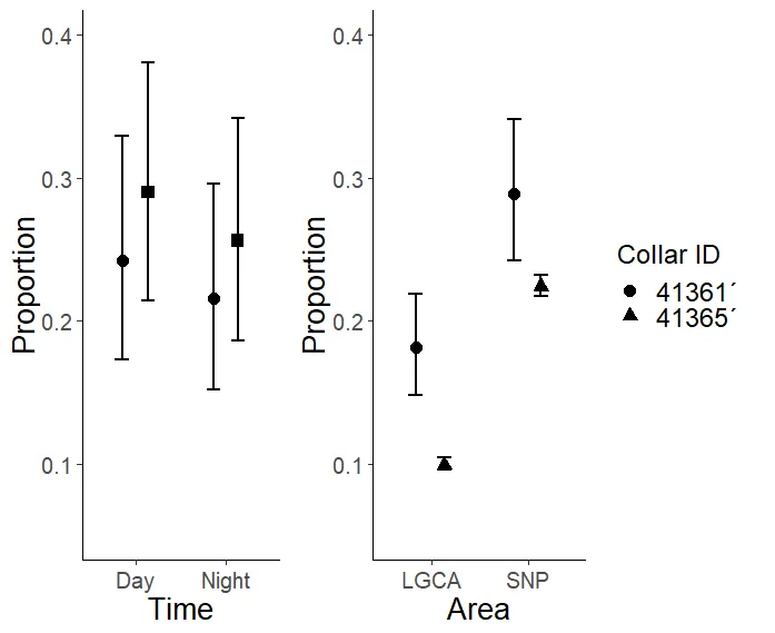
我希望该图例看起来像这个图: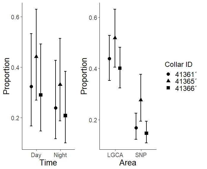
因为p是由两个不同的绘图p1和p2组合而成的,我使用了:
p<- grid.arrange(p1, p2, ncol = 3, widths = c(3,5,0))
只有p2的图例被保留下来(不包括“Collar ID”=41365´,这是我想添加的内容)。
因此,我认为最简单的方法是手动创建一个图例。如果需要的话,我使用下面的脚本创建了 p :
df1 <- tibble::tribble(~Proportion, ~Lower,~Upper, ~Time,~Collar,
                      0.242, 0.173, 0.329, "Day","41361´",
                      0.216, 0.152, 0.296, "Night","41361´")


df2 <- tibble::tribble(~Proportion, ~Lower,~Upper, ~Time,~Collar,
                      0.290, 0.214, 0.381, "Day","41366´",
                      0.256, 0.186, 0.342, "Night","41366´")


df<-rbind(df1,df2)

dfnew <- df %>%
  mutate(ymin = Proportion - Lower,
         ymax = Proportion + Upper,
         linegroup = paste(Time, Collar))

set.seed(2)

myjit <- ggproto("fixJitter", PositionDodge,
                 width = 0.6,
                 dodge.width = 0,
                 jit = NULL,
                 compute_panel =  function (self, data, params, scales)
                 {

                   #Generate Jitter if not yet
                   if(is.null(self$jit) ) {
                     self$jit <-jitter(rep(0, nrow(data)), amount=self$dodge.width)
                   }

                   data <- ggproto_parent(PositionDodge, self)$compute_panel(data, params, scales)

                   data$x <- data$x + self$jit
                   #For proper error extensions
                   if("xmin" %in% colnames(data)) data$xmin <- data$xmin + self$jit
                   if("xmax" %in% colnames(data)) data$xmax <- data$xmax + self$jit
                   data
                 } )


p1<-ggplot(data = dfnew, aes(x = Time, y = Proportion, group=linegroup)) +
  geom_point(aes(shape = as.character(Collar)), size = 4, stroke = 0,
             position = myjit)+
  geom_line(aes(group = linegroup),linetype = "dotted",size=1, position = myjit) +
  theme(axis.text=element_text(size=15),
        axis.title=element_text(size=20)) +
  geom_errorbar(aes(ymin = Lower, ymax = Upper), width=0.3, size=1,
                position = myjit) + scale_shape_manual(values=c("41361´"=19,"41366´"=15)) +
  scale_color_manual(values = c("Day" = "black",
                                "Night" = "black")) + labs(shape="Collar ID") + ylim(0.05, 0.4) + theme(legend.position = "none")

p1

df1 <- tibble::tribble(~Proportion, ~Lower,~Upper, ~Area,~Collar,
                      0.181, 0.148, 0.219, "LGCA","41361´",
                      0.289, 0.242 ,0.341 , "SNP","41361´")

df2 <- tibble::tribble(~Proportion, ~Lower,~Upper, ~Area,~Collar,
                      0.099, 0.096, 0.104, "LGCA","41365´",
                      0.224, 0.217 ,0.232 , "SNP","41365´")

df<-rbind(df1,df2)


dfnew <- df %>%
  mutate(ymin = Proportion - Lower,
         ymax = Proportion + Upper,
         linegroup = paste(Area, Collar))

set.seed(2)

myjit <- ggproto("fixJitter", PositionDodge,
                 width = 0.6,
                 dodge.width = 0,
                 jit = NULL,
                 compute_panel =  function (self, data, params, scales)
                 {

                   #Generate Jitter if not yet
                   if(is.null(self$jit) ) {
                     self$jit <-jitter(rep(0, nrow(data)), amount=self$dodge.width)
                   }

                   data <- ggproto_parent(PositionDodge, self)$compute_panel(data, params, scales)

                   data$x <- data$x + self$jit
                   #For proper error extensions
                   if("xmin" %in% colnames(data)) data$xmin <- data$xmin + self$jit
                   if("xmax" %in% colnames(data)) data$xmax <- data$xmax + self$jit
                   data
                 } )


p2<-ggplot(data = dfnew, aes(x = Area, y = Proportion, group=linegroup)) +
  geom_point(aes(shape = as.character(Collar)), size = 4, stroke = 0,
             position = myjit)+
  geom_line(aes(group = linegroup),linetype = "dotted",size=1, position = myjit) +
  theme(axis.text=element_text(size=15),
        axis.title=element_text(size=20)) +
  geom_errorbar(aes(ymin = Lower, ymax = Upper), width=0.3, size=1,
                position = myjit) + scale_shape_manual(values=c("41361´"=19,"41365´"=17)) + scale_size_manual(values=c(2,2)) +
  scale_color_manual(values = c("SNP" = "black",
                                "LGCA" = "black")) + labs(shape="Collar ID") + ylim(0.05, 0.4) +
  theme(legend.text=element_text(size=18))+
  theme(legend.title = element_text(size=18))

#+ theme(legend.position = "none")


p2


p<- grid.arrange(p1, p2, ncol = 3, widths = c(3,5,0))
请告诉我是否有更好的解决方案。非常感谢您的帮助!


ggplot的内部。我认为这可能比这更简单:您可以做的一件事是确保两个数据子集,或者至少是用于制作图例的数据子集,具有您想要显示的所有因子水平。然后在创建图例的比例尺中添加drop = F。 - camilleforcats。还有几个包可以更轻松地排列ggplots:cowplot、patchwork、ggpubr、egg(我个人没有使用过)。 - camille