我设置了一个非常简单的网页,桌面浏览器上的效果与我的意图相符,但在移动设备上却显示出奇怪的结果。以下是代码:
body {
  font-family: "Raleway", "Tahoma", "Helvetica", "Arial", Sans-serif;
  line-height: 1.4;
  color: #303030;
  font-size: 20px;
}

a,
a:visited {
  color: blue;
  text-decoration: none;
}

a:hover {
  color: red;
}

#container {
  width: 900px;
  margin: 30px auto 0px auto;
}

#links .name {
  display: inline-block;
  font-size: inherit;
  width: 90px;
}

#links .link {
  display: inline-block;
  font-size: inherit;
}

.box {
  background-color: rgba(255, 255, 255, 1);
  padding: 20px 20px;
  margin: 20px 0px;
  box-shadow: 0 1px 1px #D0D0D0;
}
<!DOCTYPE html>
<html>
<body>
<div id="container">
<section class="box">
Hi ! My name is <strong>Name</strong>. You might also know me as <strong>User</strong>. Bla bla bla, this is some text here. But not too much.
</section>
<section class="box">
My main interests are <strong>hobby 1</strong>, <strong>hobby 2</strong>.
</section>
<section class="box">
Reach me easily on <a href="https://twitter.com/Protectator">Twitter</a> !
<br>
<br> You can also find me on
<ul id="links">
<li>
<div class="name">Twitter</div>
<div class="link"><a href="https://twitter.com/Protectator">@Username</a></div>
</li>
<li>
<div class="name">Facebook</div>
<div class="link"><a href="https://www.facebook.com">Username</a></div>
</li>
<li>
<div class="name">Google+</div>
<div class="link"><a href="https://plus.google.com">+Username</a></div>
</li>
</ul>
</section>
</div>
</body>
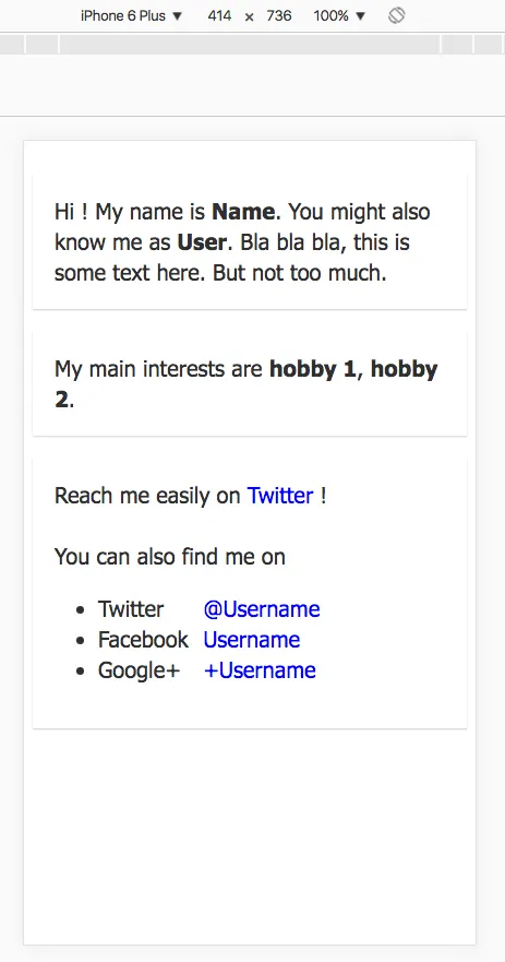
</html>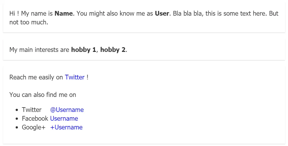 然而,当我从移动设备查看页面时,
<li>元素的文本大小与页面上其他部分相比会减小。下面是它的样子:
 我不知道为什么会发生这种情况。通过开发工具查看,似乎前两个
 <section> 元素的 font-size 会随着移动设备而增加(我已将其设置为20px,但实际上会高得多):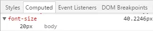 我不理解的是,为什么
<li>元素也不会受到影响?我可以使用<meta name="viewport" content="width=device-width, initial-scale=1">
但是在手机上页面会显得很丑,这不是我想要的。我只想让页面上的文本大小相同。 似乎是"display: inline-block"导致了这个问题,但是找不到其他方法来实现只使用"inline"元素垂直对齐"a"元素。
<head>部分添加:<meta name="viewport" content="width=device-width, initial-scale=1">。 - Django<head>元素吗? - connexo