在Ggplot2中有条件地给条形图着色

3
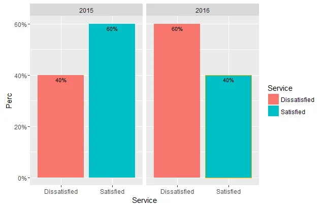
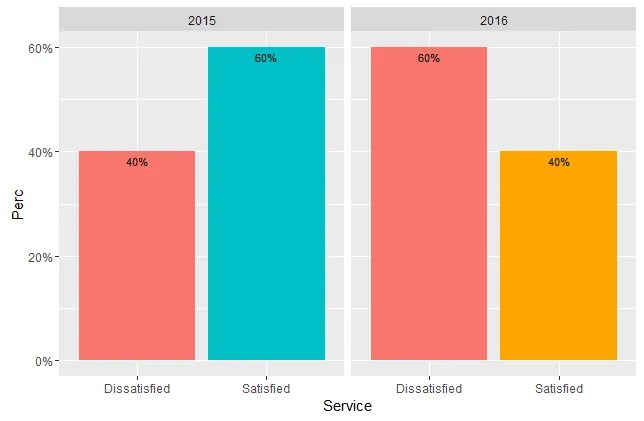
下面是一个简单示例数据框和图表的代码。我想知道如何有条件地着色柱状图。我熟悉使用scale_fill_manual手动给柱子上色,但如果我想让"Satisfied"2016方面如果低于2015中的"Satisfied",那该怎么办呢?也许是一个红色的警告边框或不同的颜色,比如橙色(只是举个例子)。这不是最好的例子,但如果我有一个年度最高分数的图表,当它们下降到一定百分比以下时,这将非常有用。我尝试了一些"colour = ifelse(Perc < 60, "orange", "green"的组合,但无法使它正常工作。我不确定如何构建ifelse语句或在ggplot代码中放置它。
Year<-c(2015, 2015, 2015, 2015, 2015, 2016, 2016, 2016, 2016, 2016)

Service<-c("Satisfied", "Satisfied", "Satisfied", "Dissatisfied", "Dissatisfied",
           "Satisfied", "Satisfied", "Dissatisfied", "Dissatisfied", "Dissatisfied")

df <- data.frame(Year, Service)

library(dplyr)
df.prop <- df %>%
            count(Year, Service) %>%
            mutate(Perc = prop.table(n))

library(ggplot2)
ggplot(df.prop, aes(x = Service, y = Perc, fill = Service)) +
       geom_bar(stat = "identity", position = "dodge") +
       geom_text(aes(label = percent(Perc)), position = position_dodge(width = 1),
                 vjust = 1.5, size = 3) +
       scale_y_continuous(labels = percent) +
       facet_grid( ~ Year)
1个回答

5

可能最简单的方法是向您的数据框中添加一个新变量:

df.prop$colour <- ifelse(df.prop$Service == "Satisfied" & df.prop$Perc < 0.6, "orange", NA)

然后您可以执行以下操作:
ggplot(df.prop, aes(x = Service, y = Perc, fill = Service, colour=colour)) +
  geom_bar(stat = "identity", position = "dodge") +
  geom_text(aes(label = percent(Perc)), position = position_dodge(width = 1),
            vjust = 1.5, size = 3, colour="black") +
  scale_y_continuous(labels = percent) +
  facet_grid( ~ Year) +
  scale_colour_identity()

enter image description here

如果您想根据条件更改填充颜色,则可以执行以下操作:

df.prop$fill <- ifelse(df.prop$Service == "Satisfied" & df.prop$Perc < 0.6, "orange", ifelse(df.prop$Service == "Satisfied" & df.prop$Perc >= 0.6, "#00BFC4", "#F8766D"))

ggplot(df.prop, aes(x = Service, y = Perc, fill = fill)) +
  geom_bar(stat = "identity", position = "dodge") +
  geom_text(aes(label = percent(Perc)), position = position_dodge(width = 1),
            vjust = 1.5, size = 3) +
  scale_y_continuous(labels = percent) +
  facet_grid( ~ Year) +
  scale_fill_identity()

enter image description here


谢谢你的回答,它非常有效。只有一个后续问题,这个答案允许我添加彩色边框,但我如何将实际的条形颜色更改为橙色而不仅仅是轮廓线? - Mike
我该如何获取第二个图表的图例? - Visahan

网页内容由stack overflow 提供, 点击上面的
可以查看英文原文,
原文链接