自定义形状的块

6
我需要为网页创建这样的元素:
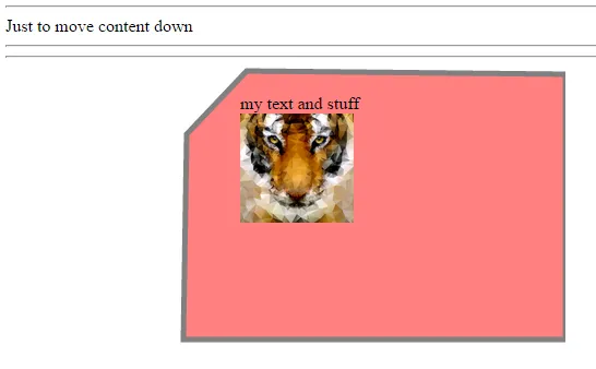
如您所见,有3个角是圆形的,而1个角是斜的。边框在块的不同状态下需要改变。这个元素下面还会有一个照片背景。
所有现有的CSS和JS解决方案都很丑陋和繁琐。
我的想法是:我们可以使用SVG元素绘制这个形状,然后能够通过JS随时操纵边框颜色吗?
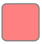
有这个带有圆角的SVG元素:
<svg width="400" height="180">
  <rect x="50" y="20" rx="20" ry="20" width="150" height="150" style="fill:red;stroke:black;stroke-width:5;opacity:0.5">
  Sorry, your browser does not support inline SVG.
</svg>

这会画出这个:

enter image description here

我的问题是:我们能否在这个svg中使其中一个角倾斜,并将内容放在里面?也许通过将此svg作为元素的背景来实现。


我认为在SVG中不使用某种形式的图像是无法完成的。 - adeneo
5个回答

7

我尝试在CSS中重新创建这个形状。就像你说的那样,它有些不完美和琐碎,但我还是想分享一下。

这种方法只适用于现代浏览器。

.box{
    border:5px solid orange;
    background-color:#eee;
    width:100px;
    height:100px;
    padding:30px;
    border-radius:20px;
    position:relative;
}
.box::after{
    content:'';
    position:absolute;
    top: -23px;
    left: -25px;
    width:40px;
    height:40px;
    border-right:5px solid orange;
    background:#fff;
    transform:rotate(45deg);
}
<div class="box">Content</div>


对于纯CSS解决方案,我认为这可能是最有可能的解决方案...也许不是100%最好的,但它可以工作:D - Cayce K

1
你可以使用JavaScript操作SVG,但它也会响应CSS的变化。
如果你有一个id为“mysvg”的SVG和一个id为“myborder”的“path”元素,你可以为边框路径定义样式:
#mysvg #myborder {
    stroke: orange;
}

你可以直接操作SVG,或像普通样式一样定义样式。最简单的方法是操纵包装器
类。这是因为操作HTML样式比SVG更容易,并且与标准JS和JS库更协调:
<div id="myshape">
    <svg id="mysvg" height="600" width="400">
        <path id="myborder" d="..." stroke="blue" stroke-width="5">
    </svg>
    <div id="content">Content</div>
</div>

然后您可以拥有这些类:
#myshape #mysvg #myborder {
    stroke: blue;
}

#myshape.hilite #mysvg #myborder {
    stroke: orange;
}

简单修改父类将会更新你的SVG。在这种情况下,添加/删除类“hilite”到父级“div”即可更改边框颜色。
示例:http://jsfiddle.net/jtbowden/ssrker2h/2/ JS对于此更改并不必要,但我使用它来修改类。这也可以通过悬停属性等轻松完成。
仅CSS示例:

#content {
    padding: 50px;
    position: absolute;
    top: 25px;
    left: 25px;
    font-size: 42px;
    font-family: Arial;
    font-weight: bold;
}

#myshape:hover #myborder {
    stroke: orange;
}
<div id="myshape">
    <svg id="shape" height="600" width="420">
        <defs>
            <pattern id="mybackgnd" patternUnits="userSpaceOnUse" width="400" height="590">
                <image xlink:href="http://placekitten.com/g/400/590" x="0" y="0" width="400" height="590" opacity="0.5" />
            </pattern>
        </defs>
        <path id="myborder" d="M 20 60 l 40 -40 l 320 0 c 10 0 20 10 20 20 l 0 500 c 0 10 -10 20 -20 20 l -340 0 c -10 0 -20 -10 -20 -20 z" stroke="blue" stroke-width="5" fill="url(#mybackgnd)" />Sorry, your browser does not support inline SVG.</svg>
    <div id="content">Hover Me</div>
</div>


0

不使用JavaScript,仅使用HTML/CSS

enter image description here

要创建所需的形状,需要使用多边形而不是矩形:

我已经测试过以下内容可行:

.foo {
      position:relative;
      top:25px;    
      left:215px;
      float:left;
    }
    <hr>Just to prove adding content moves move svg an its content down<hr><hr>
    <div class="foo">my text and stuff <br><img src="http://blog.spoongraphics.co.uk/wp-content/uploads/2014/low-poly/tiger-poly-lg.jpg" height="100px"></div>
    <svg width="400" height="400">
      <polygon points="50 250,400 250,400 7,108 4,53 62" style="fill:red;stroke:black;stroke-width:5;opacity:0.5">
    </polygon>
    Sorry, your browser does not support inline SVG.
    </svg>


0
  1. 如果您使用CSS链接SVG,则无法使用JS操纵其样式,但如果将SVG包含在HTML中,则可以这样做。

  2. 可以使用SVG <path>标签制作倾斜的角落,手工制作所需形状非常复杂,因此建议使用矢量图形编辑器工具创建形状并导出为SVG。我推荐使用CorelDraw或Adobe Illustrator,如果您有其中之一或免费的Inkscape。


0
一个 CSS 解决方案:
  1. 绘制带有圆角边框的 div
  2. 添加 :before 以将边框颜色的三角形放置在顶部角落上方
  3. 添加 :after 以在 :before 三角形上方放置稍小的背景颜色三角形

#card {
    height: 400px;
    width: 200px;
    border: 3px solid blue;
    border-radius: 10px;
    background-color: tan;
    position: relative;
}

#card:before {
    content:"";
    height:0;
    width: 0;
    position: absolute;
    top:-3px;
    left:-3px;
    border-top: 35px solid blue;
    border-right: 35px solid transparent;
}

#card:after {
    content: "";
    height: 0;
    width: 0;
    position: absolute;
    top: -3px;
    left: -3px;
    border-top: 30px solid white;
    border-right: 30px solid transparent;
}
<div id="card"></div>

对于 svg,您可以使用路径绘制框:

<svg height="155" width="155">
<path style="opacity:0.5;stroke:#000000;stroke-width:5;fill:#ff0000;" d="M42.7,2.5,2.5,42.7,2.5,132c0,11.1,8.92,20,20,20h110c11.1,0,20-8.92,20-20v-110c0-11.1-8.92-20-20-20h-89.8z"/>
</svg>


网页内容由stack overflow 提供, 点击上面的
可以查看英文原文,
原文链接