如何将坐标轴刻度标签从数字格式化为千位或百万位(125,436 格式化为 125.4K)

45
import matplotlib.pyplot as plt
import matplotlib.ticker as ticker
import seaborn as sns
import pandas as pd
sns.set(style="darkgrid")    
fig, ax = plt.subplots(figsize=(8, 5))    
palette = sns.color_palette("bright", 6)
g = sns.scatterplot(ax=ax, x="Area", y="Rent/Sqft", hue="Region", marker='o', data=df, s=100, palette= palette)
g.legend(bbox_to_anchor=(1, 1), ncol=1)
g.set(xlim = (50000,250000))

enter image description here

如何将轴格式从数字更改为自定义格式?例如,将125000更改为125.00K。
5个回答

55

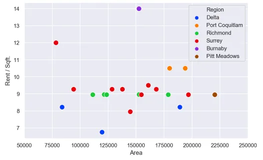
如果我理解正确,您可以格式化x轴刻度并设置这些内容:

In[60]:
#generate some psuedo data
df = pd.DataFrame({'num':[50000, 75000, 100000, 125000], 'Rent/Sqft':np.random.randn(4), 'Region':list('abcd')})
df

Out[60]: 
      num  Rent/Sqft Region
0   50000   0.109196      a
1   75000   0.566553      b
2  100000  -0.274064      c
3  125000  -0.636492      d

In[61]:
import matplotlib.pyplot as plt
import matplotlib.ticker as ticker
import seaborn as sns
import pandas as pd
sns.set(style="darkgrid")    
fig, ax = plt.subplots(figsize=(8, 5))    
palette = sns.color_palette("bright", 4)
g = sns.scatterplot(ax=ax, x="num", y="Rent/Sqft", hue="Region", marker='o', data=df, s=100, palette= palette)
g.legend(bbox_to_anchor=(1, 1), ncol=1)
g.set(xlim = (50000,250000))
xlabels = ['{:,.2f}'.format(x) + 'K' for x in g.get_xticks()/1000]
g.set_xticklabels(xlabels)

Out[61]: 

这里关键的部分是这一行:

enter image description here

xlabels = ['{:,.2f}'.format(x) + 'K' for x in g.get_xticks()/1000]
g.set_xticklabels(xlabels)

因此,它将所有的刻度都除以1000,然后格式化并设置xtick标签。

更新 感谢@ScottBoston提出了一种更好的方法:

ax.xaxis.set_major_formatter(ticker.FuncFormatter(lambda x, pos: '{:,.2f}'.format(x/1000) + 'K'))

查看文档


9
您可以尝试使用ticker.FuncFormatter:
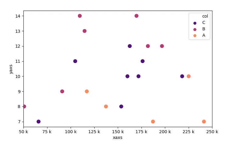
ax.xaxis.set_major_formatter(ticker.FuncFormatter(lambda x, pos: '{:,.2f}'.format(x/1000) + 'K'))。该函数可将x轴上的数值除以1000,并将结果格式化为带有“ K”后缀的千位分隔符字符串。 - Scott Boston
3
请注意,如果您的图形是“FacetGrid”,则“ax.xaxis.set_major_formatter”方法不起作用。 - Scott H

40

在标准单位中格式化刻度标签的规范方法是使用EngFormatter。 在 matplotlib 文档中还有一个示例

还可以参见刻度定位和格式化

这里可能会看起来像下面这样。

import numpy as np; np.random.seed(42)
import matplotlib.pyplot as plt
import matplotlib.ticker as ticker
import seaborn as sns
import pandas as pd

df = pd.DataFrame({"xaxs" : np.random.randint(50000,250000, size=20),
                   "yaxs" : np.random.randint(7,15, size=20),
                   "col"  : np.random.choice(list("ABC"), size=20)})
    
fig, ax = plt.subplots(figsize=(8, 5))    
palette = sns.color_palette("bright", 6)
sns.scatterplot(ax=ax, x="xaxs", y="yaxs", hue="col", data=df, 
                marker='o', s=100, palette="magma")
ax.legend(bbox_to_anchor=(1, 1), ncol=1)
ax.set(xlim = (50000,250000))

ax.xaxis.set_major_formatter(ticker.EngFormatter())

plt.show()

输入图像描述这里


FYI:对于使用 matplotlib 3.3.1seaborn 0.10.1 运行此代码的任何人,您将收到 ValueError: zero-size array to reduction operation minimum which has no identity。为解决此问题,请将 hue='col' 更改为 hue=df.col.tolist()。这是一个已知的错误。 - Trenton McKinney

10
使用Seaborn而不导入matplotlib:

使用Seaborn而不需要导入matplotlib

import seaborn as sns
sns.set()

chart = sns.relplot(x="x_val", y="y_val", kind="line", data=my_data)

ticks = chart.axes[0][0].get_xticks()

xlabels = ['$' + '{:,.0f}'.format(x) for x in ticks]

chart.set_xticklabels(xlabels)
chart.fig

感谢EdChum上面的答案,让我达到了90%的进展。

2
如果你想使用格式化工具(https://matplotlib.org/stable/api/ticker_api.html),而不是导入matplotlib,你可以使用:`chart.ax.xaxis.set_major_formatter(formatter)`。 - Nicolas Malbran

5
我是这样解决问题的:(与ScottBoston类似)
from matplotlib.ticker import FuncFormatter

f = lambda x, pos: f'{x/10**3:,.0f}K'
ax.xaxis.set_major_formatter(FuncFormatter(f))

1
我们可以使用API:ax.get_xticklabels()get_text()ax.set_xticklabels来实现它。

e.g,

xlabels = ['{:.2f}k'.format(float(x.get_text().replace('−', '-')))/1000 for x in g.get_xticklabels()]
g.set_xticklabels(xlabels)

2
强烈反对仅提供代码的答案。请包含解释,说明如何以及为什么解决了问题。这将有助于未来的读者更好地理解您的解决方案。- 来自审查 - tdy

网页内容由stack overflow 提供, 点击上面的
可以查看英文原文,
原文链接