我需要做像黄色线一样的效果。
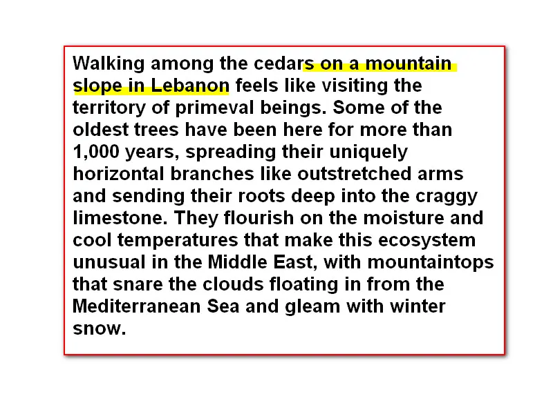
我知道使用<span>或<p>可以模仿这种标记效果。
但是我需要这个标记不要完全覆盖文本高度,必须是1/2或1/3的高度。(如图片所示)
我试过使用伪类(before和after),但仍然失败了。
请给我一些提示!
我需要做像黄色线一样的效果。
我知道使用<span>或<p>可以模仿这种标记效果。
但是我需要这个标记不要完全覆盖文本高度,必须是1/2或1/3的高度。(如图片所示)
我试过使用伪类(before和after),但仍然失败了。
请给我一些提示!
我能想到的最简单和最快的方法是使用 linear-gradient 来“半填充”你的背景:
.half_background {
  background: linear-gradient(to top, yellow 50%, transparent 50%);
}<p>Some text, <span class="half_background">some other text with half background</span>.</p>然后,我们可以轻松扩展它来执行其他操作:
p {
  background-color: #eee;
  margin: 0.4em 0;
  padding: 0.6em;
}

.half_background {
  background: linear-gradient(to top, var(--bot) 50%, var(--top) 50%);
}<p>Some text, <span class="half_background" style="--top: transparent; --bot: yellow;">some other text with half background</span>.</p>
<p>Some text, <span class="half_background" style="--top: orange; --bot: transparent;">some other text with half background</span>.</p>
<p>Some text, <span class="half_background" style="--top: violet; --bot: cyan;">some other text with half background</span>.</p>h1 {
position: relative;
color: #FFF;
}
h1:after {
content: attr(data-content);
position: absolute;
color: #000;
top: 0;
left: 0;
width: 100%;
height: 50%;
background-color: yellow;
}
h1::selection {
background: white;
}<h1 data-content="Hello world!">Hello world!</h1>来源:
我发现了这个东西,非常有用,我用过一次。
.half-highlight {
  font-size: 30px;
  background-image: linear-gradient(to right, transparent 50%, green 50%);
  background-origin: 0;
  background-size: 200% 50%;
  background-repeat: repeat-x;
  background-position: 0 100%;
  transition: background-position 0.5s;
  background-position: -100% 100%;
}
<span class="half-highlight"> </span>,希望它能对你有用!!!
HTML:
<div class="container mt-5">
  <div class="row">
    <p>
      Lorem ipsum dolor sit amet consectetur, adipisicing elit. <span class="highlighted">Sunt maiores, praesentium possimus itaque laudantium modi ratione cumque nisi quis quae hic. Maiores iure a dicta fugiat dolores modi in neque! Lorem ipsum dolor sit, amet consectetur adipisicing elit.</span> Facere ipsum sequi necessitatibus ex consectetur libero cumque velit culpa aut quo magnam eaque adipisci cupiditate eos autem molestiae, quisquam vel iusto.
    </p>
  </div>
</div>
.highlighted {
  background: linear-gradient(0deg, yellow 50%, transparent 50%);
}
要查看代码的实际效果,请点击以下链接: https://codepen.io/anon/pen/ejBLeq?editors=1100