我有一个应用程序,使用UIViewController在UIWebView中显示文章,其中一些文章有图片。 我已经设置好了当单击图片时调用
- (void)displayImage:(NSInteger)i {
ImageViewController * imageVC = [[ImageViewController alloc] initWithImageId:i];
[self.navigationController pushViewController:imageVC animated:YES];
[imageVC release];
这会加载另一个UIViewController。 我的所有视图都能很好地响应旋转。ImageViewController保持图片的比例,而ArticleViewController则用文字填充屏幕。但是,每当我在查看ImageViewController时将屏幕旋转到横向模式并按返回按钮时,上一个UIViewController会自动错误地调整大小,增加文本字体大小而不是在一行上添加更多单词。
编辑:
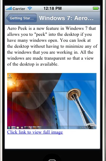
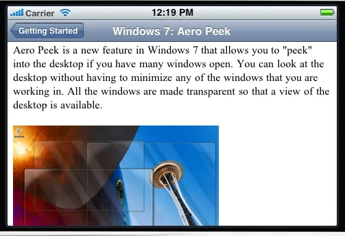
这是一篇文章视图控制器:
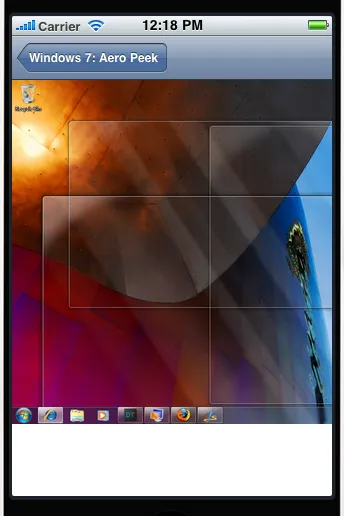
这是点击图像后出现的ImageViewController:
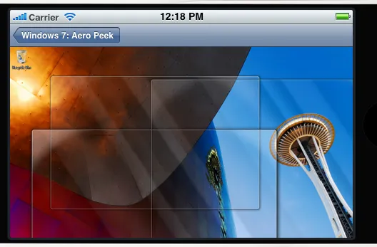
现在如果我们在这里改变方向...
然后点击返回按钮,文章内容被不适当地调整大小以适应窗口。
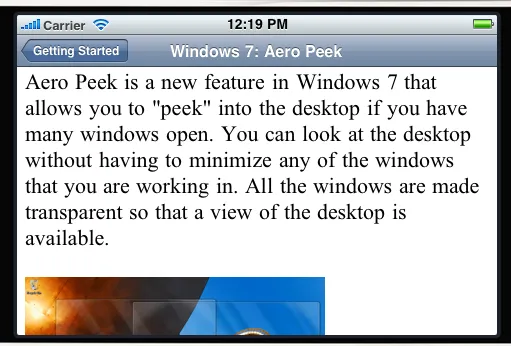
这可以通过将iPhone翻转两次来纠正。这是文章在横向模式下应该看起来的样子。
问题与UIWebView在不可见时未能自适应大小有关。我该怎么做才能解决这个问题?