很抱歉这是一大段文字,但我会解释问题,包括数据,并提供一些代码 :)
问题:
我有一些气候数据,想要使用R进行绘图。我正在处理的数据是不规则的277x349网格,其中(x=经度,y=纬度,z=观测值)。假设z是一个压力测量值(500 hPa高度(m))。我尝试使用ggplot2包在地图上绘制轮廓线(或等压线),但由于数据结构的原因,我遇到了一些问题。
数据来自于一个Lambert等角投影的正常、均匀间隔的277x349网格,对于每个网格点,我们都有实际的经度、纬度和压力测量值。它是在投影上的一个规则网格,但如果我将数据作为地图上的点绘制出来,使用记录观测值的实际经度和纬度,我会得到以下结果:
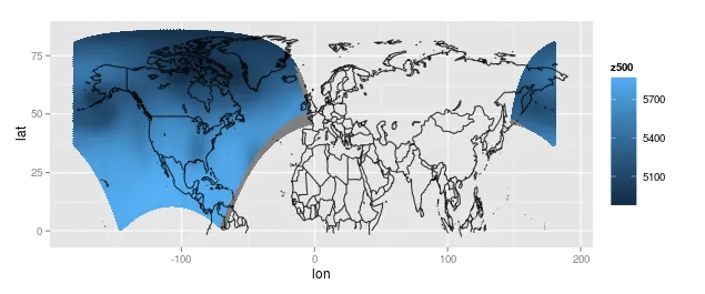
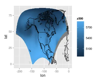
我可以通过将最右边的部分向左移动一点来使它看起来更好(也许可以用一些函数来完成这个操作,但我手动完成了这个操作),或者忽略最右边的部分。这是将右边的部分向左平移后的图:
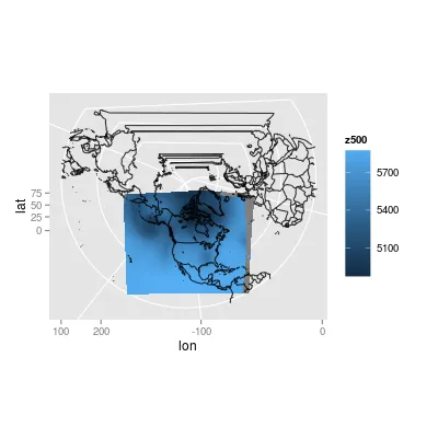
(旁注)只是为了好玩,我尽力重新应用原始投影。我从数据源中获得了一些应用投影的参数,但我不知道这些参数的含义。此外,我不知道R如何处理投影(我确实阅读了帮助文件...),所以这个图是通过一些试错产生的:
我尝试使用ggplot2中的geom_contour函数添加轮廓线,但它使我的R卡住了。在尝试对少量数据进行操作后,我发现ggplot抱怨数据是不规则网格的。我还发现这就是geom_tile无法工作的原因。我猜我需要让我的点网格均匀间隔 - 可能是通过将其投影回原始投影(?),或者通过采样一个规则网格(?)或在点之间插值(?)来均匀间隔我的数据。
我的问题是:
如何在地图上绘制我的数据的轮廓线(最好使用ggplot2)?
额外的问题:
如何将我的数据转换回Lambert等角投影的规则网格?根据数据文件,投影的参数包括(mpLambertParallel1F=50, mpLambertParallel2F=50, mpLambertMeridianF=253, corners, La1=1, Lo1=214.5, Lov=253)。我不知道这些是什么。
如何将地图居中,以免像第一个地图一样裁剪掉一侧?
如何使映射的投影绘图看起来漂亮(没有不必要的地图部分挂在周围)?我尝试调整xlim和ylim,但似乎是在投影前应用坐标轴限制。
数据:
我已经将数据上传到Google Drive上的rds文件。您可以使用R中的readRDS函数读取文件。
lat2d: 2D网格上观测的实际纬度
lon2d: 2D网格上观测的实际经度
z500: 在压力为500毫巴时观测到的高度(米)
dat: 数据排列成漂亮的数据框(用于ggplot2)
据我所知,这些数据来自北美地区再分析数据库。
我的代码(到目前为止):
library(ggplot2)
library(ggmap)
library(maps)
library(mapdata)
library(maptools)
gpclibPermit()
library(mapproj)

lat2d <- readRDS('lat2d.rds')
lon2d <- readRDS('lon2d.rds')
z500 <- readRDS('z500.rds')
dat <- readRDS('dat.rds')

# Get the map outlines
outlines <- as.data.frame(map("world", plot = FALSE,
                              xlim = c(min(lon2d), max(lon2d)),
                              ylim = c(min(lat2d), max(lat2d)))[c("x","y")])
worldmap <-geom_path(aes(x, y), inherit.aes = FALSE,
                     data = outlines, alpha = 0.8, show_guide = FALSE)

# The layer for the observed variable
z500map <- geom_point(aes(x=lon, y=lat, colour=z500), data=dat)

# Plot the first map
ggplot() + z500map + worldmap

# Fix the wrapping issue
dat2 <- dat
dat2$lon <- ifelse(dat2$lon>0, dat2$lon-max(dat2$lon)+min(dat2$lon), dat2$lon)

# Remake the outlines
outlines2 <- as.data.frame(map("world", plot = FALSE,
                              xlim = c(max(min(dat2$lon)), max(dat2$lon)),
                              ylim = c(min(dat2$lat), max(dat2$lat)))[c("x","y")])
worldmap2 <- geom_path(aes(x, y), inherit.aes = FALSE,
                       data = outlines2, alpha = 0.8, show_guide = FALSE)

# Remake the variable layer
ggp <- ggplot(aes(x=lon, y=lat), data=dat2)
z500map2 <- geom_point(aes(colour=z500), shape=15)

# Try a projection
projection <- coord_map(projection="lambert", lat0=30, lat1=60,
                        orientation=c(87.5,0,255))

# Plot
# Without projection
ggp + z500map2 + worldmap2
# With projection
ggp + z500map + worldmap + projection
谢谢!
更新1
感谢Spacedman的建议,我认为我已经取得了一些进展。使用raster软件包,我可以直接从netcdf文件中读取并绘制轮廓线:
library(raster)
# Note: ncdf4 may be a pain to install on windows.
# Try installing package 'ncdf' if this doesn't work
library(ncdf4)

# band=13 corresponds to the layer of interest, the 500 millibar height (m)
r <- raster(filename, band=13)
plot(r)
contour(r, add=TRUE)
现在我需要做的就是让地图轮廓显示在等高线下面!听起来很容易,但我猜测需要正确输入投影参数才能准确完成。
对于感兴趣的人,这是以netcdf格式的文件。
更新2 经过深入调查,我取得了更多进展。我认为现在我已经有了合适的PROJ4参数。我还发现了适当的边界框值(我想)。至少,我能够大致绘制与ggplot相同区域的图表。
# From running proj +proj=lcc +lat_1=50.0 +lat_2=50.0 +units=km +lon_0=-107
# in the command line and inputting the lat/lon corners of the grid
x2 <- c(-5628.21, -5648.71, 5680.72, 5660.14)
y2 <- c( 1481.40, 10430.58,10430.62, 1481.52)
plot(x2,y2)

# Read in the data as a raster
p4 <- "+proj=lcc +lat_1=50.0 +lat_2=50.0 +units=km +lon_0=-107 +lat_0=1.0"
r <- raster(nc.file.list[1], band=13, crs=CRS(p4))
r
# For some reason the coordinate system is not set properly
projection(r) <- CRS(p4)
extent(r) <- c(range(x2), range(y2))
r
# The contour map on the original Lambert grid
plot(r)

# Project to the lon/lat
p <- projectRaster(r, crs=CRS("+proj=longlat"))
p
extent(p)
str(p)
plot(p)
contour(p, add=TRUE)
感谢Spacedman的帮助。如果我无法弄清楚,我可能会开始一个关于叠加shapefiles的新问题!