如何让所包含的pie图表填满其所在的div?该div的宽度为198px,高度为152px。
此外,我还想在每个饼图切片内部添加一个linear-gradient效果,您可以提供建议吗?
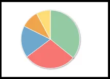
如何让所包含的pie图表填满其所在的div?该div的宽度为198px,高度为152px。
此外,我还想在每个饼图切片内部添加一个linear-gradient效果,您可以提供建议吗?
通过在饼图的plotOptions中设置size属性并从图表中删除margins、spacing和titles,可以实现饼图的完整高度。
代码
    chart: {
        margin: [0, 0, 0, 0],
        spacingTop: 0,
        spacingBottom: 0,
        spacingLeft: 0,
        spacingRight: 0
    },
    plotOptions: {
        pie: {
            size:'100%',
            dataLabels: {
                enabled: false
            }
        }
    }
示例 (更新到 fiddle 版本 2.2.4)
这里是一个示例,演示了它的效果。
至于线性渐变,我不知道它们是否已经实现,但是这里有一个显示径向渐变的示例
径向渐变现在也是 Highcharts 3.0 的一部分,这里有一个示例
更新
看起来从 Highcharts 3.0 开始,由于图表在绘图区内自动缩放,因此不再可能,以下是它们文档的摘录:
size:相对于绘图区的饼图直径。可以是百分比或像素值。像素值采用整数表示。 默认行为(截至3.0)是缩放到绘图区并在绘图区内给数据标签留出空间。 因此,在更新点并移动数据标签时,饼图的大小可能会有所变化。在这种情况下,最好设置固定值,例如 "75%"。默认为。
在我看来,这不应该是这种情况,因为 dataLabels 被禁用了。可能应该被记录为一个错误
更新(2014年8月)
As per Torstein's comment, this is indeed still possible. slicedOffset needs to be set to 0 in addition to the margins begin set. (example)
$(function () {
    $('#container').highcharts({
        title: null,
        chart: {
            type: 'pie',
            margin: 0
        },

        plotOptions: {
            pie: {
                slicedOffset: 0,
                size: '100%',
                dataLabels: {
                    enabled: false
                }
            }
        },

        series: [{
            data: [
                ['Firefox',   44.2],
                ['IE7',       26.6],
                ['IE6',       20],
                ['Chrome',    3.1],
                ['Other',    5.4]
            ]
        }]
    });
});
#container {
outline: 1px solid red;
padding: 0;
}<script src="https://ajax.googleapis.com/ajax/libs/jquery/1.7.2/jquery.min.js"></script>
<script src="https://code.highcharts.com/highcharts.js"></script>
<div id="container" style="height: 400px; width: 500"></div>我的解决方案;(针对图例位置 margin-top 错误...)
chart: {
                    plotBackgroundColor: null,
                    plotBorderWidth: null,
                    plotShadow: false,
                    type: 'pie',
                    height:'100%' // added...
                },

plotOptions: {
        pie: {
            size:'100%',
             height: '100%',
            dataLabels: {
                enabled: false
            }
        }
    }