我已经得到了当前正在渲染的HTML:
<div style="width: 912px; height: 673px;">
    <div id="img-container" style="height: 58.82%; width: 47.07%; top: 20.59%; left: 26.46%; position: absolute;">
        <img class="grid-img" src="grid.jpg" alt="grid" style="width: 100%; height: 100%;"/>
        <div style="top: 40.55%; left: 50.13%; width: 11.7%; height: 19.33%; z-index: 13; position: absolute; transform: rotate(0deg); display: block;">
            <svg viewBox="0 0 100 100" height="100%" width="100%" id="square-0" preserveAspectRatio="none" class="annotation" name="square">
                <rect x=".5%" y=".5%" height="98.5%" width="99%" stroke="white" fill="#cc0000" stroke-width="4"/>
            </svg>
        </div>
        <div style="top: 40.34%; left: 26.72%; width: 11.96%; height: 19.75%; z-index: 14; position: absolute; transform: rotate(0deg); display: block;">
            <svg viewBox="0 0 100 100" height="100%" width="100%" id="roundedSquare-1" class="annotation" name="roundedSquare" preserveAspectRatio="none">
                <rect x=".5%" y=".5%" height="98.5%" width="99%" stroke="white" fill="#990099" stroke-width="4" rx="6"/>
            </svg>
        </div>
        <div style="top: 21.43%; left: 27.1%; width: 11.58%; height: 19.12%; z-index: 15; position: absolute; transform: rotate(0deg); display: block;">
            <svg viewBox="0 0 100 100" height="100%" width="100%" id="squareLetter-2" class="annotation" name="squareLetter" preserveAspectRatio="none">
                <rect x="1.5" y="1.5" height="97" width="97" stroke="#00ffff" stroke-width="4" fill="#ff9900"/>
                <text class="step-text" x="50" y="50" dy="26.5" dx="0.0em" text-anchor="middle" fill="white" font-size="74.96px">A</text>
            </svg>
        </div>
    </div>
</div>
这将呈现为: {{link1:
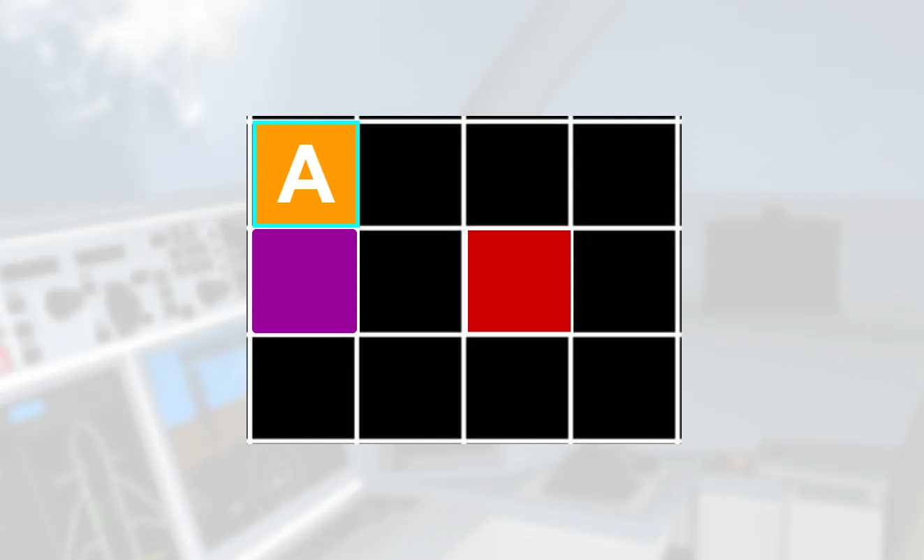 }}
}}目标是在调整浏览器窗口大小时,保持图像的纵横比,并使SVG调整大小以在网格图像内保持位置和形状。我尝试将 div上的高度设置为auto,这确实保持了图像的比例。但是SVG仍然以一种对我来说不合理的方式调整大小:
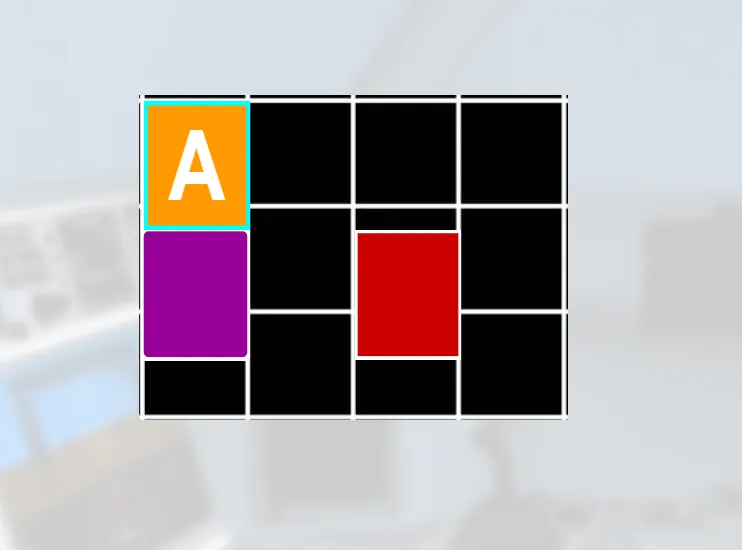
我尝试将围绕SVG的
元素的
编辑: 我应该澄清,最终的网格图像可以是任何图像。我只是使用它作为模板和指南来实现目标。最终,无论哪个图像以及任何SVG都需要一起适当地调整大小,以便始终具有相同的外观。
height更改为auto,它们看起来大小正确,但位置偏移了:
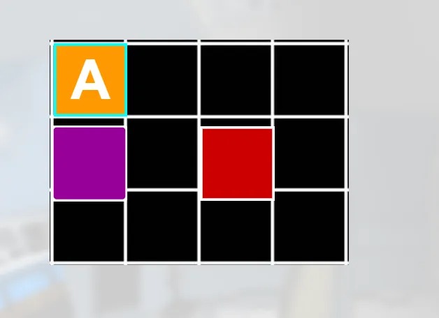
编辑: 我应该澄清,最终的网格图像可以是任何图像。我只是使用它作为模板和指南来实现目标。最终,无论哪个图像以及任何SVG都需要一起适当地调整大小,以便始终具有相同的外观。