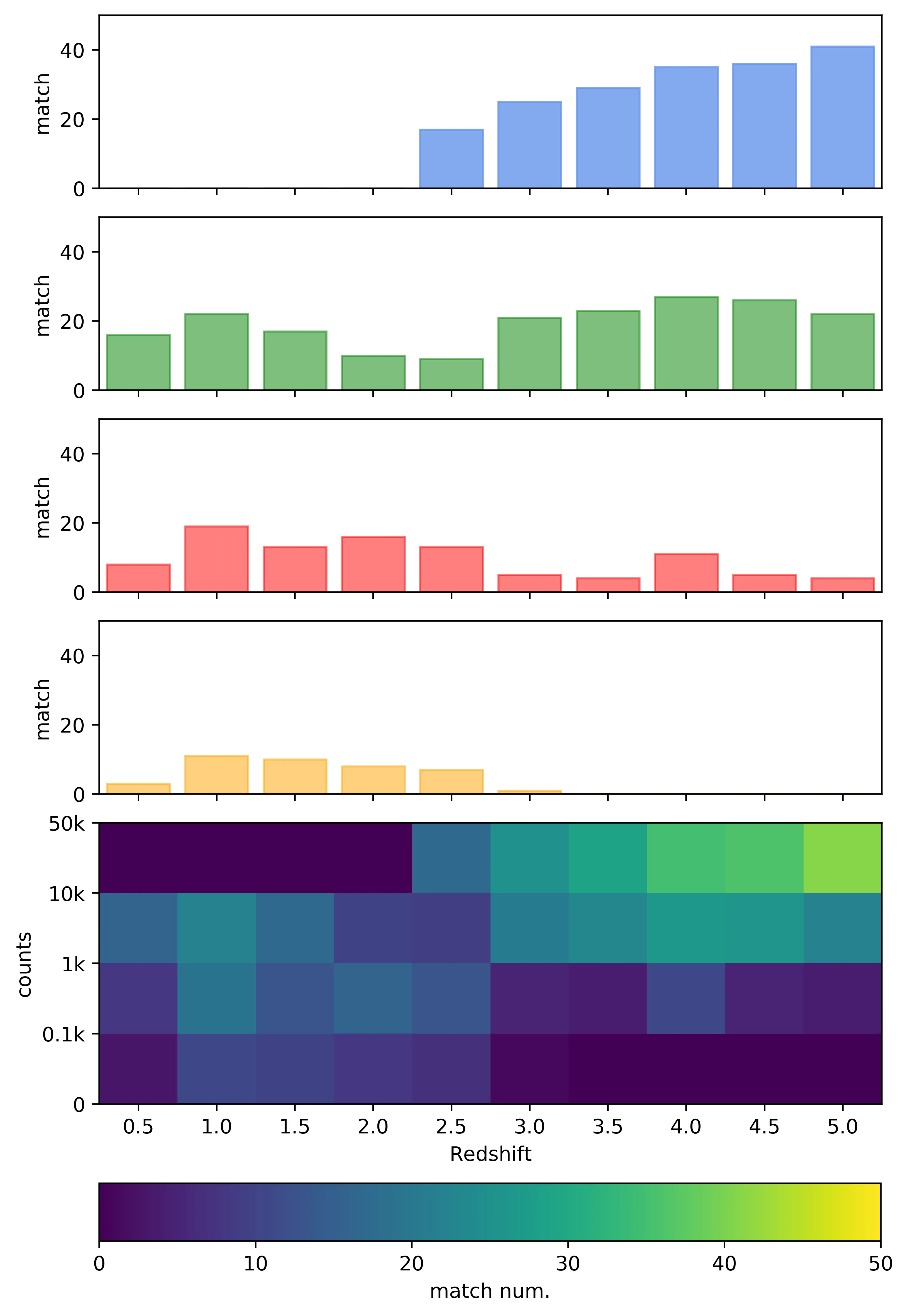
我已经在论坛上搜索过,参考了此链接,但我的问题与它有些不同。如下代码和图片所示,我用colormap“virdis”创建了一个地图。如何创建具有相同colormap的单独的条形图?我希望将4个彩条(现在用简单颜色着色)着色,使y轴上的值对应于colorbar的值,这是可能的吗?
我有这个矩阵:
我有这个矩阵:
matrix=[[ 0  0  0  0 17 25 29 35 36 41]
 [16 22 17 10  9 21 23 27 26 22]
 [ 8 19 13 16 13  5  4 11  5  4]
 [ 3 11 10  8  7  1  0  0  0  0]]
以下是相关代码:fig, ax = plt.subplots(figsize=(7, 10))
im = ax.imshow(matrix, cmap='viridian')
ax.set_xticks([0,1,2,3,4,5,6,7,8,9])
ax.set_xticklabels(['0.5','1.0','1.5','2.0','2.5','3.0','3.5','4.0','4.5','5.0'])
ax.set_xlabel('Redshift')
ax.set_yticks([-0.5,0.5,1.5,2.5,3.5])
ax.set_yticklabels(['50k','10k','1k','0.1k','0'])
ax.set_ylabel('counts')
divider = make_axes_locatable(ax)
axHistx1 = divider.append_axes("top", 1.2, pad=0.2, sharex=ax)
axHistx1.xaxis.set_tick_params(labelbottom=False)
axHistx2 = divider.append_axes("top", 1.2, pad=0.2, sharex=ax)
axHistx2.xaxis.set_tick_params(labelbottom=False)
axHistx3 = divider.append_axes("top", 1.2, pad=0.2, sharex=ax)
axHistx3.xaxis.set_tick_params(labelbottom=False)
axHistx4 = divider.append_axes("top", 1.2, pad=0.2, sharex=ax)
axHistx4.xaxis.set_tick_params(labelbottom=False)
cbaxes = fig.add_axes([0.125, 0.03, 0.774, 0.04])
cbar=fig.colorbar(im, label='match num.', cax = cbaxes, orientation="horizontal", boundaries=np.linspace(0,50,1001),
ticks=[0,10,20,30,40,50])
cbar.set_clim(0,50)
#print(matrix)
row0 = np.array(matrix[0,:])
row1 = np.array(matrix[1,:])
row2 = np.array(matrix[2,:])
row3 = np.array(matrix[3,:])
col0 = np.array(matrix[:,0]).T
col1 = np.array(matrix[:,1]).T
col2 = np.array(matrix[:,2]).T
col3 = np.array(matrix[:,3]).T
col4 = np.array(matrix[:,4]).T
col5 = np.array(matrix[:,5]).T
col6 = np.array(matrix[:,6]).T
col7 = np.array(matrix[:,7]).T
col8 = np.array(matrix[:,8]).T
col9 = np.array(matrix[:,9]).T
zbin = [0,1,2,3,4,5,6,7,8,9]
row0 = row0.ravel();row1 = row1.ravel();row2 = row2.ravel();row3 = row3.ravel();
axHistx1.bar(zbin, row3, color='orange', alpha=0.5, edgecolor=['orange']*len(zbin))
axHistx1.set_ylim(0,50)
axHistx1.set_ylabel('match')
axHistx2.bar(zbin, row2, color='r', alpha=0.5, edgecolor=['r']*len(zbin))
axHistx2.set_ylim(0,50)
axHistx2.set_ylabel('match')
axHistx3.bar(zbin, row1, color='g', alpha=0.5, edgecolor=['g']*len(zbin))
axHistx3.set_ylim(0,50)
axHistx3.set_ylabel('match')
axHistx4.bar(zbin, row0, color='cornflowerblue', alpha=0.8, edgecolor=['cornflowerblue']*len(zbin))
axHistx4.set_ylim(0,50)
axHistx4.set_ylabel('match')
ax.axis('tight')
plt.show()
ax.set_xlim(-0.5,9.5),黑色空白将被移除。 - Alessandro Peca