我正在努力解决这个问题,希望有人能提供一些建议:
 在添加图片后,页面的显示如下:
我知道一个解决方法是将图像设置为background-image,但我不想这样做,并想知道是否可以按照我上面尝试的方式完成。
在添加图片后,页面的显示如下:
我知道一个解决方法是将图像设置为background-image,但我不想这样做,并想知道是否可以按照我上面尝试的方式完成。
希望有人能帮忙!
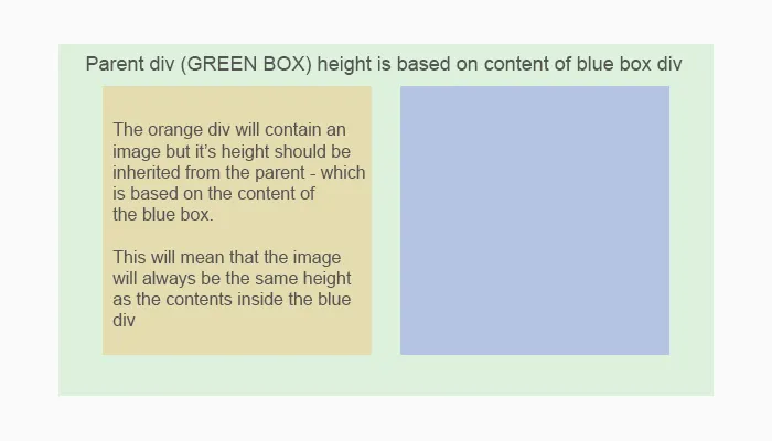
- 我有一个高度未指定的父级div,因此可以通过其内容来确定。
- 然后,在该父div内部有两个“子”元素,但我只想让其中一个决定父div的高度。
- 另一个子div包含一个图像,这个图像应占据其容器的100%的高度(其高度应基于父div的高度)- 这是通过将高度值指定为:inherit来实现的。
以下图片可进行说明:
我已经按计划完成了所有工作,但是一旦添加图像,它要么不能填满其容器的整个高度,要么会导致图像溢出,从而改变父div的高度(这不是我想要的)。
以下是添加图像之前的代码:
.parentDiv {
  width: 100%;
  background-color: grey;
  display: flex;
  flex-direction: row;
  justify-content: space-between;
}
.imageDiv {
  width: 50%;
  height: inherit;
  background-color: orange;
}
.contentDiv {
  width: 50%;
  background-color: lightgreen;
}
.contentDiv p {
  padding-left: 15px;
  padding-right: 15px;
}<div class="parentDiv">
<div class="imageDiv"></div>
<div class="contentDiv">
<p>"Lorem ipsum dolor sit amet, consectetur adipiscing elit, sed do eiusmod tempor incididunt ut labore et dolore magna aliqua. Ut enim ad minim veniam, quis nostrud exercitation ullamco laboris nisi ut aliquip ex ea commodo consequat. Duis aute irure
dolor in reprehenderit in voluptate velit esse cillum dolore eu fugiat nulla pariatur. Excepteur sint occaecat cupidatat non proident, sunt in culpa qui officia deserunt mollit anim id est laborum."</p>
</div>
</div>.parentDiv {
width: 100%;
background-color: grey;
display: flex;
flex-direction: row;
justify-content: space-between;
}
.imageDiv {
width: 50%;
height: inherit;
background-color: orange;
}
.imageContainer {
width: 100%;
height: 100%;
}
.imageContainer img {
width: 100%;
height: 100%;
object-fit: cover;
}
.contentDiv {
width: 50%;
background-color: lightgreen;
}
.contentDiv p {
padding-left: 15px;
padding-right: 15px;
}<div class="parentDiv">
<div class="imageDiv">
<div class="imageContainer">
<img src="http://www.unoosa.org/res/timeline/index_html/space-2.jpg">
</div>
</div>
<div class="contentDiv">
<p>"Lorem ipsum dolor sit amet, consectetur adipiscing elit, sed do eiusmod tempor incididunt ut labore et dolore magna aliqua. Ut enim ad minim veniam, quis nostrud exercitation ullamco laboris nisi ut aliquip ex ea commodo consequat. Duis aute irure
dolor in reprehenderit in voluptate velit esse cillum dolore eu fugiat nulla pariatur. Excepteur sint occaecat cupidatat non proident, sunt in culpa qui officia deserunt mollit anim id est laborum."</p>
</div>
</div>希望有人能帮忙!