我希望您可以用堆叠条形图来可视化每个月的收入和支出金额,同时也应该直接看到差额。
我使用了以下示例代码:
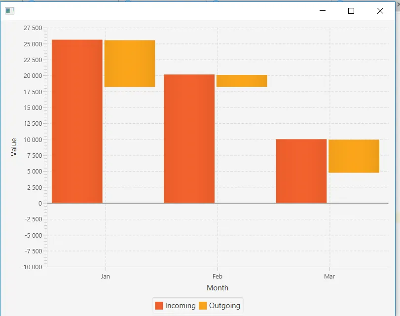
结果如下:
我使用了以下示例代码:
public class Statistics extends Application {
    final CategoryAxis xAxis = new CategoryAxis();
    final NumberAxis yAxis = new NumberAxis();
    final StackedBarChart<String, Number> sbc = new StackedBarChart<>(xAxis, yAxis);
    final XYChart.Series<String, Number> incoming = new XYChart.Series<>();
    final XYChart.Series<String, Number> outgoing = new XYChart.Series<>();

    @Override
    public void start(Stage stage) {
        xAxis.setLabel("Month");
        xAxis.setCategories(FXCollections.observableArrayList(
                Arrays.asList("Jan", "Feb", "Mar")));
        yAxis.setLabel("Value");
        incoming.setName("Incoming");
        incoming.getData().add(new XYChart.Data("Jan", 25601.34));
        incoming.getData().add(new XYChart.Data("Feb2", 20148.82));
        incoming.getData().add(new XYChart.Data("Mar2", 10000));
        outgoing.setName("Outgoing");
        outgoing.getData().add(new XYChart.Data("Jan", -7401.85));
        outgoing.getData().add(new XYChart.Data("Feb2", -1941.19));
        outgoing.getData().add(new XYChart.Data("Mar2", -5263.37));
        Scene scene = new Scene(sbc, 800, 600);
        sbc.getData().addAll(incoming, outgoing);
        stage.setScene(scene);
        stage.show();
    }
}
结果如下:
结果如下:
正如您所见,负数的 出账 值显示在零以下,而不是从正数的 进账 值中减去,这使得难以看到两者之间的差异。
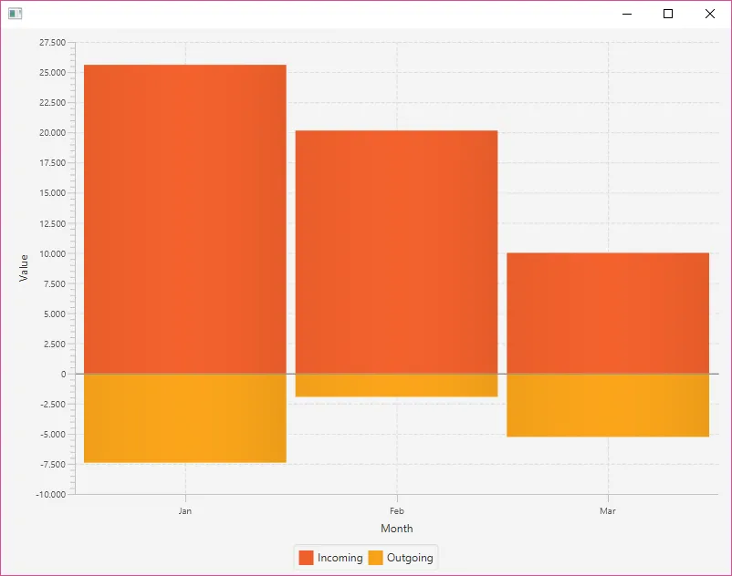
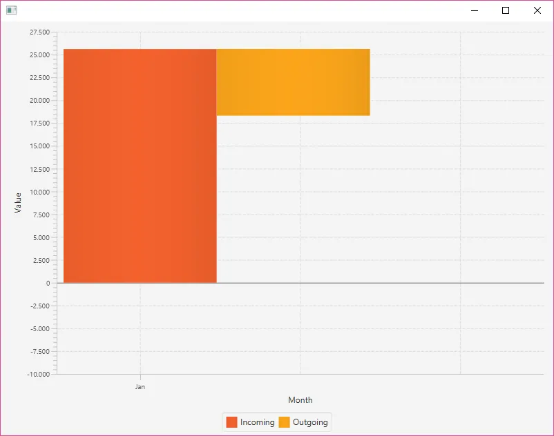
我想要的是,负值的柱子从正值的柱子顶部开始,但由于它们会重叠,所以也要沿着 x 轴应用一个偏移量。就 “Jan” 系列为例,它应该类似于下面的样子:
我试着使用 getNode().setTranslateX/Y(),但似乎这并不是一个好的解决方案,因为平移单位不是图表中的刻度,而是其他东西。
如何以一种优雅的方式创建一个类似第二张图片的“堆叠”条形图?