我正在尝试绘制一幅地图,但我无法弄清楚为什么以下内容不起作用:
这是一个最简示例。
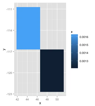
这适用于1-8行:
这是一个最简示例。
testdf <- structure(list(x = c(48.97, 44.22, 44.99, 48.87, 43.82, 43.16, 38.96, 38.49, 44.98, 43.9), y = c(-119.7, -113.7, -109.3, -120.6, -109.6, -121.2, -114.2, -118.9, -109.7, -114.1), z = c(0.001216, 0.001631, 0.001801, 0.002081, 0.002158, 0.002265, 0.002298, 0.002334, 0.002349, 0.00249)), .Names = c("x", "y", "z"), row.names = c(NA, 10L), class = "data.frame")
这适用于1-8行:
ggplot(data = testdf[1,], aes(x,y,fill = z)) + geom_tile()
ggplot(data = testdf[1:8,], aes(x,y,fill = z)) + geom_tile()
但是不适用于9行:
ggplot(data = testdf[1:9,], aes(x,y,fill = z)) + geom_tile()
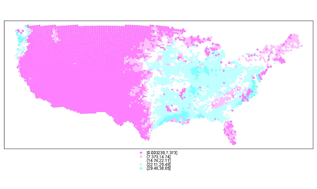
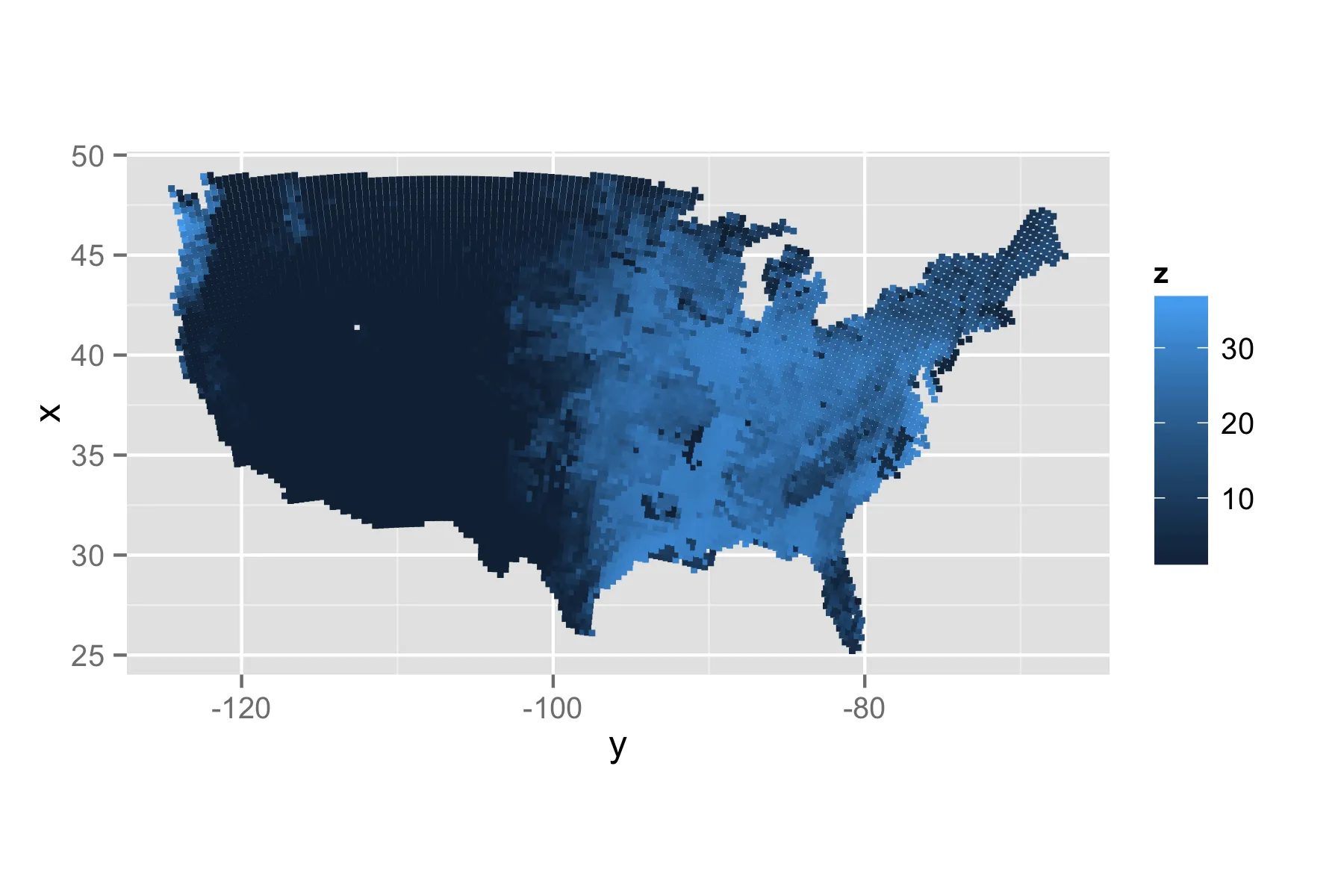
我正在寻找一种在非规则网格上绘制数据的方法。并不一定要使用geom_tile,任何关于点的空间填充插值都可以。
完整数据集可以在gist上获得。
上面的testdf是完整数据集的一个小子集,这是美国高分辨率光栅数据集(>7500行)。
require(RCurl) # requires libcurl; sudo apt-get install libcurl4-openssl-dev
tmp <- getURL("https://gist.github.com/raw/4635980/f657dcdfab7b951c7b8b921b3a109c7df1697eb8/test.csv")
testdf <- read.csv(textConnection(x))
我尝试过的方法:
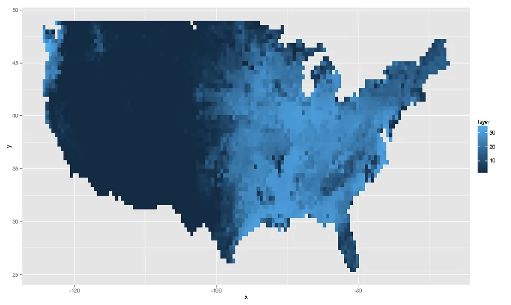
using geom_point works, but does not have the desired effect:
ggplot(data = testdf, aes(x,y,color=z)) + geom_point()if I convert either x or y to a vector 1:10, the plot works as expected:
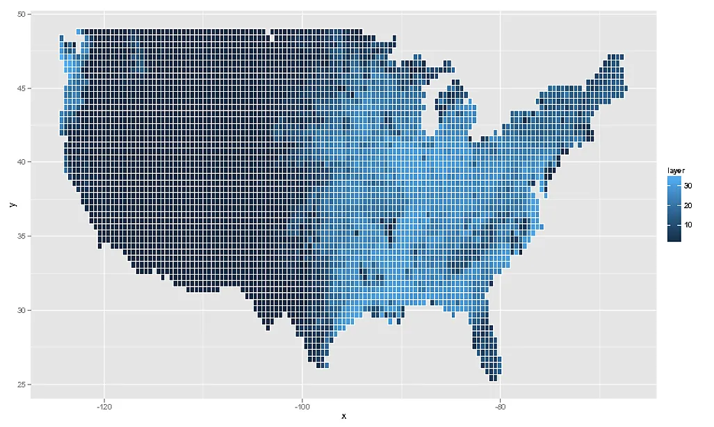
newdf <- transform(testdf, y =1:10)

ggplot(data = newdf[1:9,], aes(x,y,fill = z)) + geom_tile()

newdf <- transform(testdf, x =1:10)
ggplot(data = newdf[1:9,], aes(x,y,fill = z)) + geom_tile()
sessionInfo()R version 2.15.2 (2012-10-26) Platform: x86_64-pc-linux-gnu (64-bit)


> attached base packages: [1] stats     graphics  grDevices utils
> datasets  methods   base

> other attached packages: [1] reshape2_1.2.2 maps_2.3-0
> betymaps_1.0   ggmap_2.2      ggplot2_0.9.3

> loaded via a namespace (and not attached):  [1] colorspace_1.2-0
> dichromat_1.2-4     digest_0.6.1        grid_2.15.2
> gtable_0.1.2        labeling_0.1         [7] MASS_7.3-23
> munsell_0.4         plyr_1.8            png_0.1-4
> proto_0.3-10        RColorBrewer_1.0-5  [13] RgoogleMaps_1.2.0.2
> rjson_0.2.12        scales_0.2.3        stringr_0.6.2
> tools_2.15.2
geom_raster或geom_tile。请参阅我的答案,了解详细信息和使用geom_raster的解决方案。 - Simon O'Hanlon